
Artful Breakdown: The Art of Blood Artist

Welcome back to Artful Breakdown, the series that takes a look at the art of Magic: the Gathering cards and the strategies, tricks, techniques, and decisions that go into making it. I’m Aaron, a fantasy illustrator myself, and it’s my pleasure to be your guide to looking at the interesting stuff you might miss at card size.
Since I wrote last, we received a massive drop of stuff for March of the Machines, and my mind is already racing. In the initial batch of pieces, two especially stood out: the dual arts for Chandra, Hope’s Beacon. Plans for discussing them are in the works, but it got me thinking about alternate arts more generally. I love seeing different artists interpret the same subject matter and the different ways they solve the same problems, so today I hope you’ll indulge me as I talk about the alternate arts of one of my favorite cards: Blood Artist.
Bloody Good Work
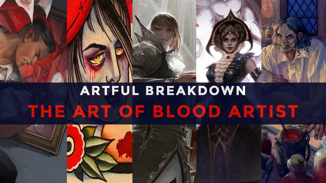
The First Blood Artist appeared in 2012 in Innistrad. Its depiction of an artist using the Vampire’s food source as paint perfectly fit the decadent recklessness of Innistrad’s Vampires.
Blood Artist by Johannes Voss
Painted by Voss and art directed by Jeremy Jarvis, the mood and atmosphere here are striking. The limited palette keeps our attention focused well on the figure of the artist and even uses the artistic principle of repetition with the containers filled with bright red blood to add interest and lead the eye to various points of importance in the piece. Between that and the rich aristocratic clothing, it sells the narrative of vampiric callousness incredibly.
There’s also a lot of storytelling happening here. If you look in the background you can see a woman hanging in a recess in the wall, her blood draining into a bowl to be used for later work. Then we’re looking up at the Vampire, his Byronic face furrowed in concentration. This is a classic bit of visual storytelling, the powerful looking down on the powerless, but you’ve got to ask, what is he looking at?
His canvas tells us. It’s very likely he’s looking down at a dying woman, the subject of his macabre painting and incidentally seemingly the woman from Curse of Oblivion, also painted in part by Voss along with Jana Schrimer.
Making a Mark
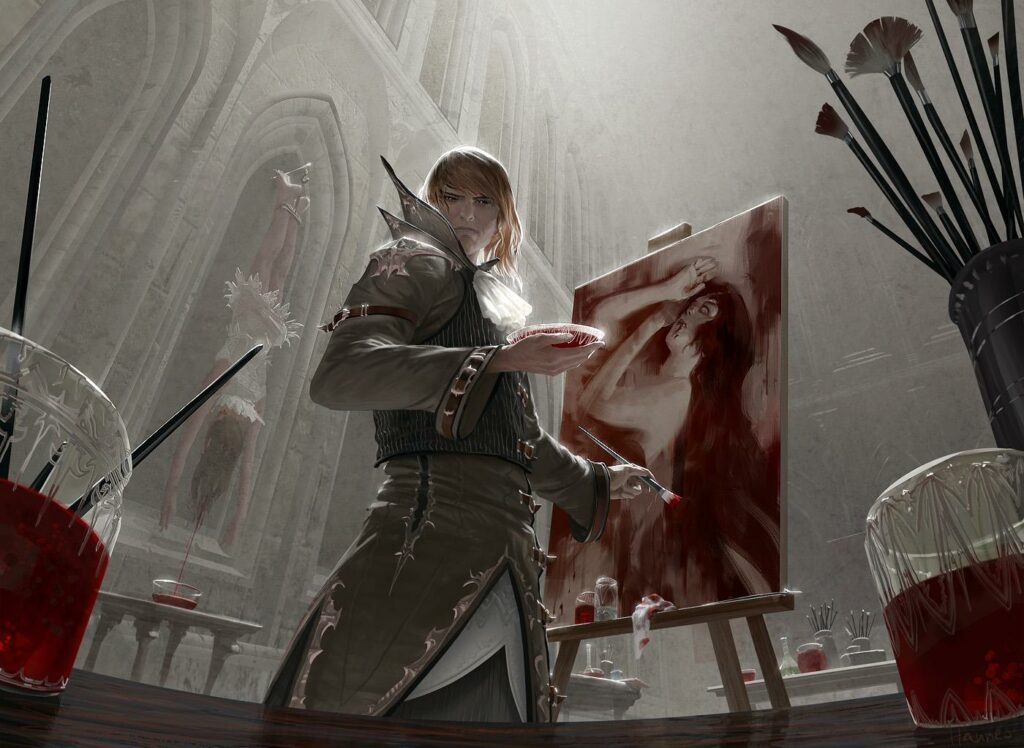
The first reimagining for this was the tattoo art secret lair by Joshua Howard.
Blood Artist by Joshua Howard
Mark Rosewater is fond of saying “restrictions breed creativity”, and that’s as true in art as it is in card design. Here, those limitations come from the needs of a classic tattoo sheet Howard was instructed to take inspiration from. With 15 years of tattoo experience under his belt, of course, he was definitely in his element. You can read an interview about him creating all the pieces for the project here.
But I love that Blood Artist was picked for one of the cards. It’s a good match thematically, and while it’s a very different style than we’re used to, it still solves the problem well. As Joshua puts it, the artist with a large palette is a classical symbol in American tattooing, and though the depiction doesn’t have the space for the wildly detailed and complex illustration of some of the other pieces, it still conveys a sort of sinister edge through the look on the Vampire’s face, though the bloody tears and the almost stereotypical beret give a nice contrast of near silliness that shows the art doesn’t take itself too seriously. Perfect for a Secret Lair doing something very different for its time.
Stylish and Staid
We return to Innistrad once more with a more serious version by LA Draws. While I stand by what I said when I last mentioned this piece, I don’t think it makes the best use of his considerable ability as a storyteller, but it’s still a strong debut.
Blood Artist by LA Draws
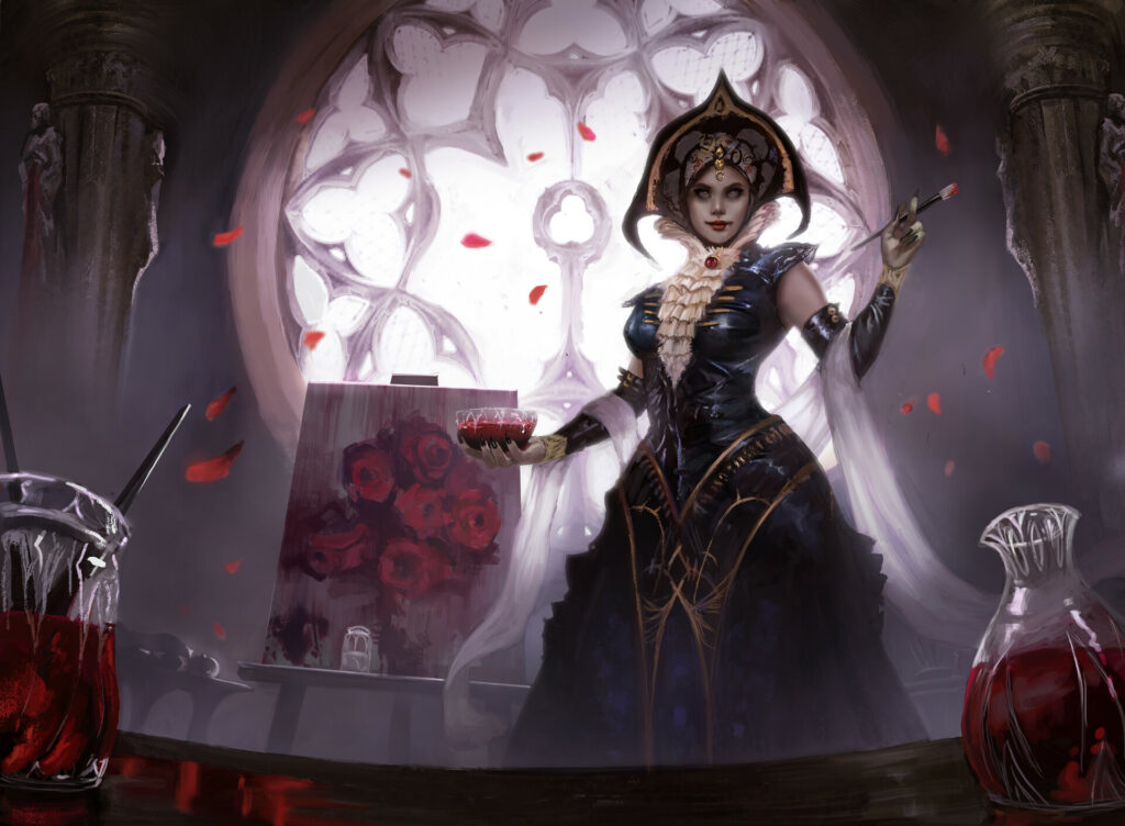
LA homages the original’s low composition here. He even used the same trick of well-rendered glassware in the foreground to lead us in, but instead of dark intensity we get a kind of elegant sedateness. The primary element isn’t the casual cruelty of the original; instead, more focus is on the character of the artist herself rather than what she’s doing.
In fact, it almost feels as if the character is posing for a portrait herself, like this entire moment is for a presentation about her and her art rather than a candid moment of her at work, and the flavor text kind of backs up that interpretation.
Burning the Midnight Oil
It’s honestly hard to place this particular Vampire for me, though as part of the Double Masters set, it may not need to be as clearly tied to a specific world. If you’ve got an idea let me know.
Blood Artist by Carl Critchlow
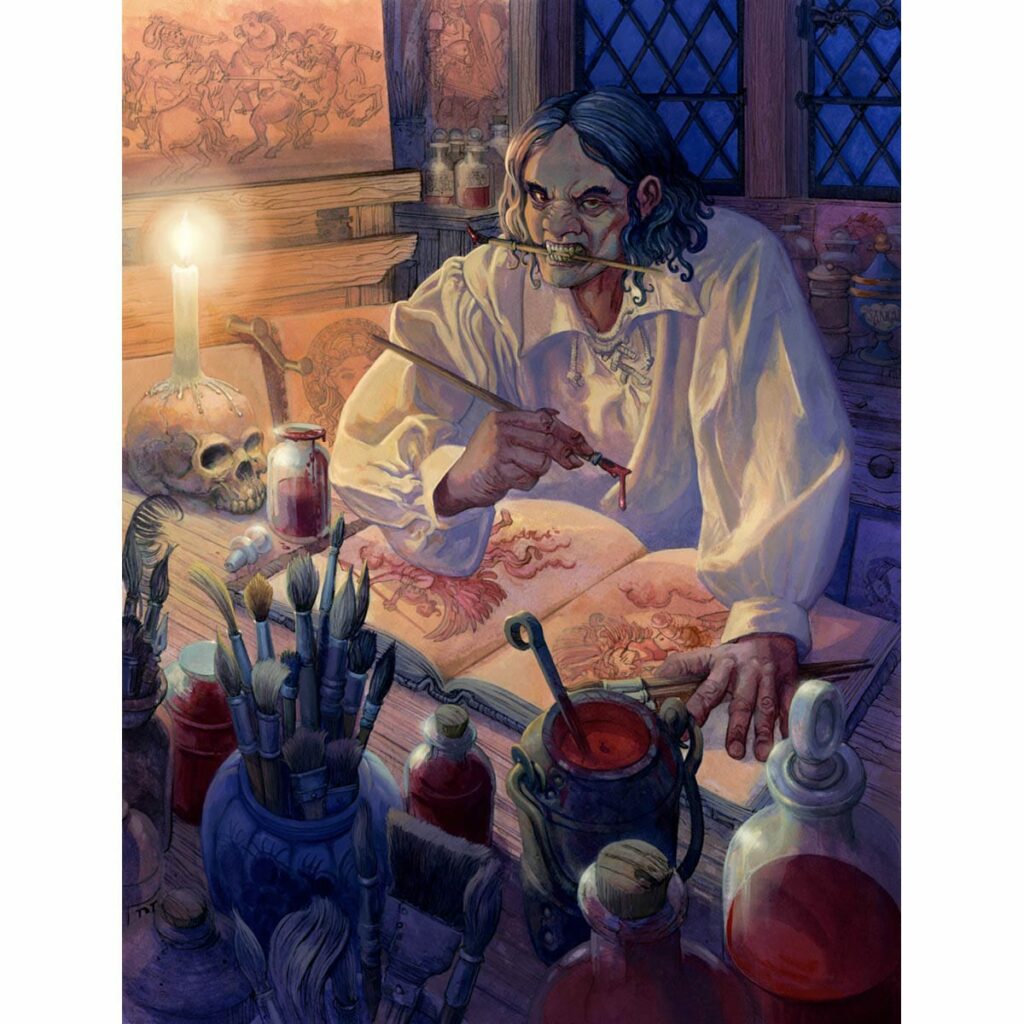
The other Blood Artists feel like they’re pulling from certain artistic stereotypes. This version feels more intimate and in some ways more in keeping with the kind of gremlin energy that, while exaggerated, rings a bit more true to the borderline obsessive need some of us have to create. This Blood Artist is surrounded by his previous works, none of which seem like allusions to Critchlow’s previous works. Some seem like riffs on classical art motifs like the angel or the battle scene on the upper left. The clustering of supplies, the finished and half-finished pieces, as well as the closer framing of the composition, makes the whole workspace feel tight and cramped. The candlelight adds to it by giving us a limited window of brightness and focusing our eye on the artist’s face.
And what a face it is! Between holding a brush in the teeth (a thing I’ve literally seen most of the art school students I studied with) and that grimace, it’s a striking little piece. Heck, I think I made that exact face last time I was interrupted with a looming deadline. It’s a stark and fun departure from the grandiosity of the previous Innistrad ones.
More!
Lastly, my favorite Blood Artist so far: the Jumpstart 2022 reimagining by Julie Dillon!
Blood Artist by Julie Dillon
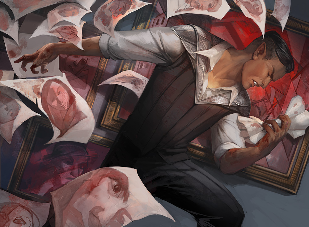
Dillon is a new artist to the game, with 19 pieces, but she’s an award-winning powerhouse. She’s been working as a pro since 2006 with a long list of awards to her name. Varied and versatile, her style makes use of exaggerated colors and evocative body language.
Here she brings that powerful energy into a very different Blood Artist. Likely hailing from New Capenna and affiliated with the vampiric Maestros, the keepers of art and luxury on the plane, Dillon leans into the stereotypical angsty element of artists with dynamic and dramatic body tilt that hits at the heightened emotion of just being unable to get a project right! She uses the strong rightward lean to create a powerful motion line. The facial expression is one of emotional anguish as he flings half-finished blood sketches everywhere. The flurry of papers mimicking his own tempestuous emotions. The art behind him even echoes the cubist/art deco inspirations of New Capenna masterfully giving us a great sense of place. It’s a familiar trope done incredibly well.
A Picture’s Worth A Thousand Words
In school, my illustration professor stressed to us more than once is that art is problem-solving. It’s not this magic or mysterious thing. Rather, it’s about figuring out the best way to communicate a complicated idea into pictures. It’s a craft and full of varied ways to answer the same questions, but that’s what makes the whole thing wonderful.
Now, if you’ve stuck with me through this thoroughly self-indulgent exploration, thank you. It’s only fair you get to do the same kind of indulging. Let me know what some of your favorite art and variants are. We’ve got mountains to choose from. That’s it for now, and I’ll see you in the next Artful Breakdown.

