
Artful Breakdown: Mia Boas Basics and the Principles of Art


Hello once again, and welcome back to Artful Breakdown, the series that takes a look at the art of Magic: The Gathering cards and the strategies, tricks, techniques, and decisions that go into making it. I’m Aaron, a fantasy illustrator myself, and it’s my pleasure to be your guide to looking at the interesting stuff you might miss at card size.
The year’s winding down, but we’re not out of fantastic art. Magic is spoiling us with several year end goodies, but I’m also seeing some wonderful work from other art columns in the space delving into some fascinating stuff.
Over on Hipsters of the Coast, John Dale Beety dug into the old concept of the hierarchy of genres, and Donny Caltrider discussed how the Raft of the Medusa inspired a small part of a common Magic card. We’ve all been challenged to get a bit weirder, it seems, and I’m down for it. So with the art for Clue and Murder at Karlov Manor trickling in and cementing Ravnica as the repository for Magic‘s noir and detective tropes, I noticed something interesting in the new basic lands by Mia Boas and a fantastic opportunity to talk about some “elementary” tools of art-making. (No, I will not apologize for that pun).
The Elements and Principles of Art
This may be familiar, but in case it’s been awhile since you’ve been in an art class, the elements and principles that are the fundamental blocks of visual art are usually taught as: line, shape, form, color, texture, space, and value.
Those are your raw materials, so to speak. From there you combine them with the principles of design to get visual art. These principles, in my experience, are usually taught as: rhythm, balance/symmetry, movement (this is the principle at the core of gesture from last time), emphasis, harmony, proportion, unity, contrast, pattern, and repetition.
That said, I’ve still seen a few others thrown in depending on who you talk to. Just know the principles can be a little looser, but it’s those last two, pattern and repetition, that I want to focus on because the Boas lands lean on those principles to a level I rarely see in Magic art.
The Boas Basics
Mia Boas is new to the game entirely. They’re a lighting and environment artist, and if you look at their portfolio, you’ll see they mainly use Blender to create intricate digital dioramas. Many of their larger-scale pieces really take advantage of the program’s ability to perfectly mirror elements. That comes through especially strongly in these.
The layered repetition works fantastically for Ravnica and fits with the general feel of a city plane where everything is built atop itself. The surrealness of the scenes actually reminds me a lot of MC Escher’s Relativity piece. That’s probably one reason I enjoy these so much. Then there’s the composition, which takes advantage of the vertical frame to go tall rather than wide, as most cityscapes do. The Forests are a good example, but all of them use this technique as well.
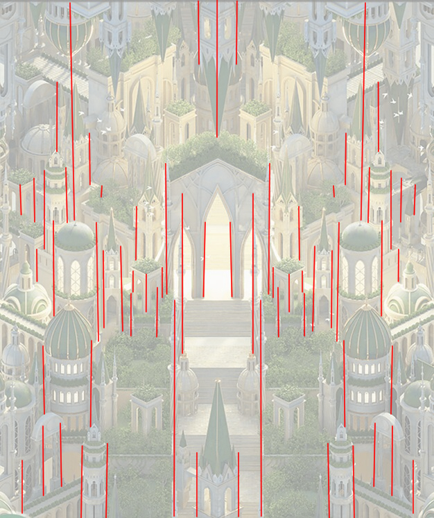
In doing this, Boas emphasizes the vertical lines of the buildings and it adds an almost stressful feeling. It works for the hustle and bustle of the city. But this repetition isn’t chaotic or ill-considered, either. Here’s where the principle of pattern comes in. It provides a structure that helps to keep them easy to read and understand at card size. It’s also helpful to have an understanding here of why these are different things. All pattern is repetition, but not all repetition has a pattern. Compare the art from Sunken Citadel by Matteo Bassini from The Lost Caverns of Ixalan. The stalactites and the great stone heads repeat, but there isn’t really a pattern to that repetition.
Back to Boas, the pattern they use doesn’t just extend across the left-right divide. They repeat top to bottom as well, linking the images across the primary axis.
All of this is purposefully anchored with a central point for emphasis (another principle!). Each piece has a central space that’s not as busy as the rest of the art. It’s a place for our eyes to rest and return to and provides just enough variety to keep our eyes looking for more of it.
And that’s the other fantastic thing being done here. Our brains love patterns, but we also love finding things that are off, different, or wrong. Images like this are a great place to deliberately break patterns in small ways once you’ve set them up.
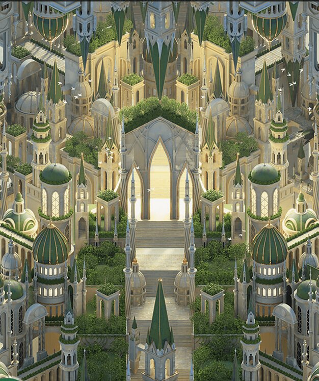
In doing this, it gets our brains to hunt for the things that are different or amiss, incredibly fitting for a set that’s built around a murder mystery. For example, I noticed that we have at least one building at an impossible angle in the Plains.
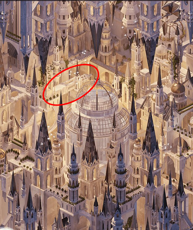
I don’t know if that was on purpose, and if I’m honest, I don’t really care. It’s a wonderful addition, and I hope she has others like it buried on these.
My Favorite
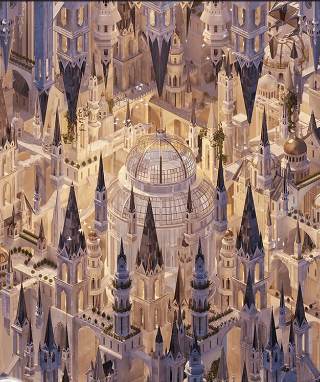
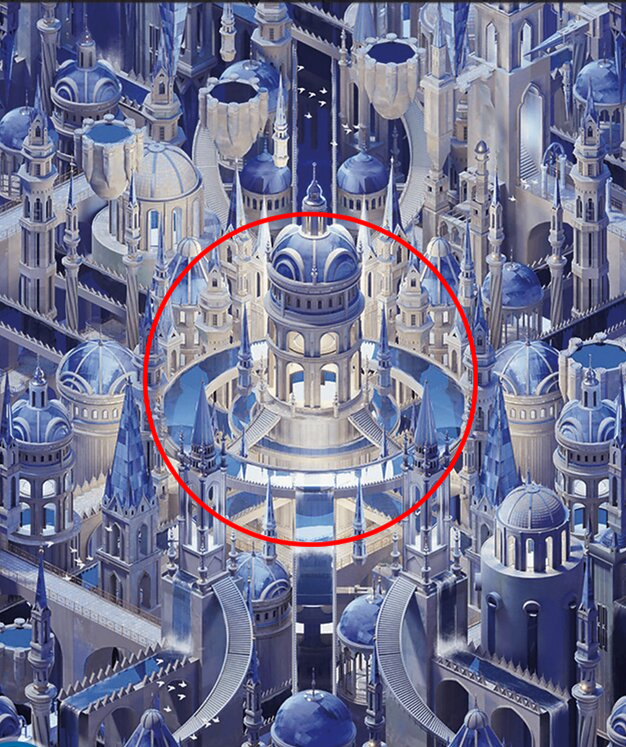
My favorite of these is the Island. Clearly referencing the Azorius parts of the city, I love the contrast of curved and straight lines across the diorama. Light emanating from the center marks it as the focal point. Staircases curve away from it and towards it, some curving inward, others out, and the reflections add an extra layer of depth. Just so much is going on here.
Placing the Lands
The last thing I want to talk about how well these fit into the existing iconography and look of Ravnica as a plane. We’ve been to Ravnica several times now, and it’s a testament to how well-defined the look is that so many different artists are able to collaborate together, even with an Art Director’s guiding hand, and we get such a consistent look of the place, so much so that Mia’s dioramas take very little effort to place within the city plane.
The Forest firmly draws on the gold and green of Selesnya and is awash in gentle warm tones.
The Island, as mentioned, is clearly Azorius. It weaves imposing white marble structures with intricate building designs that create a kind of ordered but claustrophobic maze.
The Plains uses the whites and blacks of the Orzhov along with the ornate and spiky architecture.
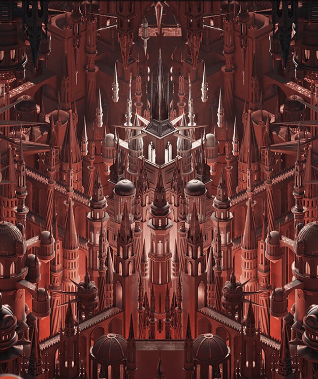
The Mountain is clearly Rakdos-aligned (if you zoom out enough, you can even see the face of a demon in the art’s shape), taking the spikes and points of the architecture up a notch and bathing the whole thing in red and black, making it stark and eerie.
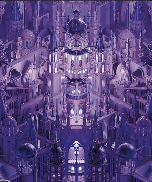
Finally the Swamp takes us beneath the city (you can see it in the sewer pipe openings that show up a few times in the image). The violets and blues clue us in this is probably Dimir-aligned as far as locations go and the architecture has the suitably haunted energy to match.
But across all five of these, certain patterns and motifs persist. In some places, most of what differentiates the art is colors before you really get to the details. Repetition as an element of art can extend not just to a single piece, but at the level Boas is using it, an entire body of work like these. Certain shapes and elements repeat across all the lands, and it helps ground them as being related.
It’s a trade off. You don’t want things to be simple palette swaps and there’s lots of intricate details to make each of these feel like their own distinct locations. When doing something like this, your details have to be much stronger. Careful attention to detail becomes paramount. You can’t just let a duplication tool do the work for you and call it a day.
And if there’s one thing these show us, it’s that Mia Boas has an amazing attention to detail. I hope these aren’t the last things we see her do like this.
Conclusion
It’s been amazing looking at the year in Magic art with all of you. I’ve learned a lot, and I hope you’ve gained a greater appreciation for the wonderful art and artists that make this game what it is. I’ve had a blast.
That being said, in looking at my plans for 2024, I don’t think I’ll be able to continue working on this, so we’ll soon be winding down the Artful Breakdown. But I’m not leaving you all just yet. We’ve got one more article this year, and it wouldn’t be right to close out without a best of the year retrospective/favorites, so look forward to that as we close our an amazing year for Magic art.
Let me know your favorites or art you’re excited about. You can let me know here or find me around the internet on places like Twitter or help support me on Patreon to keep up with and support my future artistic adventures. You can also find me on Bluesky. Until then, take care of yourselves, and I’ll see you in the next Artful Breakdown.

