
Magic Cards Where Artists Misunderstood the Brief

Knowledge Demands Sacrifice
Have you ever wondered why some Magic: The Gathering cards seem to have a name and art that don’t seem to quite gel together? Like there might have been some sort of communication breakdown between designer and artist?
Words. They’re tricky. Or rather, one’s brain’s interpretations of them can be tricky. The words themselves aren’t inherently deceptive, they’re just there on the page, or screen, or in the case of the subject of this article, they’re right there on the art direction brief. Just sitting there, daring you to misread them. So maybe they’re more conniving than we think.
I’m a person who makes a living with words, and I’ll be the first to admit that the intent of the person writing doesn’t always line up with the reader’s takeaway. And whose fault is that? That’s right, we blame the words.
At least, that’s what the art directors are probably saying when the art for these cards return slightly… wrong. The art itself is of course expertly created by professionals and in most cases would be serviceable depictions for Magic cards, but sometimes, starting from bad information yields bad results regardless of skill.
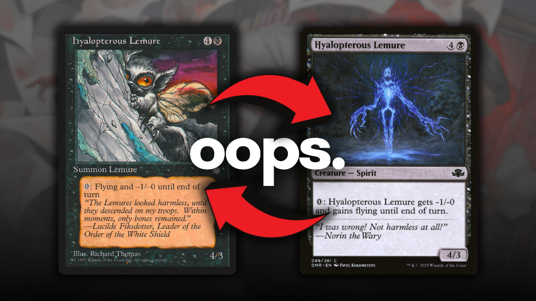
Hyalopterous Lemure
Let us start with what is likely the most famous example of this particular phenomenon. Imagine being Richard Thomas around the time they were developing Ice Age. The Pennsylvania-based Thomas is one of Magic‘s original 25 artists and is credited with a number of iconic creations that Magic players of a certain age know very well, including the design of “Stuffy,” the sack doll seen on several cards starting with Alpha’s Black Vise. Have you indulged your villainous streak by putting the Blueprint Secret Lair version of Tangle Wire into your Commander deck? You can thank Richard Thomas for the art’s inspiration.
Back to “lemure.” It’s well-known that, throughout the history of Magic: The Gathering, dictionaries of all sort have been beaten to death in service of creating interesting, unusual, or memorable card names. English teachers the world over applaud students’ knowledge of words like “rancor” or “fumerole”, unaware that they should credit the Wizards of the Coast design team with getting those words in front of young players.
So when it comes to Hyalopterous Lemure, that’s a double whammy. Neither word seems like a real English word to a layperson, but the inquisitive sort might be compelled to Google both. But we’re in late ’94 into early ’95 right now. There’s no such thing as “Google,” as the search engine so ubiquitous to life today wasn’t introduced to the public until September of 1998. Today, anyone can discover the meaning of both words as quickly as it takes to type them into a search bar — “hyalopterous” meaning having transparent wings like a bug, and “lemure” being the name of a horrible ghostlike monstrosity from Roman mythology.
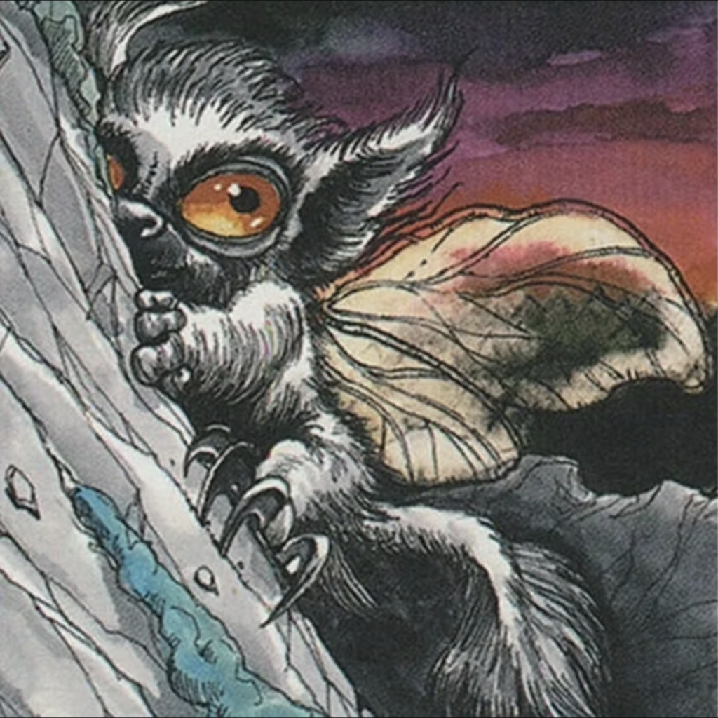
Oddly, of the two obscure words that make up the card name, Richard Thomas’s art gets the arguably more rare word, hyalopterous, right. The fuzzy little guy has translucent insect wings, there’s no doubt about it. But the fuzzy little guy being a fuzzy little guy shows that Thomas read “lemure” as “lemur,” made even funnier coupled with the card’s flavor text. “The Lemures looked harmless, until they descended on my troops,” says the quote. Maybe Madagascar’s lemurs are cousins to Australia’s drop bears?
The misunderstanding was made into an in-joke thanks to Viscid Lemures from Time Spiral, this time the famously courageous Norin the Wary being the one confusing the monstrous Lemure and the precious lil’ lemur, and in 2006, Drew Tucker at least had the ability to Google “Viscid,” just to be safe. By the time Dominaria Remastered rolled around in 2023, we’ve all had our fun, and Wizards opted to finally give the Lemur/es a new art befitting the original intent, along with a referential flavor text quote courtesy once again of Norin.
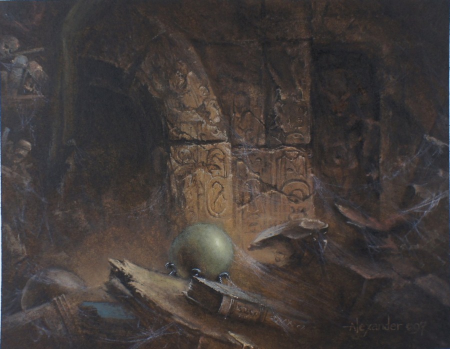
Alchor’s Tomb
At first glance, everything seems fine with this particular Legends rare. The name’s “Alchor’s Tomb,” and the art seems to depict exactly that. It can certainly be posited that yes, what we’re seeing is a tomb. It’s a tomb that noticeably does not interact with the graveyard in any way, but it’s a tomb nonetheless. This, however, is a case of the card’s name being changed at the last minute to fit what the artist heard, instead of what the original intent was.
Legend goes that “Alchor’s Tomb” began its life in design as “Alchor’s Tome,” or a big ol’ book full of wizard spells. That’d be a more fitting artifact owned by Alchor. Wizards of the Coast co-founder Peter Adkinson’s Dungeons & Dragons character was a wizard named Alchor, and Legends designer (and fellow WotC co-founder) Steve Conard wanted to create a card version of Alchor’s in-D&D grimoire as a tribute.
Everything was assembled regarding the card: it had a name, ability, mana value, you name it. All it needed was art, and shortly thereafter, Swedish artist and art director at the time Jesper Myrfors delivered a piece of art based on what he thought was the name of the card.
Somewhere along the line, the word “tome” was corrupted to “tomb.” Some sources say it was Conard who miswrote it when communicating to Myrfors, while others point to a phone conversation through which Myrfors allegedly misheard the word when spoken by Conard. Unlike with the Lemures, however, there was still time to make an edit before the cards went to print, and Alchor’s Tome became Alchor’s Tomb. Regardless, what began as a tribute to Adkinson became a canonical death for a beloved D&D character.
Myrfors is obviously very well-known as both a Magic artist and the game’s first art director. In fact, he and Christopher Rush are credited with designing the now-iconic “Deckmaster” Magic back as well as most of the elements of the card frame, and it was Myrfors who championed the idea of commissioning original artwork for the game instead of pulling art from secondhand sources, so it’s a bit of poetry that a visual gaffe happened to him, as harmless as it may have been.
Unless you’re Alchor, of course.
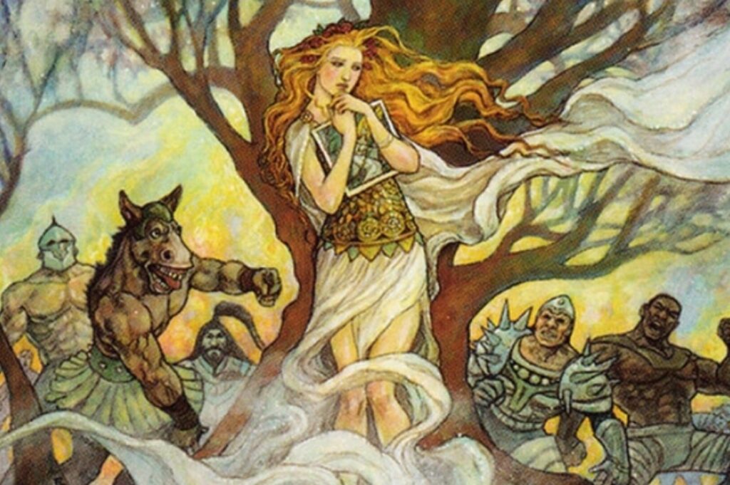
Rubinia Soulsinger
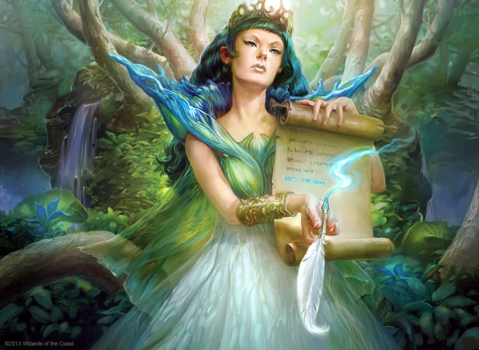
With Rubinia Soulsinger, we get an example of the second artist possibly making a bit of a misinterpretation.
Originally from Legends, Rubinia Soulsinger as depicted by Rob Alexander is your generic faerie lady jammed up against some foliage. That’s no shade against Rob; this is 1994 we’re talking about, and a style book or concise art direction was but a twinkle in Jesper Myrfor’s eye at the time. That kind of cohesive visual design didn’t come into being until ’96, ahead of the Weatherlight saga, so likely, Rob was told to draw a faerie woman, and that’s exactly what he did.
The name “Soulsinger” implies that Rubinia has a sort of siren-esque quality about her, evidenced by the card’s ability to gain control of opponents’ creatures, and nearly two decades later, it was Cynthia Sheppard’s turn to paint the Bant faerie.
Rubinia Soulsinger was among the reprints of Commander 2013, and Sheppard updated the character to be featured with a scroll and quill, holding the items temptingly toward the viewer, almost as if she’s asking for the viewer to sign their soul away. Sheppard herself denies the misunderstanding, saying around the time of C13’s release that she painted to the direction she was given. “The art brief said she ‘conscripted’ creatures into her army, hence the scroll and quill,” said Sheppard. “They changed the flavor text to match the art, not the other way around.”
Sheppard went on to provide an anecdote in 2013 on her blog, stating that after seeing her new interpretation of the character, a fan asked her whether the depiction was designed “from a dyslexic misreading” of the Soulsinger’s name. “No, and yes,” said Sheppard. “The art brief mentioned that Rubinia was used to conscript creatures into an army, plus the card is a reprint, so unlike usual I had a decent idea of what she was going to do. My husband actually suggested the scroll and quill, and I ran with it because I thought it was awesome — like a recruiter trying to get your signature, but in a more alluring/powerful way?”
After the suggestion from a fan that there was a misread between Soulsinger and Soulsigner, Sheppard admits to assuming she was initially incorrect, “that it was –signer all along,” she said. “But on closer inspection later I realized I was right the first time.”
According to Doug Beyer, a designer at Wizards, the only direction the team had for Sheppard was to remove Rubinia’s wings, which she had in the sketch. “Magic’s faeries do almost always fly, but Rubinia doesn’t; she only became type Faerie during the Grand Creature Type Update, if I’m not mistaken,” he said. “You can still see some of the shape of her former wings in her gown.”
Beyer said the idea for the new art was to “just illustrate a faerie who was masterful at taking over the souls of those who trespassed in her realm, and [Sheppard’s art] was the interpretation of that that we liked.”
Sheppard, by the way, is not only an artist but served for several years as a senior art director for Wizards, leading the art direction for sets like Ixalan, Modern Horizons, Kaldheim, and Throne of Eldraine. She also had a hand in designing and developing Rivals of Ixalan, so she’s probably right in her interpretation of Rubinia Soulsinger’s art, and the singer/signer mixup is pure coincidence. Probably.
Urza’s Miter
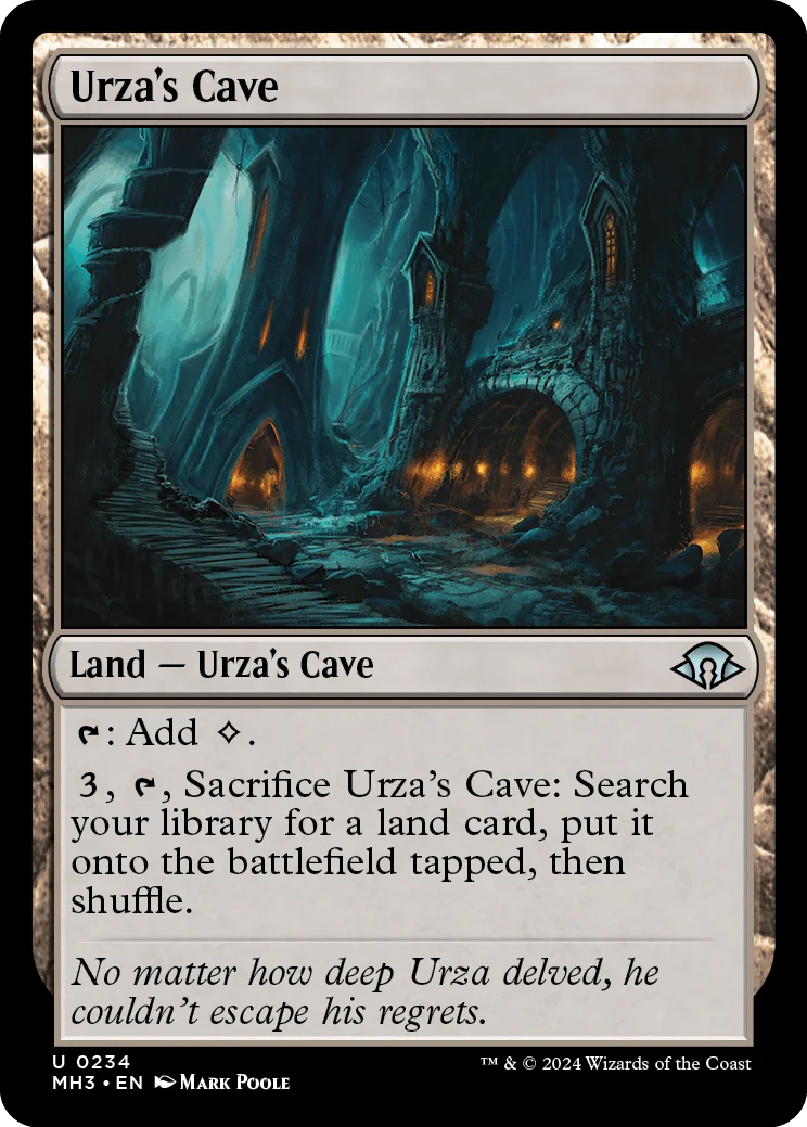
We know Urza very well today. He’s been the protagonist for more than one story arc, he’s depicted on or mentioned by more than 200 cards (and one Blind Seer), and as we learned recently from Modern Horizons 3 spoilers, he has an entire cave dedicated specifically for sulking:
But back in pre-Antiquities times, circa early 1994 or so, we knew very little about the guy. We knew he had glasses and sunglasses (we can assume the latter were prescription), and that’s about it. Then Antiquities arrived, and we got a much more detailed look at the various bits and bobs accredited to the man called Urza. We had an Avenger, a Chalice, and of course his Mine, Power Plant and Tower. We also had a pope hat.
Between the art and flavor text of the non-hat cards mentioned above, we were safe to gather that Urza was some sort of gifted inventor and artificer. But with Urza’s Miter, we seem to be asked to infer that he is also the head of the Catholic faith. Not impossible, I guess, but it seems very unlikely. Urza started off in lore as Dominaria’s Leonardo da Vinci, and we have historical evidence that Leonardo da Vinci knew popes in real life, so maybe one of them loaned him a hat? And now since Leo has a card himself and is essentially Multiversal canon, it might be time to break out the red string and pushpins.
Or, as Urza’s Razor tells us, if you have two competing ideas to explain the same phenomenon, you should prefer the simpler one. And the simpler one, in nearly every case, is that someone goofed.
This one isn’t a result of an artist mishearing or misreading direction, but rather a case of those dastardly homonyms. We know during Antiquities that Urza’s an inventor, and we know he has workshops as referenced in the flavor text of Urza’s Chalice. It stands to reason that he’d be well-acquainted with a miter. Not the papal headgear, but rather the engineering term for a specific kind of joint between two objects coming together at a 90° angle, or the tool for making them. Remember what we were saying about Google earlier? The word for the ceremonial pope-topper in Commonweath English (read: non-USA version) is sometimes spelled “mitre” as well, to add to the mounting evidence of error.
It wasn’t until later that the lore went out of its way to explain why Urza’s Miter is a hat and not a workshop tool. That came in the form of the novel The Brothers’ War, Book One of the Artifacts Cycle, by Jeff Grubb. That was published in 2001, a solid seven years after we first saw the miter. Here’s an excerpt from the book related to the hat-miter, and not the tool-miter:
Urza hefted the miter, clearly delighted. Finally Tawnos said, “I’ve never seen you this cheerful when the people praised you in Kroog. Is it the fact that they are your own countrymen that makes you smile?” Urza looked up, puzzled for moment. Then he smiled broadly. “You think that is it? That I have become a vain old popinjay, thriving on the adulation of the crowds? Look into my new hat, my former student, and see the truth of the matter.”
Tawnos moved over and looked over the brim of the upturned miter. Gemstones were sewn into the lining of the tall hat. That was why it was so heavy.
No, not gemstones, Tawnos realized. Power stones, pure and un-flawed. There were more than had been in the chest Urza had shown him five years ago.
Tawnos looked at Urza, and the Lord Protector beamed a warm smile. That was why he had put up with all the pomp and trappings of the ceremony, the Chief Scholar realized. That was why he had endured the speeches and courted the nobles and why, while claiming modesty, had accepted the post of Lord High Artificer.
All to gain more power. All to gain more resources.
Urza left the miter in Tawnos’s hands and went to fetch his chalice before the pair left for the interminable banquet. Tawnos shook his head. His former master had not changed at all. His devices were still at the center of his universe.
Tawnos did not know if that knowledge made him feel better or worse.
So really, what was likely supposed to be a simple workshop tool became a fancy hat that was then wrapped up in the story as they fleshed out Urza’s lore. And of course, Urza being Urza, it doesn’t make him seem very likeable. Is this a case of a butterfly flapping its wings and changing the future? We’ll never know. But maybe had Urza’s Miter just shown a tool in its art, and not a pope hat, Urza wouldn’t be the character he evolved into. Or, I’m reading way too much into an art direction oopsie from 30 years ago.
Mystic Remora
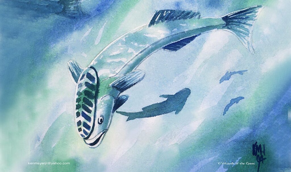
Now we’ll go from one homonym to another, much like miter/miter, and even more so than the previous example, people can be forgiven for not knowing the dual definitions of “remora.”
The famous fish-that’s-not-a-fish has been imposing taxes on Magic players since Ice Age, and that’s a long time for people to wonder why an enchantment clearly depicts an aquatic critter, and not, say, some glowy lights like most enchantments.
The confusion likely boils down to the word “remora,” which is obvious, but what’s less so is that the word actually has two meanings in English. The first and much more widely known definition is what we see in the art: a fish with a suction cup on its head that attaches itself to sharks. The other, rarer, meaning of “remora” is any hindrance or obstacle that makes progress difficult. In a sense, that’s a much more apt description of the card’s mechanics: hindering your opponent by imposing a tax on their game actions in the form of card advantage.
Whether or not this was a mistake in clearly explaining which definition of “remora” was intended is somewhat apocryphal, but it’s clear that in the years since, Wizards has leaned into the double meaning with subsequent reprints. Every version of the mystic fishstick has featured the finned fella prominently, from the Secret Lair version to the dual arts featured in Dominaria Remastered.
Bronze Calendar
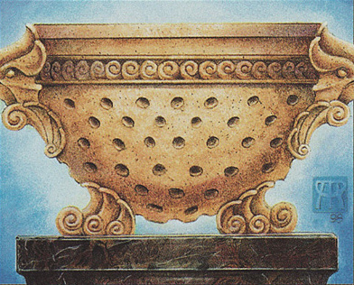
Next up in our little trip across the various art errors of Magic is the card version of a wink/nod to that very issue.
Bronze Calendar obviously depicts a colander, but this was intentional, as an “homage” to the times prior to Unglued when artists/art directors weren’t on the same page (or canvas, I guess). “This is a joke at the numerous times artists have misunderstood the art description and drawn the wrong item,” said Mark Rosewater waaaay back in 2004, around the time of Unglued’s release. “The Hyalopterous Lemure (a lemure is a ghost, the picture shows a lemur) is the best example of such a real goof in Magic.”
It’s also a riff on The Dark’s Stone Calendar. Surprisingly, neither calendar is any good at chronicling time relevant to any plane. For that, head here.
Ancient Craving
Did Rob Alexander misread the prompt as “carving”? With something as hard to depict as a “craving,” perhaps he was just going metaphorical. Or maybe the ancient carvings on Portal Second Age’s Ancient Craving are just that. The card’s been reprinted several times since it debuted, all with the same art, so mistake or not it seems that Wizards is fine with letting it ride.
At this point I’m much more interested in going on social media and making it the core of my identity to post every day complaining that Tojira, Swamp Queen doesn’t have a legendary card.
Glaive of the Guildpact
Medieval warfare enthusiasts (half of a Venn diagram that overlaps with Magic fandom a considerable and surprising amount) will be the first to tell you that a “glaive” is a polearm weapon similar to a halberd, or more closely a naginata. What German artist Volkan Baga painted seems to be your everyday sword. Was this a mistake?
Baga’s done more than 220 Magic cards and even won a 2009 Chesley Award for excellence in genre art, so it’s safe to say that he’s well-versed in all things fantasy at this point. Mistake, miscommunication or misinterpretation: whatever you want to call it, I think we can all agree that Baga is absolved, especially since he’s the artist behind much more interesting pieces of Equipment before and since the glaive.
Honorable Mention: Persecute Artist
This time it’s not a case of the artist misunderstanding an art director when it comes to a painting, but an artist who might have misunderstood an art director when it comes to getting fired from Wizards. As the story goes, Rebecca Guay was told by art director Jeremy Cranford that she’ll not be returning to do art for Wizards… for the set Legions.
Guay said Cranford informed her that her work is “too feminine for the vision Cranford has for the game.” Guay interpreted that as being fired and said so publicly. Cranford has spoken on record regarding the misunderstanding, saying that Guay’s art style just didn’t fit with the set Legions, specifically, since it was meant to be a set with “really intense exaggerated versions” of creatures, and the creative team at the time selected artists that “we felt would fit precisely within this vision of what Otaria was becoming.”
It all seemed like water under the bridge by the time Unhinged brought us Persecute Artist in 2004, along with Cranford himself adorning Fascist Art Director, and Guay’s gone on to do art for many, many cards since, including her own Secret Lair.
Torture or Art Direction?
There we have it, friends. We’re all human, and we all make mistakes. Luckily, for most of us those mistakes aren’t immortalized forever in the form of Magic cards, though you could make the argument that Tiktok enshrines mistakes just as well.
Stay off social media, kids.
Do you know of any other times when the artist misinterpreted the assignment? Add them in the comments for all to see.
