Artful Breakdown: Storm the Seedcore by Jason Rainville
Welcome back to Artful Breakdown, the series that takes a look at the art of Magic: the Gathering cards and the strategies, tricks, techniques, and decisions that go into making it. I'm Aaron, a fantasy illustrator myself, and it's my pleasure to be your guide to looking at the interesting stuff you might miss at card size.
At the start of the year when I made my roadmap post, I talked about how I wanted to take my time and savor interesting things as the year goes on. As such, I wasn't planning on talking about March of the Machine just yet. I wanted to take time to digest the set after the full spoiler release. But sometimes a piece comes out that is so manifestly worthy of attention that plans have to change, and when episode 8 of the March of the Machine story dropped, that's exactly what happened!
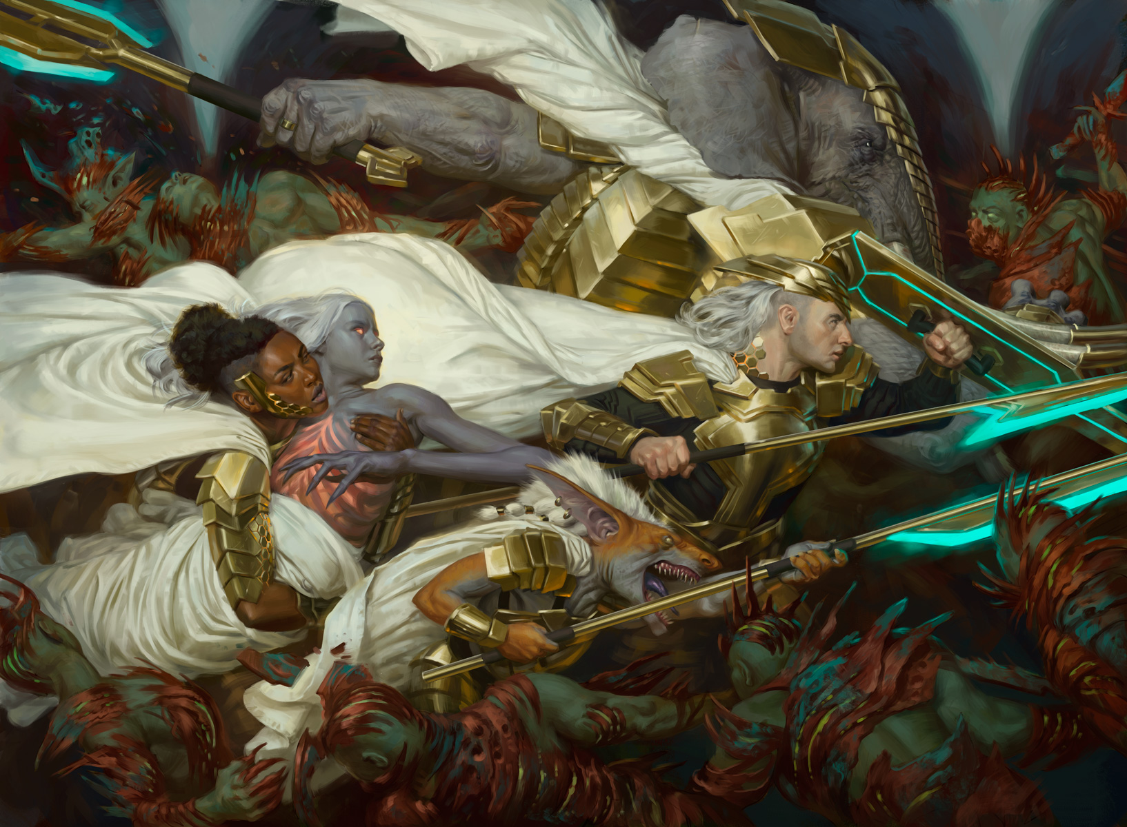
Storm the Seedcore by Jason Rainville
Just... look at it.
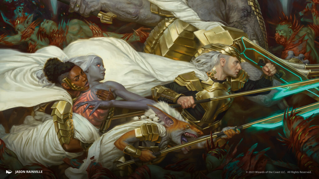
Jason's not new to the game. He started with the "Battle the Horde" promotion, and if you've been playing since Tarkir you've probably seen his stuff. He's regularly shown an affinity for art history and pulling in elements from past movements into his work. But this is something else.
Everyone who sees this pretty quickly clocks the classical feel; "Wrennaissance" jokes have been thick on the ground. I've also seen comparisons to Baroque painting in some of the guesses. For my money, though, I side with the people who noted this feels like it borrows more from the Neoclassical period of painting that was popular around the French Revolution. It eschews the linear perspective and natural/religious subject matter that were hallmarks of the renaissance. Also, it doesn't have the particularly stark, harsh lighting typical of the baroque masters.
Instead, Jason relied on a shallow depth of field, somber colors, and tight rendering with careful value control and clean lines of action in order to give the work a feeling of timelessness. All of these line up pretty well with Neoclassicism. Heck, even the way the cloth is painted feels like it has more in common with Jacques Louis David's "Napoleon Crossing the Alps" than Sandro Botticelli's "The Birth of Venus."
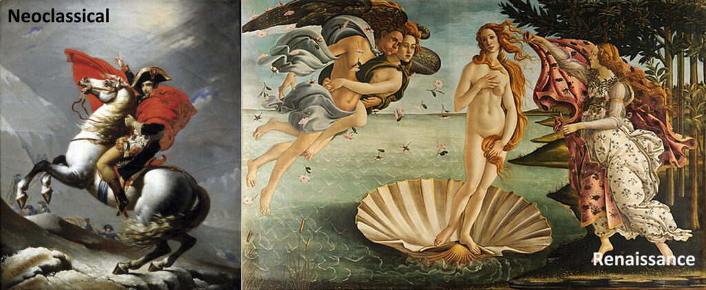
That said, all of these ARE influences for Rainville. If you're not following him on Twitter, he actually goes into this in detail and discusses how the formalism of his influences help handle and create drama in storytelling, and that's an important takeaway. The quintessential element here is a kind of broad understanding of the methods of the past to inform and recontextualize them into something new in a modern work.
Composition
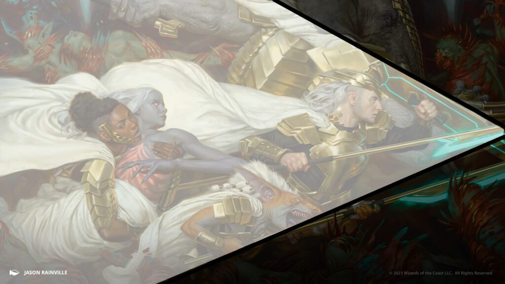
Even the composition of this is delightfully classic and straightforward. Because we read left to right in the west, Jason chose to orient all the energy in this moving toward the right. All the faces and weapons point that way. The trailing white capes indicate the speed of the Mirran forces as they charge. The Mirran resistance even form a loose arrow driving forward.
Vibes
Let's talk about composition and how it plays into storytelling. Up to this point in the lore, things haven't gone well for the heroes. They've lost engagement after engagement. But this is the turning point illustration, a last desperate rush to get Wrenn to reach the invasion tree, Realmbreaker. The mood is hopeful and uplifting. The white and gold colors push back against the darker greens and coppers that create this feeling of darkness on the edges.
Jason literally interprets the "tip of the spear" idea into the composition itself and zeroed in on that idea as the crux of the piece. In the story it's a harrowing, dangerous scramble, but thematically it's the moment where the heroes stop losing and things start going right for them, so rather than literally interpret what's going on in a story that Rainville couldn't read, he instead had to interpret this the idea of the moment he got in the brief.
Everywhere you look, something is happening, which adds to the intensity. Phyrexians surge and fall; the implied waves are handled with relatively few bodies but the implication is there are always more. And still the Mirrans push on. The strong implied lines of the spear give the impression of driving forward no matter what. It adds weight to the unity of purpose of the resistance.
Details
Another fun element of this piece is that it breaks down beautifully into smaller vignettes. The carrying of Wrenn is the first one I noticed, and this acts as a kind of focal point to the piece due to the contrast both between the skintones of the characters and the fact both are the darkest colors against a sea of cream colored cloaks.
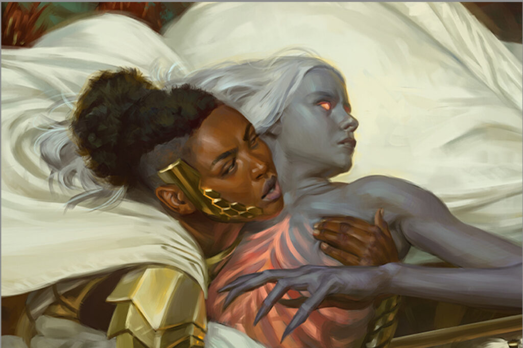
The attention to detail and ability to communicate rendering here is stupendous! Look at the impression of a hand sinking into Wrenn's pectoral! And the furrowing of the brow that speaks to Wrenn's worry in the moment. Outstanding.
The human and the goblin, as well as the human and loxodon, work as their own individual pieces too. The stoic human pairs well with the more animated faces of the Mirrodin goblin and the loxodon beside him as they fight.
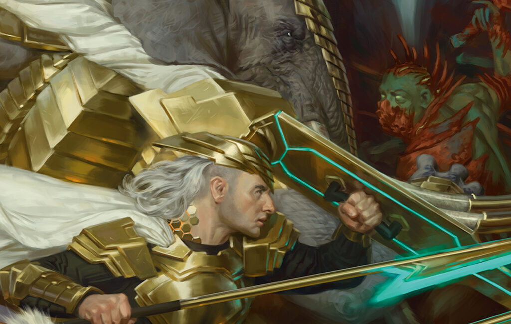
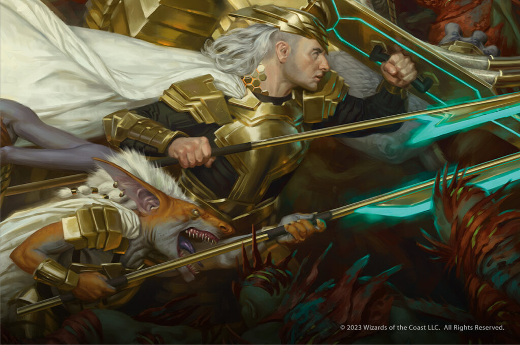
Lastly, I want to talk about another and less often discussed detail this piece has: restraint. It would've been tempting (for me at least) to light the whole thing in the blue glow of the weapons of the Mirrans, but I think it would've been a mistake. Jason had to be incredibly careful with color delineation here, and adding the blue lighting more than necessary would've made it all the more difficult and could rob the image of power. Instead the blue is just enough to put a capstone on the image.
Conclusion
Without a doubt I think this deserves to be called a masterpiece. If you'd like to support the artist, his inprint store is here. Additionally, I encourage you to read his own thoughts on the process of making this over on his Twitter. Between this and the teaser art so far, if this is what they show us before the set is even out, I can't wait to see what else they have in store for us to break down. And I'll see you all again to do just that, next time.