
Artful Breakdown: Hierarchy in March of the Machine

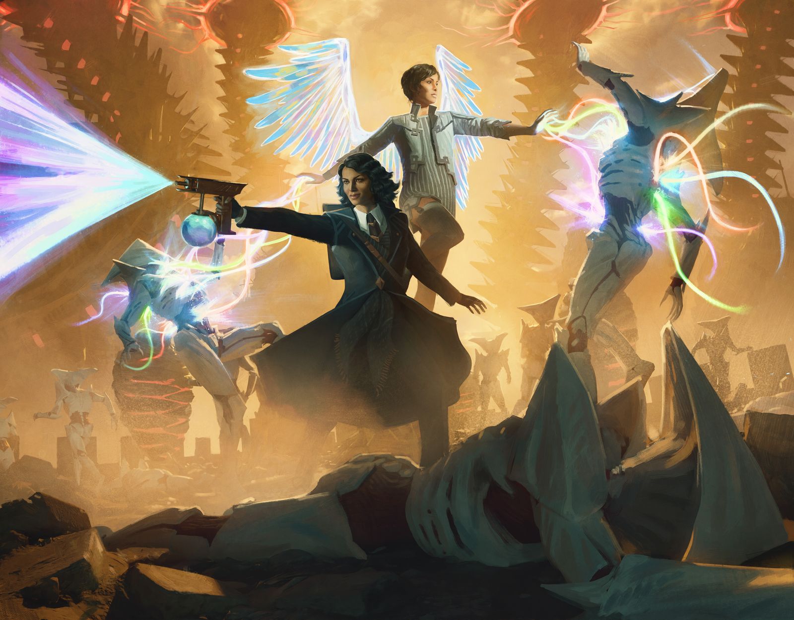
Errant and Giada | Illustrated by Cristi Balanescu
Welcome back to Artful Breakdown, the series that takes a look at the art of Magic: the Gathering cards and the strategies, tricks, techniques, and decisions that go into making it. I’m Aaron, a fantasy illustrator myself, and it’s my pleasure to be your guide through the interesting stuff you might miss at card size.
If you’re new here, each new set I like to go through the art and see what gems I want to discuss. Usually I only focus on a few cards per set and try to dive deep rather than doing an overview of my favorites or what I think the best pieces in the set are. That’s… not going to work this time.
Y’all, in my initial pass alone I found over 30 cards I wanted to talk about. That’s just a first pass! I had 4 pages of notes! This is precisely why I wanted to slow down this year and try to savor things. So if you don’t see something you love here, don’t worry: we’ll be looking at this stuff for awhile. I did notice a pattern, though. The pieces that grabbed me most demonstrated a strong grasp of something I haven’t talked about a lot here.
Hierarchy!
Errant and Giada, by Cristi Balanescu
In its simplest form, hierarchy is just what the artist wants you to pay attention to and in what order. Imagine a movie poster that wanted you to read things in a specific order. The designer might make some text larger or an important word a different color. Illustrators use similar tactics.
Errant and Giada, by Cristi Balanescu does this fantastically. He’s had some real banger art pieces in the game recently. This piece among them, featuring the pair fighting while surrounded. When a lot is going on, as in a battle or a war setting, hierarchy becomes imperative to ensure a viewer knows what’s happening. Balanescu uses several techniques to ensure that. One is layering a clear foreground, middle ground, and background. That layering established, the focus of the image is in the midground with the characters.
The next trick was being very deliberate in his rendering. The ladies, in tints and shades of blue, pop against a pale orange sky, the halo and streams of magic further adding contrast and color variety.
Their foes, meanwhile, literally blend into the scenery, including one in the foreground who’s almost indistinguishable from rubble in terms of color use and value. In certain places he doesn’t even render any more than necessary. It sells the idea of waves of enemies and avoids drawing focus to something you likely wouldn’t be able to see between card size and distance anyway.
Furtive Analyst, by Marcela Bolivar
Marvela Bolivar is new to the game, with only five pieces between this set and Phyrexia: All Will Be One, but if you look at her portfolio, she’s got a real sense of the gothic and eerie that make it evident why she was called in to paint Phyrexians. She brings that penchant for the unsettling to this little gem, and if you’ve read this column for a while, you’ll know I do tend to gravitate toward these smaller moment cards.
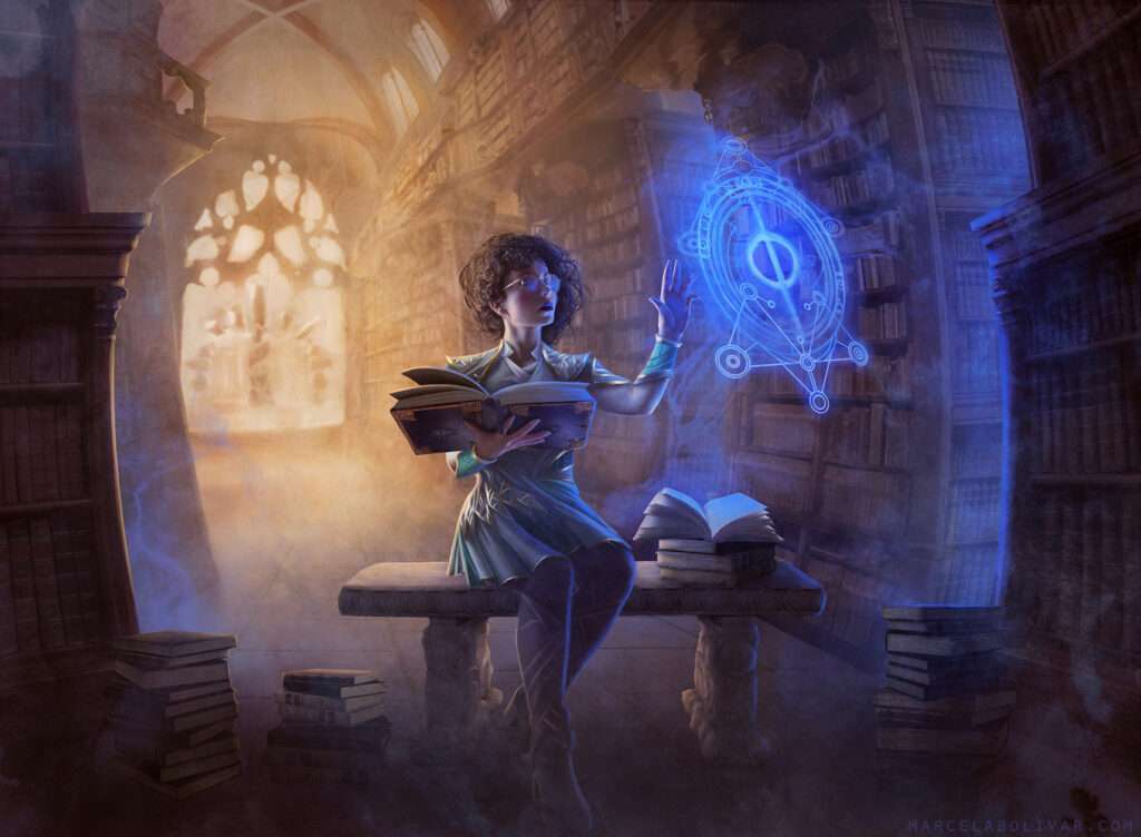
Cristi chose to use a combination of factors to really make clear the hierarchy of his image that relied on making Giada and Errant the biggest things in his piece. Bolivar opts instead for putting her most important element more in the foreground: the phyrexian symbol overtaking the analyst’s spell. It uses saturated colors to draw our eye as well as the contrasting colors of blue and orange again. The image itself almost fish eyes as we look around and notice the lessened detail moving toward the background, but here the background architecture twists into an odd skull like visage with possibly another phyrexian symbol hiding in the more gestural shapes out the window. Bolivar does a splendid job of bending the perspective and using the lines of the shelves to take our eye there but only after we know the most important bits.
Invasion of Regatha, by Daarken
Daarken is a veteran of the game’s art whose tenure stretches back to Future Sight! He’s done complex compositions plenty, but this kind of multi-figure piece is a rarity.
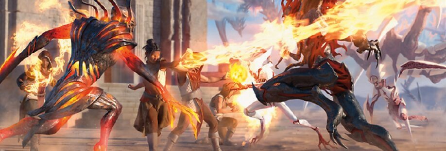
I’m going to do a whole article talking about my favorite battles and the storytelling opportunities they provide artists, but this felt like a prime moment to talk about how this battle specifically uses hierarchy to achieve its clarity. Daarken offsets the image a bit to start. More stuff, or visual weight, is on the left of the piece, and we begin by seeing the Phyrexians immediately. They’re darker in color and contrast than much of what’s around them, but they act more as blocking or framing in the composition. They aren’t the most important element in the image. Daarken chose instead to focus our attention on the fire wielded by the Regathan defenders.
Our eye is immediately drawn to this figure leading the charge, hand outstretched. Her body language shows her importance as well. We start with the threat of phyrexia and then look where the body language is most powerful and commanding of our attention. The bright flashes of fire clue us in to where we should look next, with a small explosion in the background to our right leading us to see the rest of the invasion horde. Though it is a bit frustrating there wasn’t a great way to take us back to the figure on the far left who seems to be lining up some impressive fire of their own.
Traumatic Revelation, by Cristi Balanescu
Lastly for this article is another Balanescu piece, and it hits hard.
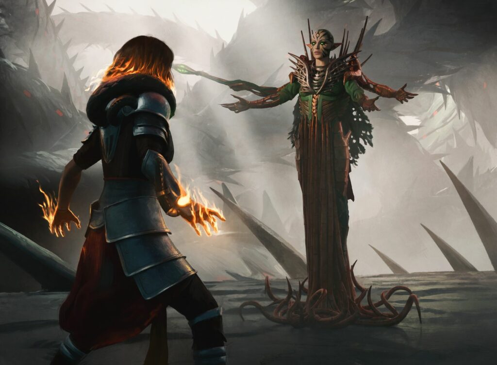
Situated on the left of the image we first see Chandra, relatively large in frame but seen from behind. From there we instinctively follow where her eye line would be along with the staff in one of Nissa’s arms to the elf herself. This is a useful little trick here. Chandra’s the place the artist wanted you to look first, but Nissa’s clear focal point. She’s the most important thing here. But if that’s true, why would Balanescu want Chandra to be seen first? If I had to guess, I’d say emotional payoff. This is a huge moment, and I think Balanescu wanted it to hit us as hard as it does the characters.
He used a few other tricks to make this work. For one thing, the background is pretty much entirely in grays. This has the effect of everything else fading away. There’s nothing to distract us from the interaction of this moment between the characters. Even the background fades to silhouettes quickly. The lighting also leaves Chandra in shadow, the color of her fire drawing our eyes in the dim glow before we get to the more natural light falling on Nissa and illuminating her face. That’s another thing Balanescu had to be mindful of in painting. Our eyes, as humans, are drawn to faces. It’s a simple technique but it has to be balanced in a piece like this. Otherwise we might overlook Chandra entirely.
And So We March On
There is so much good art in this set, folks, and for me, one of the best things about the game going on for so many years is that artists have had a long time to study what makes a Magic card work. The use of hierarchy in these images helps them be legible small and phenomenal when blown up. There are mountains to talk about with this set, some of it technical, some of it more esoteric, and I’m excited to share it with you all. I haven’t felt this fired up to talk about art in a while, and I hope you’ll come along with me.
Please let me know what your favorite arts are in the set and what cool stuff you’ve noticed! And stick around for next time when I’ll take a look at the storytelling opportunities and challenges in the new battle cards! I’ll see you in the next Artful Breakdown.

