Artful Breakdown: The Art of Battle
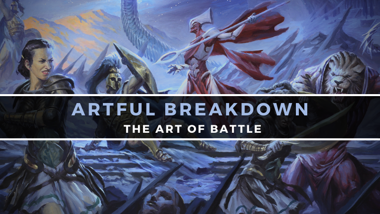
Invasion of Theros by Johan Grenier
Welcome back to Artful Breakdown, the series that takes a look at the art of Magic: the Gathering cards and the strategies, tricks, techniques, and decisions that go into making it. I’m Aaron, a fantasy illustrator myself, and I’m back to once again guide you through the coolness that might not always be visible at card size and discuss the behind-the-scenes stuff as best as I can see it from one artist’s perspective.
Last time I promised you a look at the newest card type on the block: battles! Battles offer a unique set of opportunities of challenges and artists working on Magic. I’m not going to be able to cover every single one, but the longer panoramic view changes the approach to composition and storytelling in unique ways, so let’s take a quick look at how just some of these tell the story of the biggest invasion the multiverse has ever seen.
Invasion of Gobakhan by Andreas Zafiratos
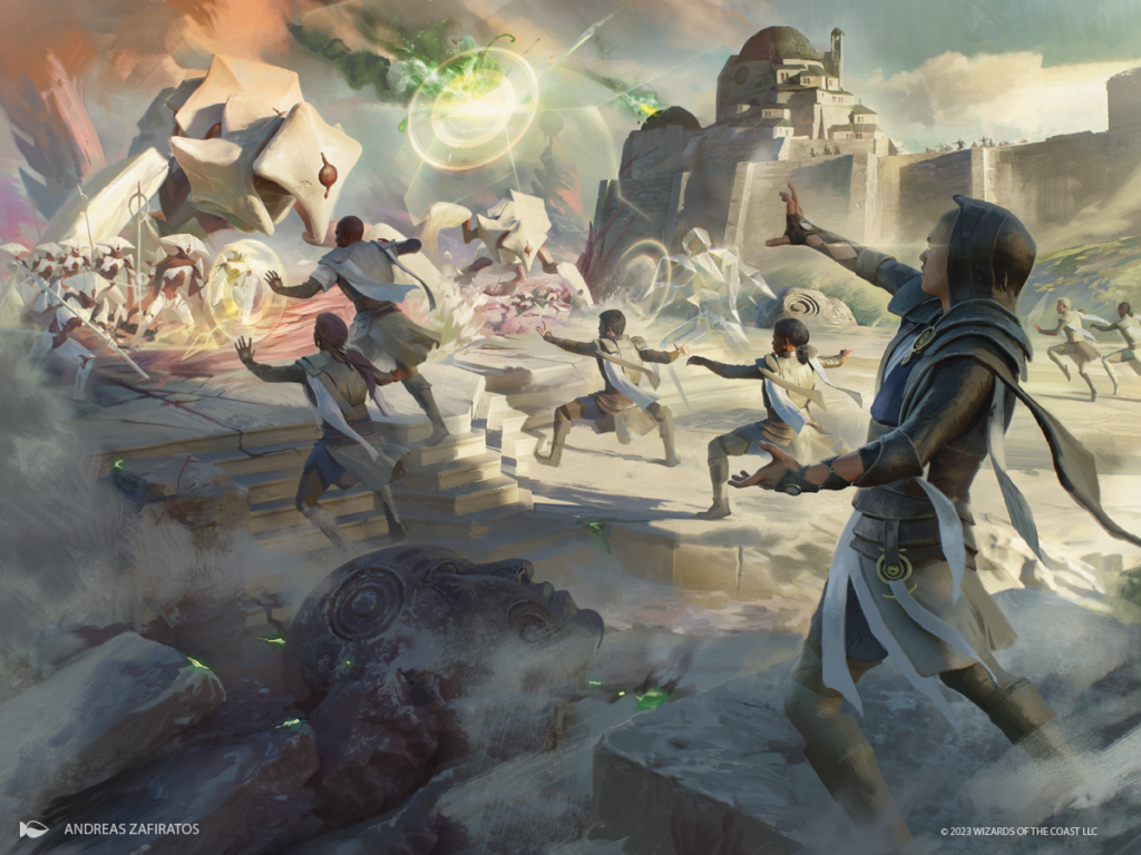
At just 27 cards painted, Andreas Zafiratos of Greece is relatively new to the game, and if you look at his portfolio, you can see a lot of growth in a short time. Here, he gives us a look at the shieldmages of Gobakhan, home plane of Teyo, the Shieldmage. We’re treated to a hectic scene immediately with the hordes of Phyrexians packed tightly on the left assailing the defenders on the right who are more spread out and clearly outnumbered. This helps sell the storytelling and emotion; it shows us the defenders at a clear disadvantage. It also sneakily solves the problem of big complicated pieces by giving empty space to allow the eye a chance to rest, what we call letting the image breathe. That’s facilitated by the different image ratio here. That wider space helps bring down some of the difficulty of creating that breathing space.
It also situates most of the action where things tend to get most complex: around the horizon line. Partially because that’s naturally where this kind of thing happens in compositions but it’s also a consideration of the battle card frame. The most important information needs to line up well. Additionally, the use of shadows and light plays a role. The darker foreground adds needed contrast with the lit spaces and helps keep things clear at card size. If you want even more information, check out this great interview here.
Invasion of Shandalar by Adam Paquette
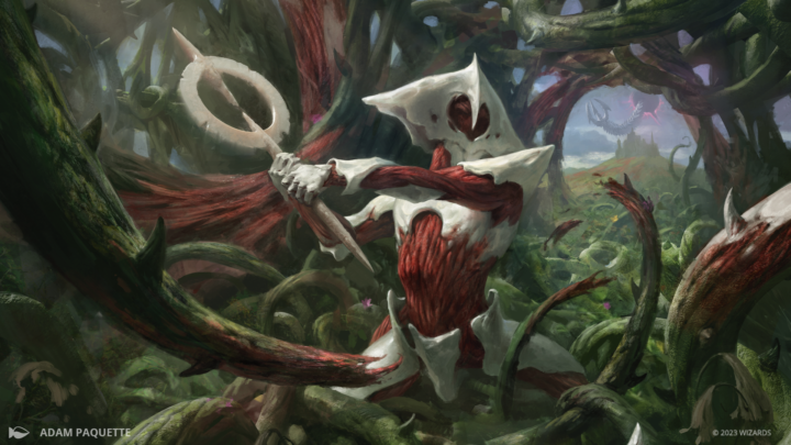
Battles provide a rare opportunity for Magic art: the chance to use setups and payoffs over two images. In Invasion of Shandalar, Adam Paquette demonstrates his strong landscape painting skills (a large number of the cards he’s done have been some great lands) and gets to flex his storytelling muscles.
He shows us a soldier of Elesh Norn’s army bogged down and notably alone in a hostile jungle environment, a situation that rarely goes well for the invaders, historically. Struggling, they hack through the undergrowth and attempt to corrupt it as the invasion tree looms in the far distance. Reds and greens work well together as complementary colors, adding a kind of tension to the piece as we see the red sinew and white porcelain of the soldier start to take over. But again, there’s that nagging fact they’re alone that puts the whole image in an awkward place narratively.
That’s all set-up.
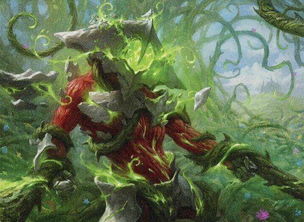
Once it flips we see the pay off. It shows us this Phyrexian was probably alone because the jungle got all their others. Now it’s gotten him too and the mood shifts. Before, it was centered on the character damaging the environment. The back shows us how the wild magic of Shandalar returns fire. We see verdant growth ripping this unnatural thing apart as green mana surges through it. This shift even extends to the background. Where once we saw the roiling gray sky and branches of Realmbreaker, we now see only clear and vibrant sky. A good use of simple before and after.
Invasion of Regatha by Daarken
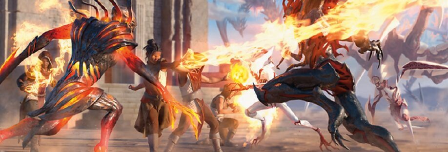
I talked a bit about this in my previous hierarchy article, so I won’t belabor it here, but I feel like Daarken’s battle makes good use of the wider window of battles to give us good indications of long-range combat and to show us a lot going on at once, but it also shows the challenges. Just like a real battle, it can be easy to lose sight of figures and miss interesting elements when there’s a lot going on in the frame. For example, in my first article I completely missed a whole figure.
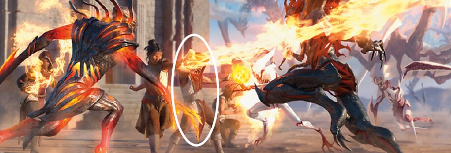
A good reminder that even a piece you think you understand is often worth a second look.
Additionally, much like the invasion of Gobakhan, the hectic front gives way to a more collected scene of teamwork. That seems to be a theme that plays out on a number of these Invasion cards. Also, just a cool little trick, the mages pooling their energy together “power of friendship style” to launch an attack works well here because we don’t need to question who they’re firing at. Thanks to the front, we know it’s the Phyrexians in a way that seeing either side individually might not register as quickly.
Invasion of Theros by Johan Grenier
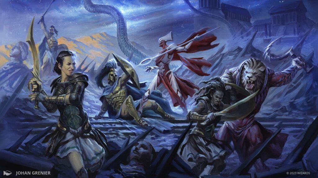
Please indulge me a moment as I leave my favorite for last. The Invasion of Theros is honestly kind of odd. The storytelling and posing feels very different from the pitched battle style arts, like Invasion of Fiora or Invasion of Ixalan and more. Things feel stiffer here, and the composition less dynamic. It makes good use of the wider frame to give us a very spread out battle with distinct and clear characters from each of the polises of Theros dueling a Phyrexian. They’re engaged in smaller battles and struggling. But it doesn’t have the same epic sweeping scope, even with the invasion tree in the background. I couldn’t figure out why the whole thing felt less like a battle illustration and more like a stage play. And I didn’t really understand at all what the figure in the back was doing.
The stage play similarity kept nagging me. Then it hit me. It feels like this battle card is emulating an older style of illustration! This kind of staging was actually very common in illustration at one time but hasn’t really been so since the days of Howard Pyle, who helped pioneer a more dynamic style of composition. It made me realize this could be an homage. If that’s the intention it would’ve been much harder to pull off without the wider field of view. And this kind of set-up just feels so deliberate the longer I look at it. This kind of choice leads me to finding this battle especially appealing. Of course, featuring my favorite of the Theros gods doesn’t hurt!
And historical homage could also explain the figure in the back. Greek plays often had some sort of divine figure come in and set things right at the end. It’s the original “Deus ex Machina.” I think the figure raising their weapon in triumph in the background is attempting to call on divine assistance. And of course, on Theros, someone might just answer!
And on the back we see just that with Ephara, Ever-Sheltering battling the threat of Phyrexia throughout the night in a very dynamic shot to contrast the set up on the front side while the colors tie the images as if they’re both happening at the same time in place.
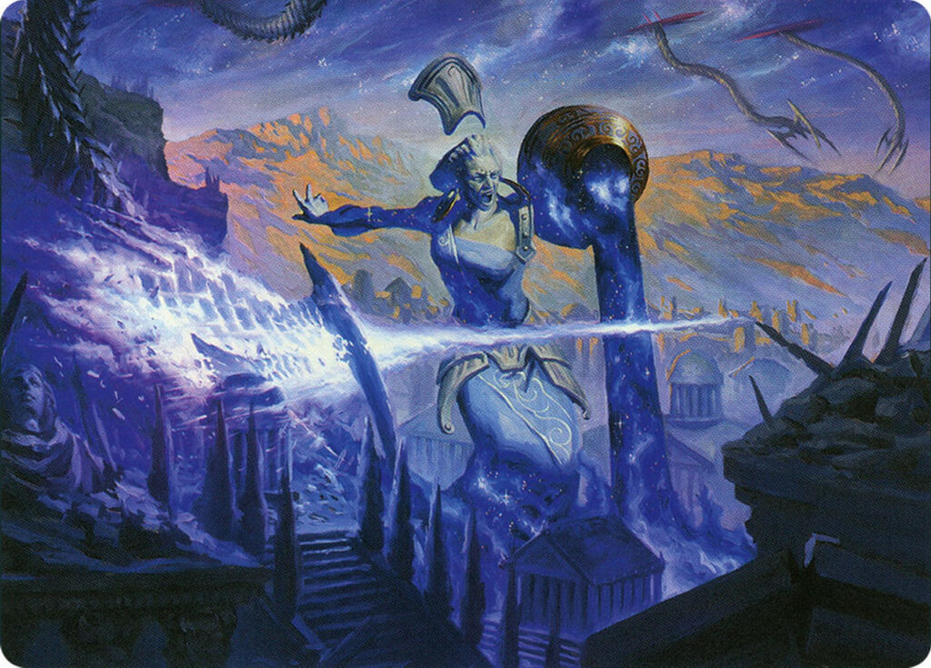
In both cases but especially the front, the larger space lets the artist lean into expressions on the characters. We see the struggles in the individual duels. Then it feels even more powerful when it flips and we see the god of civilization throwing down just as fiercely.
The Battle is Over, but the War Continues
New card types don’t come to Magic often. Much like planeswalkers, battles present artists and art directors with new tools to use to tell the game’s stories. They’re a great for sweeping epic confrontations in ways the standard frame isn’t. Plus, being double-faced lets artists have more room to tell the story.
Let me know what your favorite battles are in the set and what planes you love. Also, I’d love to hear your own analysis and what you noticed works differently with these than other kinds of Magic art. If you’d like to see more of the things I do regarding writing, art analysis, and my art in general you can find me out in the world at @aaron_radney on Twitter and if you’d like to see more of my own work drop by on patreon. That’s all for now and I’ll see you in the next Artful Breakdown!