
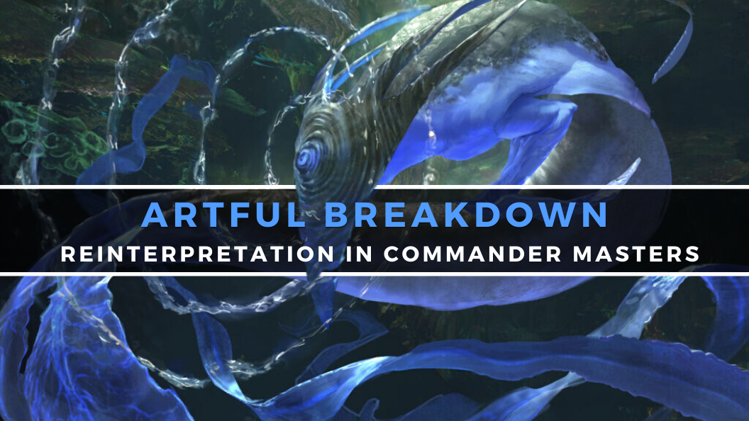
Artful Breakdown: Reinterpretation in Commander Masters

Welcome back to Artful Breakdown, the series that takes a look at the art of Magic: the Gathering cards and the strategies, tricks, techniques, and decisions that go into making it. I’m Aaron, a fantasy illustrator myself, and it’s my pleasure to be your guide to looking at the interesting stuff you might miss at card size.
If you’re new here, when interesting art comes out I like to go through a set and take a deep dive on a few pieces I find exceptional in order to talk about what makes them so and why they work.
I took some time off recently, but I’m back and thrilled to talk about some Commander Masters art. You’d think there wouldn’t be much to discuss in a reprint set, but they provide an interesting opportunity when reprints come in with new art.
The Power of Reinterpretation
One of the best things about reprints from an art perspective is how they allow us to see the spells we’ve come to know and love in a new light. Artists can see what’s been done previously and rather than making something from scratch, can respond to what’s been done before, either clarifying old ideas or providing fresh new ones to explore how the same spell may work on different worlds in the multiverse.
I want to head one thing off before we dive in: when I make comparisons here, those aren’t value judgments on the previous art; I’m merely acknowledging some of the interesting differences in decision-making. With that out of the way, let’s get into it!
Flawless Maneuver by Warren Mahy
Flawless Maneuver is certainly that from Mahy here. They take fantastic advantage of the framebreak treatment to create a sweeping composition built entirely around the line of the shield magic. The shield leads our eye from the fire it blocks up to Teysa’s finger, then from there to her face with the body language just oozing effortless skill and contempt.
It really sells the ease of Teysa’s spellcasting. I’ve talked before about how illustrators usually use the moment before or just after something happens to heighten storytelling. In western visual storytelling we don’t often use this sort of en media res type of depiction. It can sometimes rob a moment of power and impact (there are ways around this of course), but here it’s exactly the right mood and energy. It’s a fantastic reenvisioning of the original that took place on Ikoria. I struggle to imagine what those soldier’s swords would do against kaiju-sized behemoths.
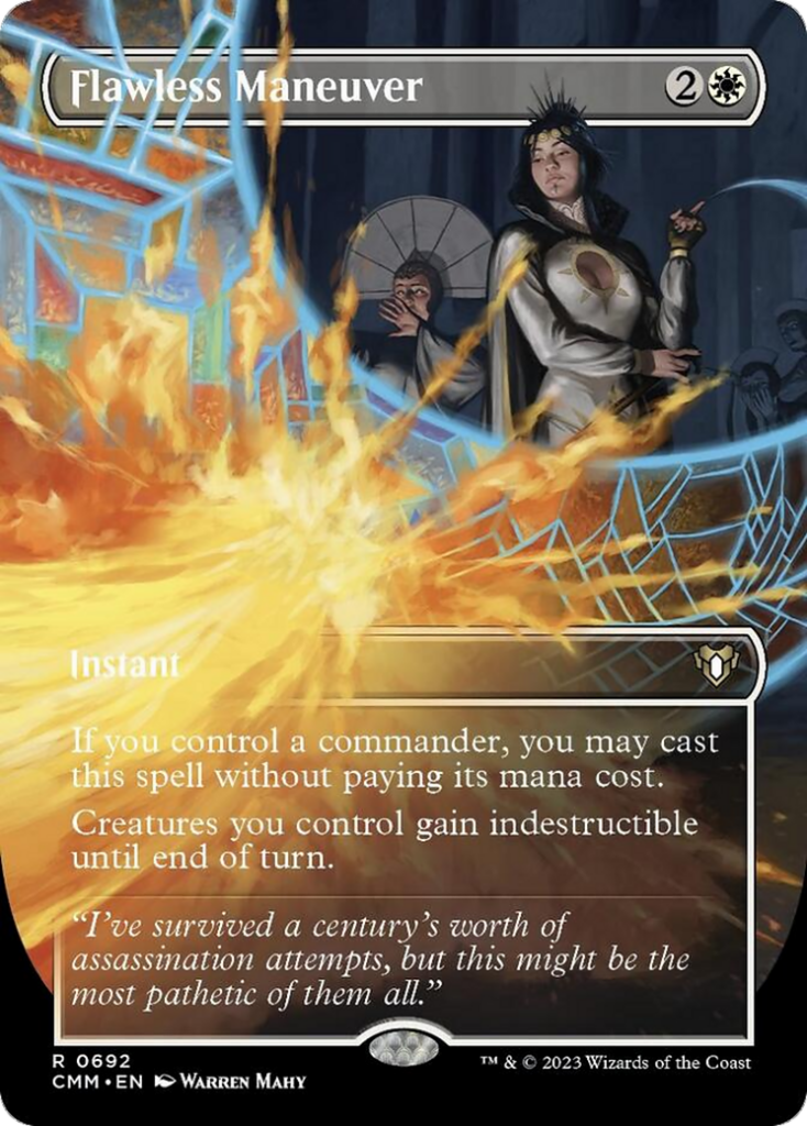
Diffusion Sliver by Campbell White
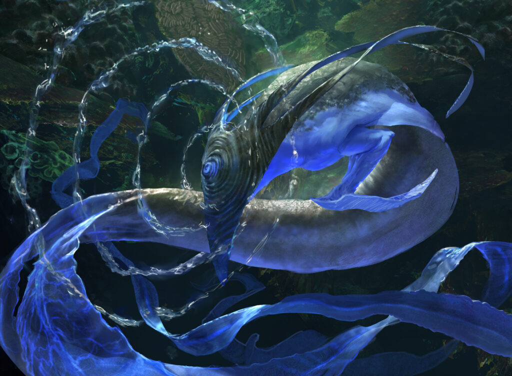
The original Diffusion Sliver was from that core set where the Slivers took on a different, more humanoid appearance. I don’t remember the exact reaction from the player base at the time, but I remember being both a bit confused and deeply curious.
WotC seemed to want to avoid those questions all together and keep the precon Slivers uniform with their classic design. This does two things really well. One, it hammers home the hivemind/brood elements of Slivers by keeping their physicality uniform for new players. Two, for older ones it also emphasizes the fact that Slivers can and will end up different on a bunch of planes.
The artist, Campbell White, is both skilled and prolific, two things that make an artist in high demand. Seriously, they’ve got around 100 cards to their name, and their first card came out in Theros Beyond Death. That’s just three years ago! Plus they brought their A game here, so much so I like this better than some of his other pieces, which can be a bit dark to see well at times. The design and rendering are striking, with the long sinuous body leading our eye along the curves and making our eye want to follow it. The whole thing feels like an image out of a nature documentary, and you can almost forget for a moment just how deadly these things are supposed to be in lore.
The sonar waves rippling the water creating this pattern is a great choice as well. It funnels us to a focal point and makes clear we’re underwater without a lot of extraneous rendering or detail that would take attention away from the creature.
Mikaeus the Unhallowed by Benjamin Ee
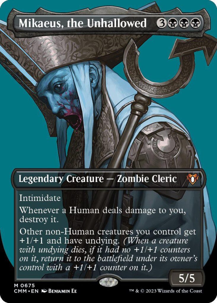
The profile showcase series is new, interesting, and something I’m still sorting out my feelings about. I’ve seen a few artists talk about the special challenges that come with it that they enjoyed, and Donny Caltrider over on his Mirror Gallery is thrilled about it (hilariously, he’s less enamored with the frame breaks, which I actually like a lot) but this Mikaeus is… haunting!
It takes advantage of the close up to make the fallen Lunarch more unsettling. The original feels very distant yet still imposing. This feels somehow more dangerous due to clarity, like we just bumped into him while running away and now he’s slowly turning his gaze toward us. The glassy eye and the gaping, bloodspattered mouth just sells the whole Zombie vibe incredibly well. I especially enjoy the painting technique here which feels like a kind of rendered comic book style, for lack of a better description.
And the teal background provides a wonderful sense of eeriness because of how the color plays with the washed out blues of the portrait. It also just feels both cold and wonderfully tragic. Ee only has a few cards in the game and almost exclusively seems focused on specialty showcase arts, which they’re good at, and the fact these are so different from even the other ones they’ve done makes me excited to see what we get next.
Elvish Mystic by Greg Staples
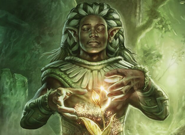
I’m furious I couldn’t find a full art of this rather than just the crop. Even so, Staples brings his traditional art sensibilities to a piece that feels much more mystical than the classic version of the card and leans much more into the druidic aspects of the mana dork.
Staples is a veteran of the game, with a great handle on his materials. It comes through especially in the skillful use of color. The greens of the piece highlight the dark skin and the subtle variations in tone amazingly well. It helps keep a strong feeling of warmth in the image.
If I can one day match this kind of subtle control in my own work I’ll be happy.
Path of Ancestry by Mark Poole
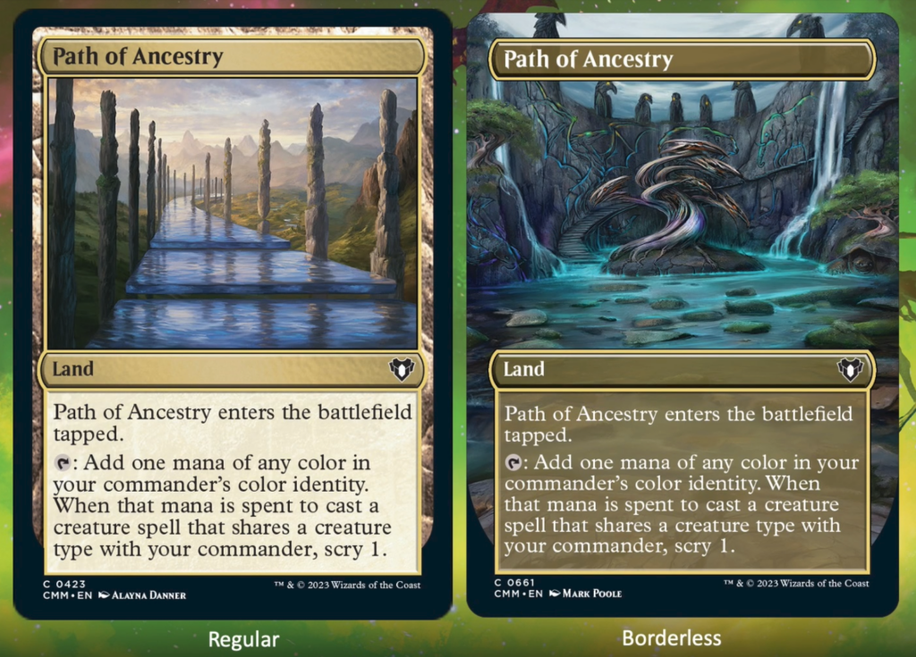
We’ll close out this one with the new Path of Ancestry. Honestly, it’s hard to get more veteran than the person who literally painted Ancestral Recall.
The original actually feels just like a really solid landscape image. It makes me ask “why” is this called the “path of ancestry.” That in and of itself can be good storytelling. This one I get a bit more of that sense with the carvings and the statues. The stairs themselves feel like they may be the path. Or that this place is the end point of a sacred trail with the carvings representing the work of those who came before.
Conclusion
One of my favorite recent articles I’ve written was a dive into the various arts of Blood Artist. There I talked about how the treatments and interpretations affect the mood and storytelling of the card. There are a host of other cards you can do that with, and Masters sets play in that same space, especially now with all these unique treatments. It’s always fun to see how different artists interpret the same subject matter through their own idiosyncrasies.
Additionally, the freedom that comes from not being tied to a single specific plane provides lots of open space for artists and art directors to find creative ways to show off new ideas, yet even as Magic explores these new avenues for depiction, it’s great to see things that still fit nicely into the overall look and feel of the game not going away. In fact, things like the frame breaks really make it feel like WoTC is embracing elements from the card-altering community in ways they never would have in the past, and of course, I’m not going to ever be mad about more artists getting to explore their take on Magic cards.
That’s all for this article, but I’m not done with Commander Masters yet. While the reprints are definitely cool, there’s some new cards that caught my eye as well, so we’ll tackle that next time. If you’ve got pieces you love or just want to talk about art in general, you can find me on Twitter (I refuse to call it X). Or if you like, you can help support my own artistic endeavors over on Patreon. You can also find me on Bluesky now which I’m enjoying more than a fair bit.
That’s it for now so take care of yourselves out there, and I’ll see you in the next Artful Breakdown.

