
Artful Breakdown: Hidden Gems of 2022

Welcome back once more to Artful Breakdown, where I examine the art of Magic: the Gathering sets to show you the interesting tricks and techniques that go into the visuals of this phenomenal game. I’m Aaron, a fantasy illustrator and a huge fan of the game’s art and artists. With this packed year in Magic winding down, I wanted to take a quick run through a few overlooked gems.
Reanimate by Nils Hamm
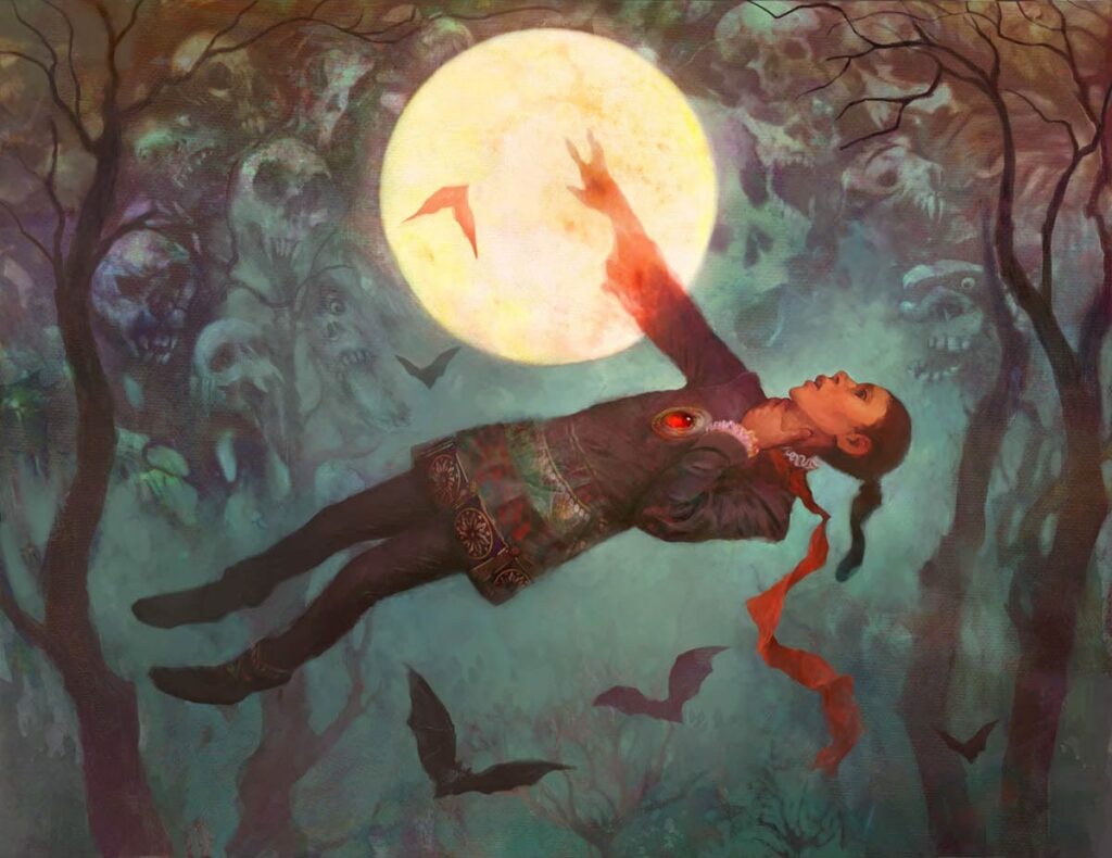
Nils Hamm is a prolific painter with over 200 pieces in the game. That’s including iconic faves like Baleful Strix, Grave Titan, and Delver of Secrets, to name a few. He began working with WoTC for a now defunct horror game, and it’s not at all hard to see why he was picked for it. The use of oil and digital in his pieces gives a good balance of control and tactile grit to his illustrations. There’s a strong sense of the macabre in Hamm’s paintings, as well as a sort of Grimm’s fairy tales creepiness. That dark storybook vibe is incredibly strong in this art, and he even uses the texture to hide little skulls within the background.
Careful Cultivation by A. M. Sartor
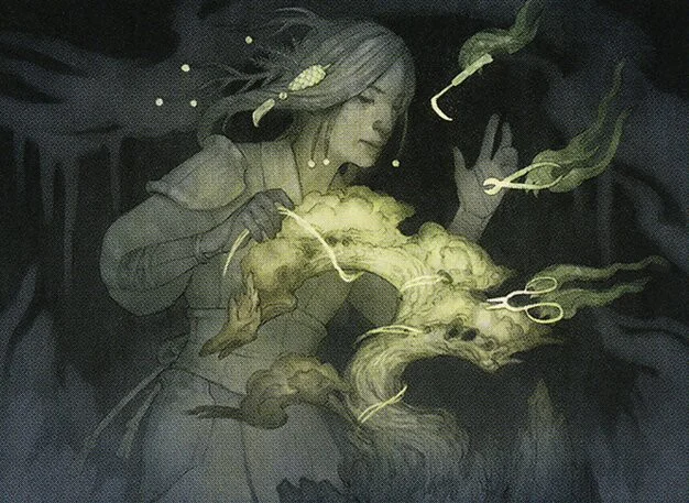
On to Kamigawa: Neon Dynasty. A. M. Sartor’s work has captivated me this year even if it’s only 5 pieces. Like Hamm, she clearly draws inspiration from fairy tales but adds in influences from modern children’s books and her home in the Pacific Northwest. Her style limits color, emulating the gray of a world on an overcast day. It also leans heavily on what seems to be watercolor, ink, and line. By leaning so heavily on subdued colors to create a washed-out look, Sartor heightens our attention when she uses spots of color; in this case, the tree and clippers. It mirrors the character’s attention to detail here. The image feels aligned with the kind of watercolor storybook work Arthur Rackham was doing in the early 1900s. A major contrast from the fantasy tech world of the rest of the set. Art like Sartor’s adds tension and texture to Kamigawa’s cyberpunk setting.
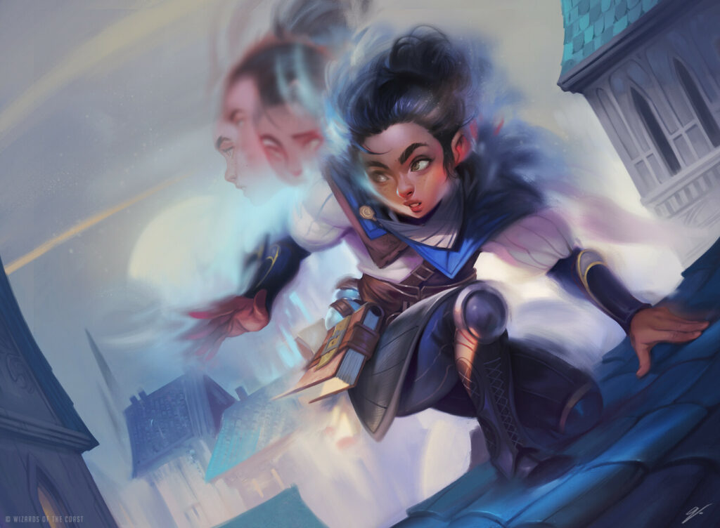
Brokers Ascendancy (Golden Age Variant) by Shawn Pagels
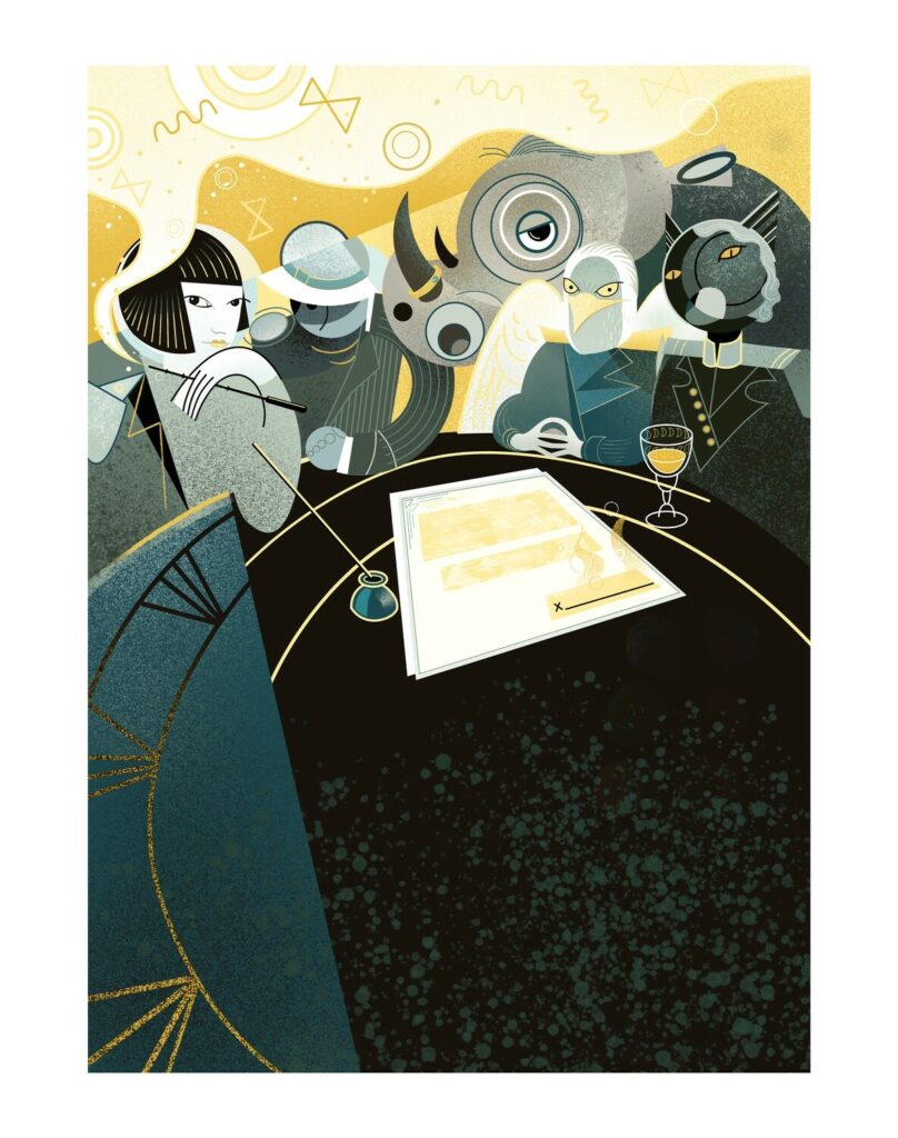
Streets of New Capenna was the set that began this column, and while I was fixated on the strong fundamentals of the cards I talked about at that time (see the article here), they were far from the only great pieces. Brokers Ascendancy was one of the first cards spoiled for Streets of New Capenna. The 1920s Art Deco designs were a huge departure from most Magic: the Gathering art. Shawn Pagels is well versed in combining multiple art movements, such as cubism and expressionism, popular in the 1910s and 20s, with modern pop-culture into imaginative and fascinating scenes. It’s uncanny how perfectly his work suits what WoTC was trying here. The art director who found him deserves a raise. The artist was kind enough to discuss his influences for the piece with me on Twitter as well near the start of the year.
The Art Deco designs definitely helped give Streets of New Capenna a distinct identity, both visually and thematically. There is a feeling of both progress and danger to the whole set, and these helped marry the set to a time, place, and aesthetic. While cards like Dapper Shieldmate and Night Clubber in their comparatively modern looks and weapons were definitely a departure from the norm, the beauty of cards like this and the Art Deco lands help make the space feel like a welcome bit of seasoning rather than something that clashed with the overall dish.
Blur by Dave Greco
We return to more classic fantasy with Battle for Baldur’s Gate, and Dave Greco’s art here manages to do one of the hardest things I think you can do in single image illustration: convey movement. It’s one of the limitations of Magic card art that you only get one scene to convey everything. Dave breaks out an old comics artist trick here and shows us multiple sorts of “frames” in one. I love how he’s played with focus here, starting with a low opacity but still crisp image of the character’s profile sliding into a more unfocused one that’s also in profile before repeating the pattern by giving us another unfocused image of the character in the same view that she ends in. Our brain fills in the rest. The controlled distortions and small bits of sparkle you can see around the edges of the character help convey this isn’t just fast movement. It helps show it’s both fast and magical.
Thousand-Year Storm by Donato Giancola
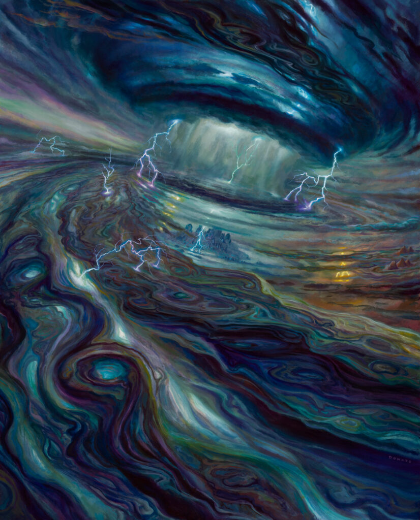
A veteran of the game’s art from back to Mirage, Donato’s work has evolved in fascinating directions. His early work is beautifully rendered and almost hyperrealistic, including a frankly stupendous mastery of hands. Around Darksteel, though, you can see his propensity for well-rendered metal start to really take off, but as time has gone on, you begin to see a sort of loosening of his style. His pieces become no less rich and vibrant but in some ways more expressive; less concerned with rendering and instead become more centered on emotion and communication.
In Thousand-Year Storm, we see a merging of all of that. All of that time, experience, and mastery come together in an incredible piece. Unshackled from having to ground the Storm on Ravnica, Giancola gives us something that feels otherworldly! It looks as though it’s made of quicksilver clouds roiling and crackling with lightning and untamed energy. Chaos is a hard thing to convey in art. Our brains naturally seek out patterns and desire to make sense of them, so rather than depict it through doomed attempts at randomness, Giancola leveraged his strengths and blended his fastidious rendering from the early days with his more expressive brushwork now and his mastery of the medium of oil to get a piece that achieves the feeling of immense power and chaos by zooming out, allowing us to let our brains find the pattern in roiling wildness.
Impulse by Sam Guay
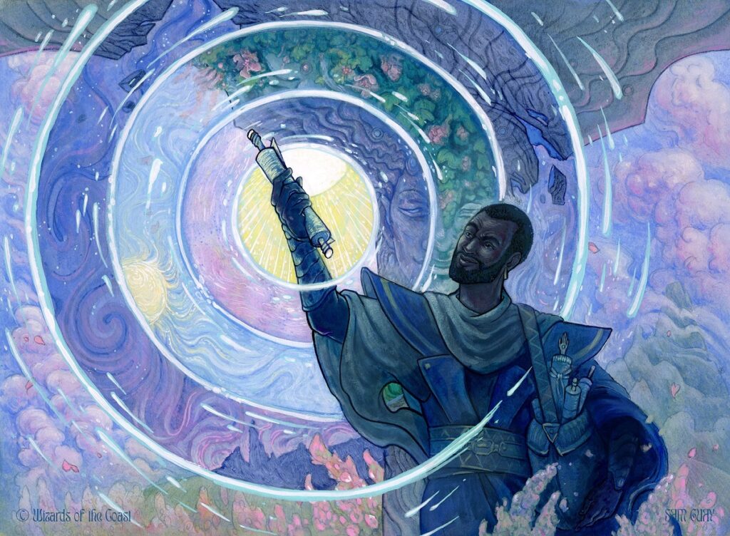
Revisiting Dominaria United made me realize I hadn’t talked about Sam Guay yet and that felt like a crime! If you’re not paying attention, you’d be forgiven for thinking that this was a relative of the inimitable Rebecca Guay. Not quite. There’s no blood relation, but Sam credits their mentorship with Rebecca to helping get them to where they are. You can definitely see the stamp of the elder Guay’s work on the younger, but where Sam differentiates from their mentor primarily is in the use of color. Sam’s treatment of color is much bolder and less restrained while retaining the same interesting stylizations and whimsy. They only have 10 cards right now, but I can’t wait to see more. The game can definitely use someone to carry on the torch of this kind of abstraction.
Launch Mishap by Kim Sokol
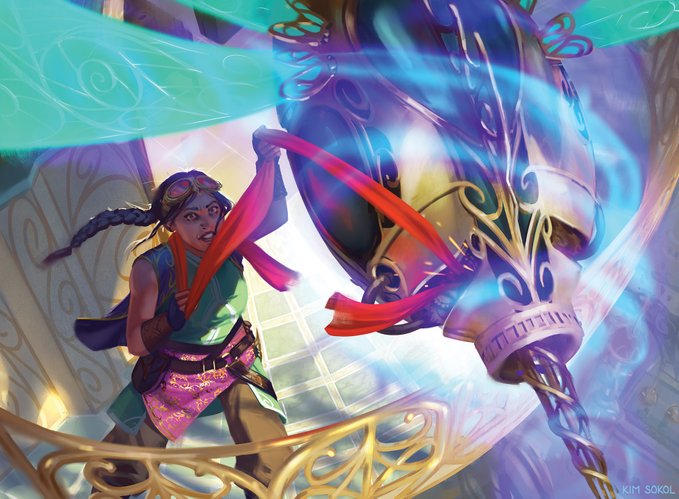
Since The Brothers’ War is so recent, let’s skip straight to Jumpstart 2022. Kim has 24 pieces so far, but my goodness, are they splendid. She has a tremendous skill with body language that I love. From the indulgent glee of Voldaren Bloodcaster to the hunched-over intensity of Candlekeep Sage, Kim captures a lot of character nuance in something as basic as the tilt of a character’s shoulders.
On Twitter they noted that this was a rush job, but I honestly couldn’t tell. Jumpstart has a more jokey tone than some other sets. The caught scarf on the Thopter is a good example, and while the Thopter is the focal point, we can also see, in shadow, the expression of fear on the artificer’s face telling us of her concerns (both for her scarf and the creation itself). At card size, it’s a hard detail to see, but Kim added it anyway and it adds an extra layer of storytelling to the image.
The Curtain Closes
And with that this year in Magic comes to a close. Years ago I remember grumbling in the Magic space about how similar all of Magic‘s art looked. Well, if there’s one thing I think really defined this year it was a willingness to take artistic risks. Magic did a host of things outside of its norm with different treatments, Secret Lairs, and crossovers. The art of Magic is probably more varied than it’s ever been. The Brothers’ War even managed to retroactively make me feel like the Warhammer crossover wasn’t out of the realm of workable.
When I started this column, I hoped it would help others appreciate the skill that goes into the game’s art. The mechanics are fun, but I really believe it’s the art and flavor that keeps us coming back. The illustrators who bring our favorite worlds to life are a big part of that. They often go unappreciated. That’s felt especially true at times this year. Artists have been faced with numerous instances of theft of our work, insults, harassment, and more this year. From crypto scams to the current trend of text-to-image generators trained on the work of some of our favorite artists without their consent that may threaten the future of this field in an ugly form of theft, it’s been rough.
I can’t predict what that future looks like, but I hope that this column helps you see and appreciate the human effort, skill, and thought that goes into each piece. Hopefully, it reminds you there’s a living, breathing craftsperson behind each and every image you see, and if you like their work, let them know. They could probably use the self-esteem boost right now.
As we prepare for or continue our way through the bevvy of winter holidays and celebrations, I hope you’ll all stay safe. Keep your loved ones on your minds, and again, let me know your favorite art for this year in the comments.
I’ll see you in the new year in New Phyrexia on the next Artful Breakdown.

