
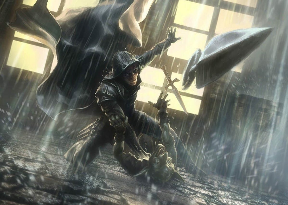
Artful Breakdown-Streets of New Capenna

|
To Be An Artist is to Believe In Life
-Henry Moore
Hey, folks, it’s nice to meet you. I’m Aaron, a fantasy illustrator, cartographer, worldbuilder, and aspiring Magic artist who you may or may not have seen around the online communities for those things as well as occasional guest on Commander streams. I love art and storytelling, and with New Capenna being chock full of fantastic Art-Deco-inspired designs, the folks at the Commander’s Herald brought me on board to talk about some of it.
I’m here to go through some of the New Capenna cards and give you the breakdown of why they work!
The Cards
These are the cards I want to break down today. What’s amazing about these to me is the artists are telling three very different stories, but they’re all using the exact same techniques in slightly different ways. Don’t believe me? Then read on.
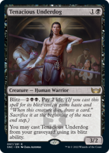
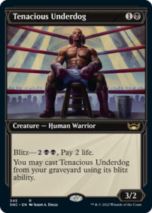
Tenacious Underdog
Let’s start by talking about composition. In art that just means how the stuff in an image is arranged. All three of these are what’s known as a centered composition, for obvious reasons. The art on both versions of this card emphasize this by using the boxing ring ropes as leading lines to draw us directly to where they want our focus (focal point). They both further emphasize this by making the spots around their heads the brightest point in the image in a technique sometimes called framing or flagging, building a halo effect on top of everything else. There’s no question of where we’re supposed to concentrate.
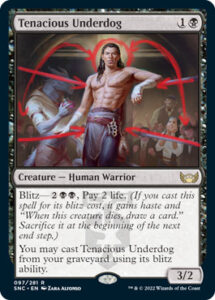
A problem with centered compositions is that it can be dull if done poorly. We’ve all seen young artists who haven’t quite figured out backgrounds that have this problem. Both pieces solve this with arching lines.
These contrast the straight lines that are otherwise dominant and help our eye move around to investigate everything. That’s what leads us into the fun storytelling elements. In the main set art, we can see the dreamy-eyed spectator (bottom-right). The artist did this as an homage to their teacher, who painted cards like Enthralling Victor, and it’s a neat element that tells us we’re supposed to find this piece just a little alluring. Both arts also play with this idea, as the showcase art has a… let’s call it interesting choice of where to put the horizon line in the image (what’s also known as the eye line), and both images speak to something of the rugged, dangerous charm of mob movies and glamour.
Then there’s the character design and body language. The main set art’s fighter has seen action with those battle scars, brass knuckles, and a boxing glove on their hip. That and the wrapped hands tell us this isn’t a mob hit or a high class prize fight. It’s something in the middle, perfect for a Riveteer card.
The alt art is telling a different story. The figure’s body language is less cocky and his outfit says big prize fight where he’s trying to go the distance. The first is confident and may be getting some assistance from the Viashino with the potion on the side. The second is weighed down by the fight but knows that they have to keep going. You can see it in the way the audience is depicted, too. They’re indistinct and impersonal and there’s so much more of the picture above the figure than below. It makes us feel like the weight of the picture is pressing down on what we’re seeing and creates a feeling of exhaustion.
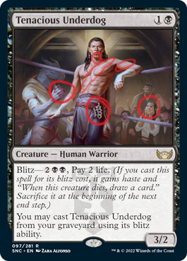
That’s further reinforced by those same horizontal lines in both images. You see them above the fighter in the main set art and in the ropes and shoulders of the character in the alternate. When read with the body language they speak differently; horizontal lines in art usually defuse tension. In the first image they say, “The character isn’t in danger.” In the second they say, “This character is tired.”
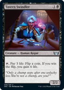
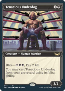
Tavern Swindler
Now check out Tavern Swindler. She’s using almost the exact same tricks, just subtler (how appropriate).
Before, the leading lines were obvious boxing ropes. Here, they’re the fingers and arms of the foreground character and the wood paneling. The composition is still centered and locks us in by focusing our attention toward the main character’s face, but it puts us in the action by centering our “camera” behind the eyes of a character. That immediately puts us off balance. Why? Because this character is being swindled. They’re off balance, and we need to be too. To that end, there’re almost no true horizontals in this image. Those defuse tension. Instead, the image is full of verticals because those ramp it up.
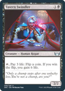
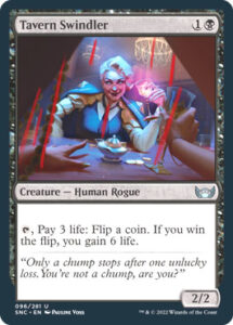
Also, the picture is on a tilt. That’s called a Dutch angle in film, and it’s usually used to create a feeling that things are not right or are off-kilter, perfect for a shot where someone’s being bamboozled.
There’s one last subtle thing about this piece. The art here uses what’s often dubbed bi-lighting: a combination of pink, blue, and violet that often evokes the ethereal or otherworldly, and it’s a great way to subtly hint that magic may in fact be being used here and remind us even in a very modern seeming set this is still Magic: the Gathering!
There’s so much more that you could dig into with these pieces, but that’s more than enough for now. The people that create the images for this game are amazing at their craft and put an incredible amount of thought and consideration into what they do. Art isn’t an easy job regardless of what some will tell you and if this gave you a little better insight into all that goes into it please let me know in the comments.
If you liked this please let the folks at Commander’s Herald know and I may be back to provide you with more Artful Breakdowns.

