Artful Breakdown: Wilds of Eldraine
Welcome back to Artful Breakdown, the series that takes a look at the art of Magic: The Gathering cards and the strategies, tricks, techniques, and decisions that go into making it. I’m Aaron, a fantasy illustrator myself, and it’s my pleasure to be your guide to looking at the interesting stuff you might miss at card size.
If you’re new here, when interesting art comes out I like to go through a set and take a deep dive on a select few pieces I find exceptional in order to talk about what makes them so and why they work.
Into the Woods
I’m incredibly excited to be returning to Eldraine. A bit of a personal story here: my first plane when I started really playing Magic was Lorwyn/Shadowmoor, another world that drew from classic fairy tales for its inspirations, and it’s great to get another bite at the apple of its spiritual cousin in Eldraine, but, as usual lately, we run into a problem: when I’m enamored with a set, it makes it hard to pick just a few pieces to talk about. With that in mind, I’m going to focus on how I feel certain cards best play into some of the themes of Wilds of Eldraine as I see them.
Virtue of Knowledge by Josu Hernaiz
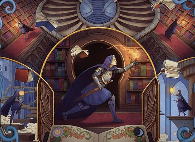
One of the major themes of Eldraine is stories and adventure, and what better way to kick that off than with a storybook adventure in a library. I’m glad Josu Hernaiz got a chance to do some more of these alternate art storybook treatments like he did the first time around here. It really feels like he’s quite comfortable using both a more industry standard fantasy style and this storybook approach. That’s a thing I don’t see talked about enough. Lots of people discuss an artist’s style but rarely acknowledge that it’s more than possible for illustrators to have several.
Here, that second style gives a great “choose your own adventure” vibe to the whole image, which I think is fitting. The composition even rewards you for trying different pathways and seeing where things connect as well as how. It’s easy to read left-to-right as we typically do, but the central image also gives incentive to start where the character is largest and branch out from there, encouraging us to read the story before us in several different ways through the use of the vignettes. You can even read it as the knight being lost in the library and the story.
Picklock Prankster by Iris Compiet
In case you’re wondering if I read the comments, one of the first things someone asked in my last article was basically;
“Are you going to talk about Iris Compiet?”
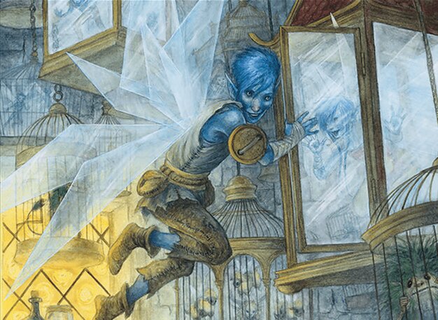
Oh, if only they knew how long I’d been waiting to! Iris is a fantastic illustrator who’s relatively new to the game and one of the first people I think of when I envision watercolor work. She’s a traditional artist that blends watercolor, gouache, and colored pencil. She’s a perfect pick for the set. Her focus on fairy creatures and the combination of darkness and whimsy that comes with them add sensitivity and groundednss to the characters of the wilds.
My favorite bit about this is that I thought I saw a direct influence in Iris’s work that actually turned out to be inaccurate. I thought I specifically saw a lot of influence from Tony DiTerlizzi, who’s an artist I know best from his “Arthur Spiderwick Chronicles” illustrations. Though fairytales and folklore have always been a huge inspiration for her, Iris’s work draws on a bunch of different sources, and she doesn’t credit DiTerlizzi as an inspiration all that much. In a way, that’s even more wonderful because it’s an example of a kind of artistic convergent evolution, and it’s a testament to her own originality and ability to synthesize all her influences into her own unique look.
Regardless, Compiet is certainly in her element here, and you can almost feel the joy in her favorite subject matter with how she treats these fairy tale characters.
Sneak Attack by Shafer Brown
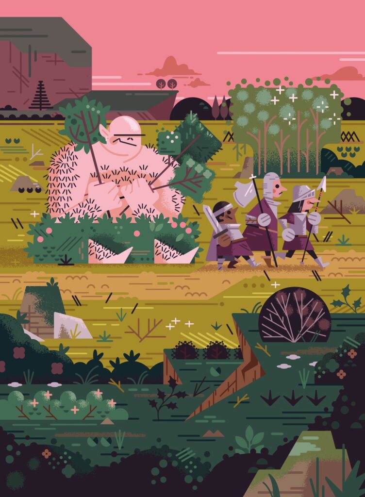
I can’t talk about Eldraine and the kind of twisted fairy tale set up it has without also talking about the whimsical element at play here. Red is very good at that, and Shafer Brown’s style does a great job of playing in that space. The flat illustration style, reminiscent of paper doll cutouts, hammers home that childlike element of the stories being told. At the same time, it reminds us this set isn’t inspired by Disney but by the Grimm Brothers’ tales, and so they have a kind of darker edge to them. That contrast is important to making the card work.
Yes, it’s very comical that the ogre is hiding poorly and barely understands the concept of an ambush. Those knights are still about to have a VERY bad day. Fairy tales were meant to entertain kids and teach important lessons in a safe environment. This captures the humor you need for that kind of thing well.
Beluna Grandsquall by Victor Adame Minguez
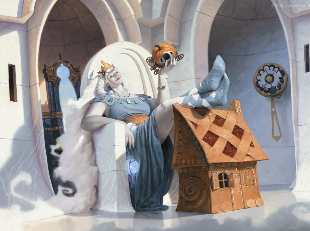
From fairy tale stylization to the other side of Eldraine’s spectrum in magical realism. In my opinion, Beluna is a great rendering from arguably the strongest technical painter on Magic‘s current roster. This piece gives us an Eldraine giant in all her glory and conveys so much power and mercurial personality, and all through body language and environment. The stark white background makes Beluna stand out all the more, and the whole piece feels, like its subject, breezy and unconcerned.
It also uses callbacks to the previous set to tie it into the world and give us insight into Beluna’s nature as a collector.
Eriette of the Charmed Apple by Magali Villeneuve
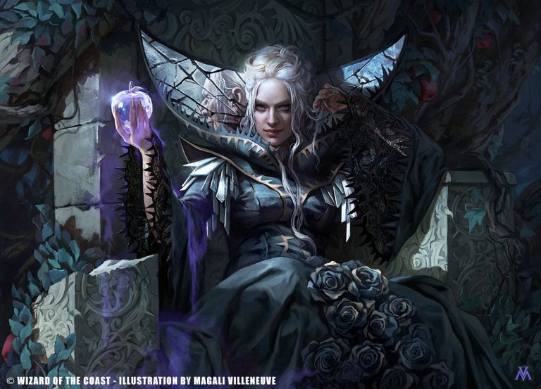
Just… dang!
Let’s close where we began. Eriette was one of the first looks we got at the new Eldraine. Magali Villeneuve has done it again with a spectacular piece that relies heavily on dark blues and pale grays to create a starkly beautiful work, one that also feels incredibly dangerous. Everything about the piece says “dangerous temptress”, a vibe that’s further emphasized by the character design. Notice how the collar of her dress looks so much like a Venus flytrap, spikes and all.
I also want to call attention to a very specific bit of skill flexing here: look at that fractured mirror collar. Notice the reflection in it?
Villeneuve did not need to go that hard! You can see a reflection of the crone version of Eriette in the mirror. I cannot stress how hard that is to do, let alone make it readable at card size. I can only imagine how hard that was to conceptualize properly, but Villeneuve just makes it look so easy in the way only the skillful truly can, and in some ways it makes sense she put as much into this as it looks like she did. She worked on the concept push for this, and Eriette is her baby!
Closing This Chapter
The set has so many banger pieces, I can and will spend some time here. I’ve got a few things planned including another interview. This may not be the last we see of Eriette in this space. Let me know what your favorite pieces are or any cool artistic tricks you noticed in the set. If you’ve got pieces you love or just want to talk about art in general, you can find me on Twitter or help support me on Patreon. You can also find me on Bluesky now, which I’m enjoying more than a fair bit. That’s it for now, so take care of yourselves out there, and I’ll see you in the next Artful Breakdown.