
Artful Breakdown: Unfinity!

Vorthos Steward of Myth by Caroline Gariba
Welcome back to the Artful Breakdown, the article series where I pull back the curtain on the art in Magic: the Gathering sets to show you what makes them tick and hopefully help you appreciate the art a little bit more. I’m Aaron, a fantasy illustrator, (hopefully one day for Magic itself) and all-around art nerd. I’ll be your guide into this particular set of attractions.
This time we’re tackling the art of the latest Un-set to come out: Unfinity! These are always a bit odd stylistically. By design they’re a break from the standard look of Magic, but in a different way than, say, the Universes Beyond. The Un-sets don’t always have a story or identity that I’m aware of, but with Unstable and Unfinity, they definitely do.
Where Unstable had a sort of mad scientist/spy vs spy vibe, Unfinity gets its visual cues from the pun in the name and takes us to space with a retrofuturist kitsch aesthetic combined with a carnival and circus theme.
Themes and Style
And now I should probably explain what any of that means. Retrofuturism is an art movement, generally defined by art influenced by what people in the past thought the world of the future would be like. Think stuff like the Jetsons. If you want to read a more detailed explanation you can do so here
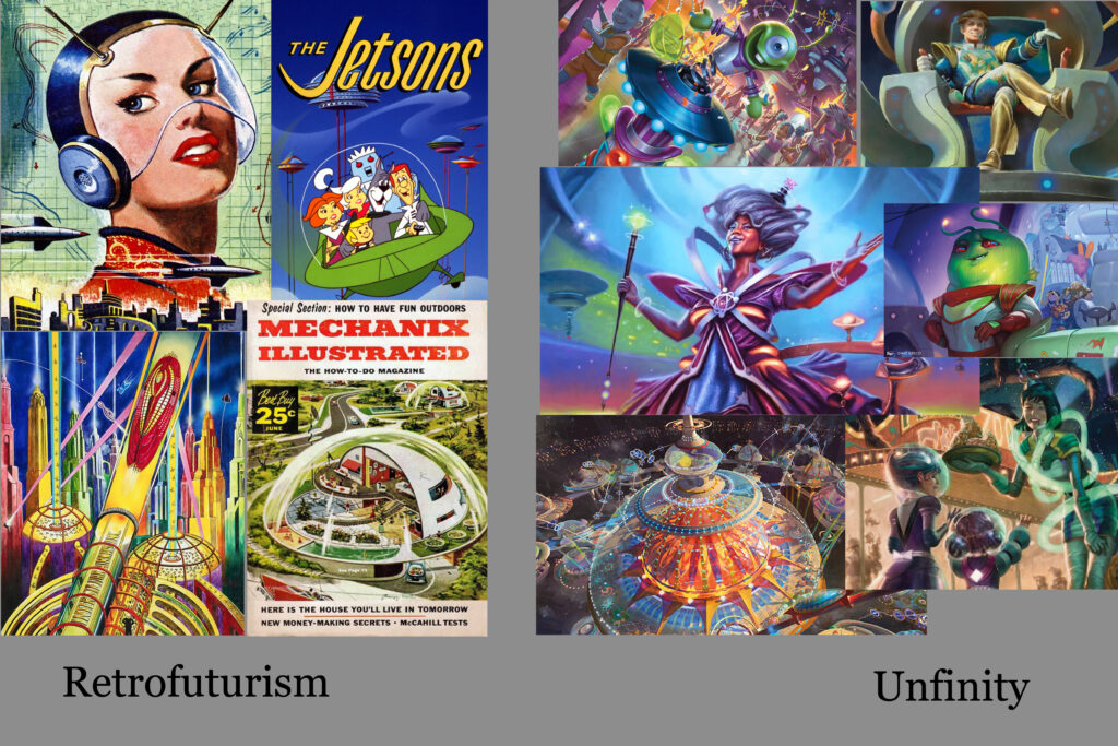
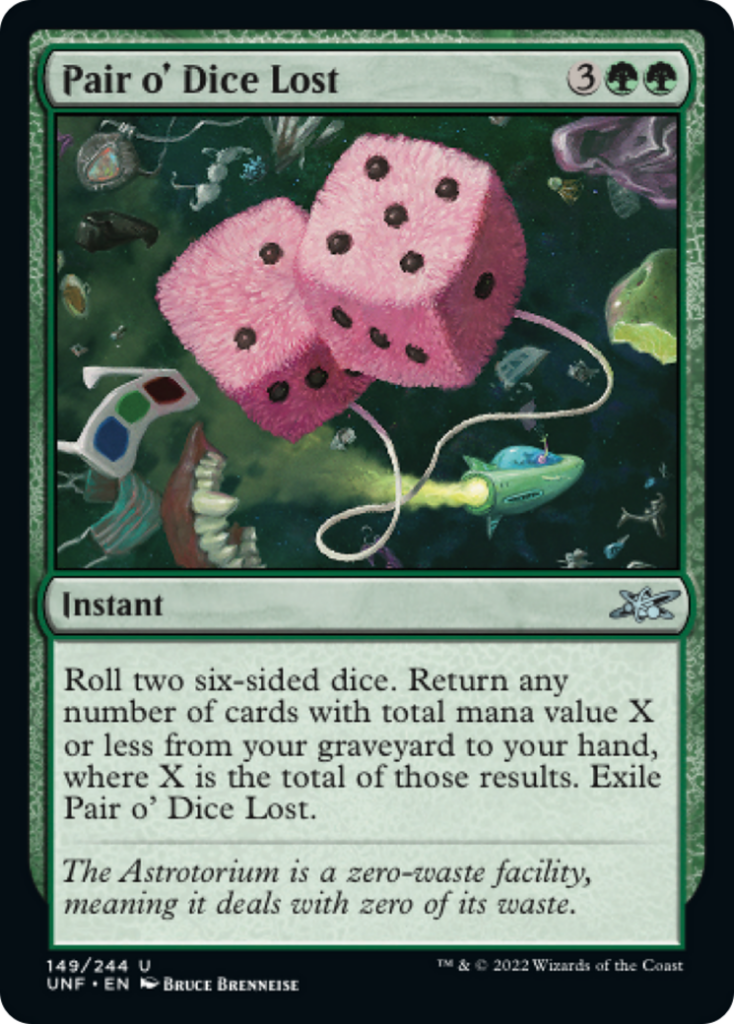
Kitsch is less flattering. It comes from a German term describing low-brow popular culture. This stereotypically includes things that would be considered tacky or cheap but could be used to refer to any form of popular culture or entertainment seen as not seen as “high art.” This would include carnivals and amusement parks. Funnily enough, the definition I found even mentioned fuzzy dice as an example, and, well…
Additionally, like other Un-sets, the art leans heavily on cartoonish exaggeration, specifically on some of the ideas of caricature to tie into the circus theming. All of this combines to provide the set with a kind of zany, frenetic energy focused on excitement and carefully controlled chaos. To me, it gives the set a strongly blue/red vibe, so we’ll focus on a blue card and a red card which also touch on two major themes of the set: the retrofuturist circus element and the inside jokes/lore elements of the set.
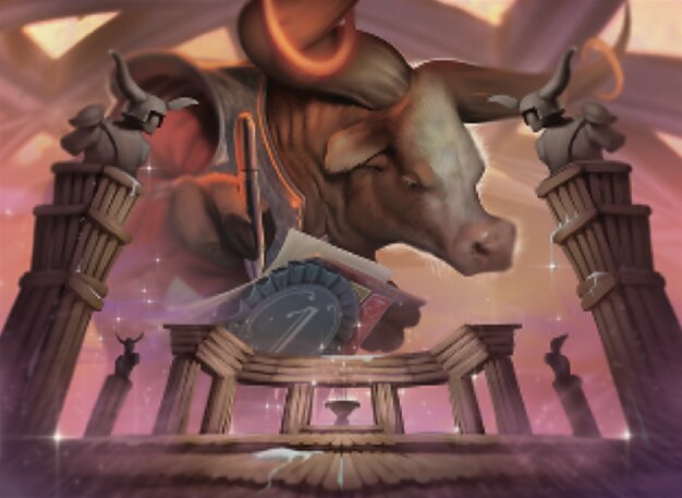
Boing! by Gaboleps
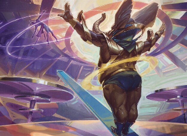
There’s just… so much going on here. Everything is just precision engineered to make you giggle. Gaboleps has a lot of work in a short amount of time. Of their total 35 pieces for the game thus far, a full 15 are in this set. That’s 42% of their output! I think the first real taste that they might’ve been right for an Un-set could’ve been Big Score in Streets of New Capenna. Several of their pieces have similar zany energy and bright colors. I can see an art director tapping them as having comedy art chops.
But Gaboleps has strong technical chops too. Immediately we’re drawn to them because of the detail and the brightest point being around their head. This is a technique called flagging. It grabs our eye and from there we move down the character.
The teeter totter they’ve jumped on and flung another performer into the air acts as both an example of depicting the moment after something has happened and as a direction line to the figure flying. The repeating circles of the platforms, the top of the performance astrotorium, and the one around the figure all work together to keep our eye moving and the piece unified. Also, the neon pinks play with the violets, blues, and yellows extremely well. This is a monstrously difficult color palette to balance.
Finally the circles, as well as the seesaw and the figures, create two overlapping triangles of interest in the composition that keep our eyes moving and our attention invested. The decisions here are stellar. If I had one issue, it’s that there are multiple instances of things in the image very nearly touching rather than overlapping where they could. Big ones are the trunk and the seesaw with the left platform.
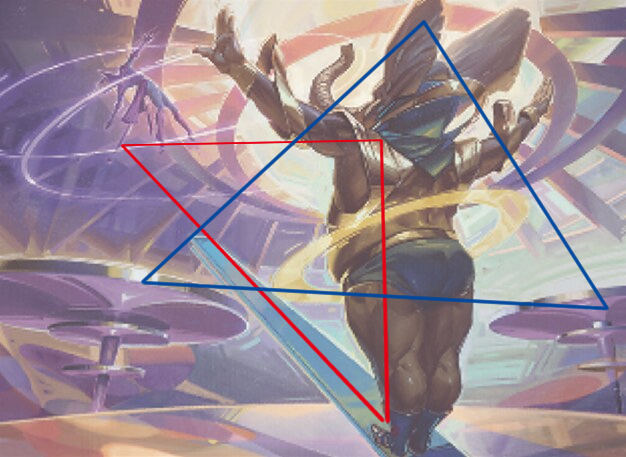
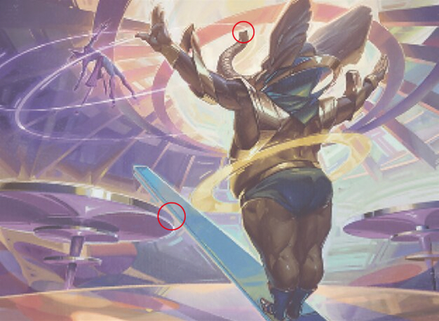
Artists call these tangents, and they can add unnecessary tension and distraction to the image. That said, I’m tempted to believe this was deliberate as a way of creating some small sense of the danger the scene is supposed to depict. If you look at this image long enough you may start to feel oddly uneasy about it and be unsure as to why. This could be one of the reasons.
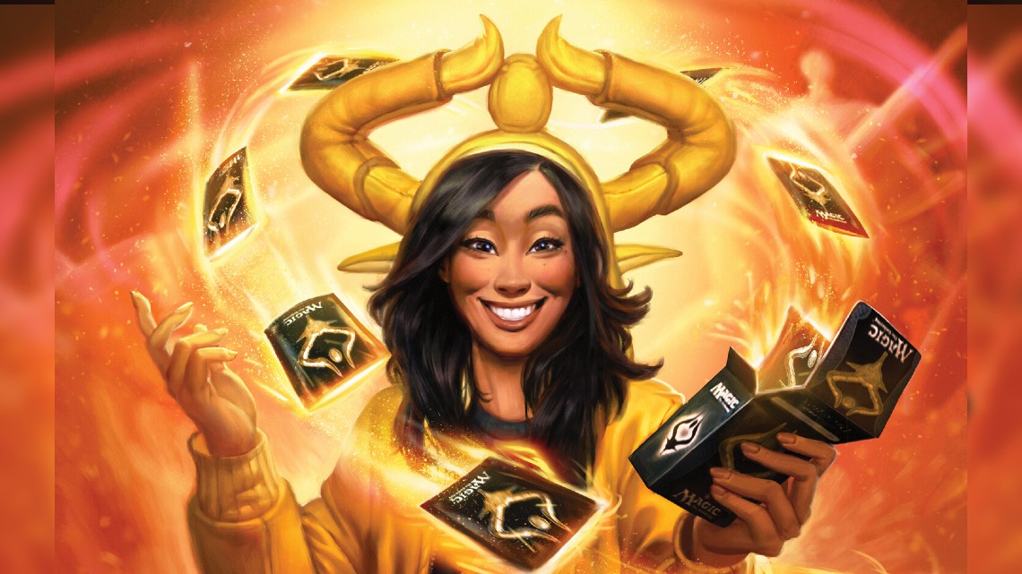
Vorthos, Steward of Myth by Caroline Garb
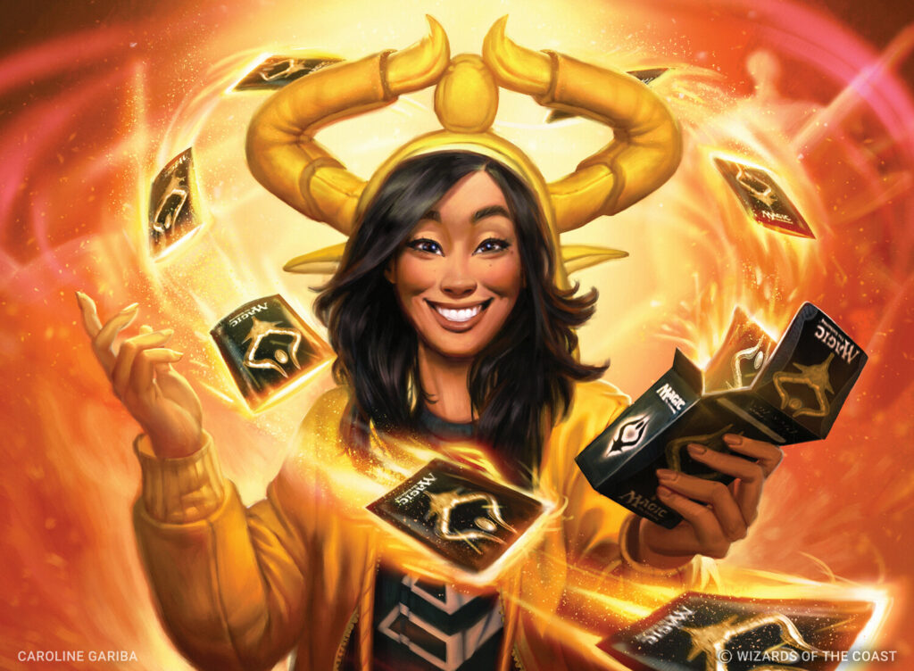
The latest in the series of cards that represent players (Timmy, Johnny, and Spike previously). Caroline Gariba has done an excellent job bringing her to life from the large expressive eyes to the joyous grin. Emotion oozes from Vorthos and any card she’s on. Caroline’s journey with Magic begins back in Theros Beyond Death. With about 30 pieces of her own, there’s plenty of variety. Her strength seems to be versatility. It shows across many cards, but she has a fantastic skill with facial expressions. You can see that on full display here and in Trivia Contest.
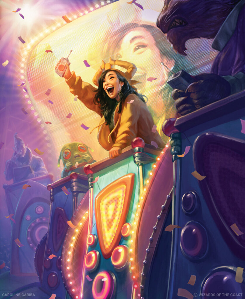
I bring this up to highlight how challenging this is. It’s not easy taking a character from a portrait to a full body piece and keeping them recognizable, let alone inject it with life and personality. We’ve all seen how hard animators and comic artists work to avoid going off model, and we notice when they don’t succeed. Illustrators don’t always pick up this skill if they aren’t in those fields. Not only has Gariba managed it, but she’s kept the wonderful expression and communicated that Vorthos excitement and incredibly red energy.
She masterfully uses yellow, orange, and violet colors to spotlight her character and creates warm violet shadows to amp up the contrast. At this moment, Vorthos is the center of attention, and we can’t take our eyes off her.
The Show Will Go On
For now, it’s time for the curtain call on this article. There’s another batch of art I want to discuss before we travel on to The Brothers’ War, though. Come back next time for that as well. For now, though, let me know your favorite art from the set below, and I’ll see you in the next Artful Breakdown.

