
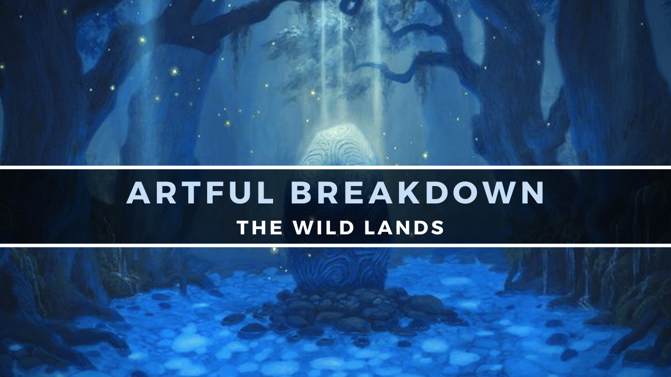
Artful Breakdown: The Wild Lands

Island by Sarah Finnigan
Welcome back to Artful Breakdown, the series that takes a look at the art of Magic: The Gathering cards and the strategies, tricks, techniques, and decisions that go into making it. I’m Aaron, a fantasy illustrator myself, and it’s my pleasure to be your guide to looking at the interesting stuff you might miss at card size.
In preparing for this article, I was looking over the smorgasbord of options we’ve been presented with lately and feeling a bit underwhelmed. I’m still going through the new Doctor Who cards, but there isn’t a lot yet that really grabbed me from a composition or design perspective, which is a shame, because an artist I’ve followed for awhile now, Luisa Preissler, makes her debut this set with the The Tenth Doctor, Rose Tyler, and a Preordain reprint revealed at the time of writing.
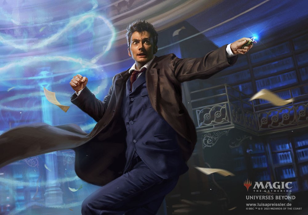
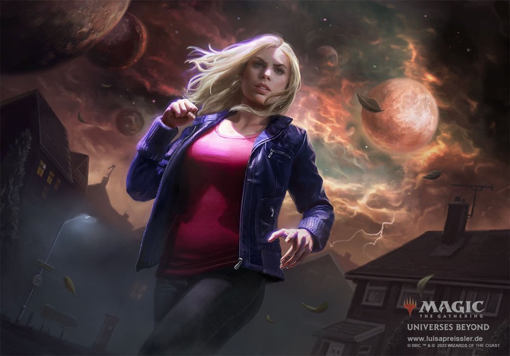
They’re beautifully handled, and Preissler has a fantastic sense of light and rendering. When I first found her, her work reminded me of Dan Dos Santos. She’s got a similar way of handling her painting and color, especially in her work from a few years ago. That said, now I think she’s his equal if not surpassing him in some ways. Aside from that, the desire to recreate shots and moments from the show is kind of causing me to shrug. There’s definitely some things I’m excited to discuss from the Lord of the Rings holiday stuff, but I need some more time to organize my thoughts there.
But once again, the wilds provide!
Into the Woods
Last time we were in Eldraine, the castles and the human lands took precedence. This time, though, the basic lands in the distant wilds take a stronger focus, and we even get a special series of graphic-art-style lands. It’s easy to overlook, but the lands here have so much life and fairy tale mystique to them it feels like we’re entering another world. Fitting that many of the arts evoke a feeling of portals and pathways.
Plains by Carlos Palma Cruchaga
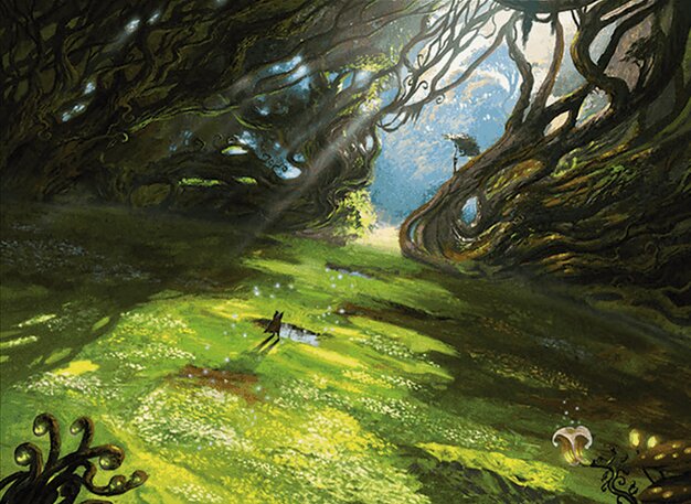
We’ll start with a Plains that masterfully evokes the feeling of setting off on an adventure. Carlos only has a few cards to their name but they’re clearly not an artist who neglects their environments even in character pieces. In all the art they’ve done so far, Cruchaga has treated the environment in a way that makes it as much a character as whatever the subject of the painting is. It’s fitting they’d get a chance to make the environment the subject itself, and I love the way they pulled it off.
The portal theme is on display here with the branches and vines casting long powerful shadows on either side of a path illuminated by the light coming between them. It creates a path of light leading toward the horizon. The high angle and the tilt help the piece feel otherworldly. The use of light and dark makes for a great composition and even helps make the hero more visible at his small size by exaggerating it with his cast shadow.
It feels in keeping with the idea of a grand quest, especially the one Kellan sets off on in the lore of the set.
Island and Mountain by Sarah Finnigan
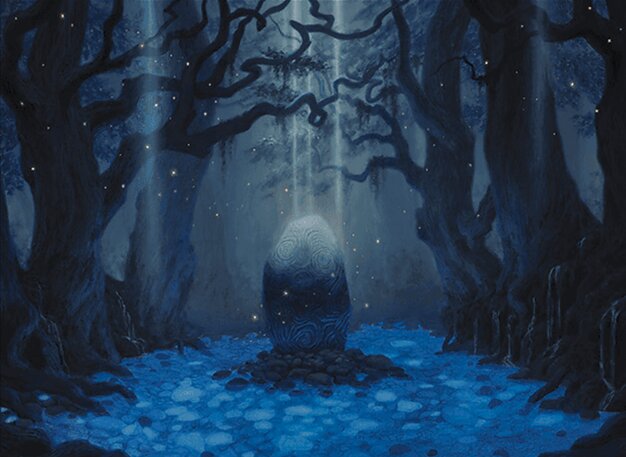
It felt right to group these two together since they’re done by the same artist. Sarah has about 20 cards, most of them lands. She seems to have a penchant for curvilinear forms, and they show up a lot in her pieces. Here she combines them in the trees and on the stone in the center of her image to evoke a sense of dark fairy tale mystery. The portal theme isn’t as much on display here, but there is still one of discovery along the journey. The light filtering down in the dark glade gives a strong feeling of the old, the sacred and the unnerving. Fitting for an Island, as blue mana is the realm of the fae on Eldraine.
That being said, like many Magic players, I do question how this counts as an Island. The blue area in the center beneath the stone feels less like water and more like loose stones or leaves.
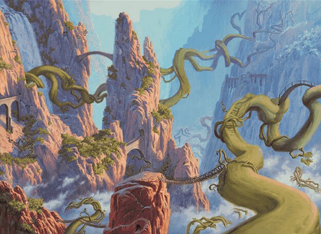
There’s no question about the Mountains, though, and it uses a primarily red and green palette to fantastic effect. In my opinion, red and green is one of the hardest palettes to use. The colors are, at their baseline hues, actually very close in value as opposed to blue and orange or yellow and violet.
Sarah’s leaned on a heavy dose of orange to manage that issue along with making this piece a great example of using blue and violet for shadows. Overall the whole thing feels incredibly cohesive. She uses the greens of the vines to break up the big expanses of red/orange with the mountains and lights the whole thing in warm sunrise colors.
Swamp by Julian Kok Joon Wen
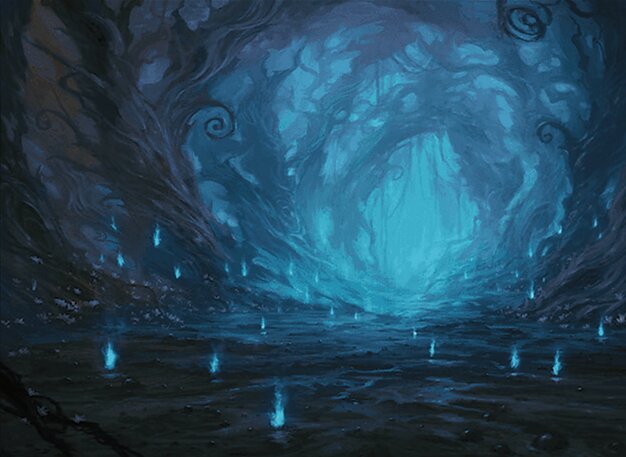
Now let’s go from the warmth of sunrise to the gloom of night. Julian has around 30 cards to their name in a variety of different subjects. The portal and path theme returns here through the use of will-o-wisps doing exactly what they do in folklore: leading us deeper into the woods. The blue glow in the distance helps evoke a sense of the unnatural, like whatever is down that way isn’t something we’d deal with normally.
It really hammers home the creepy vibe. This feels like the dark path the hero has to travel down or is tempted down during the story. The blue light also provides much-needed contrast to actually see the shapes of the piece. Wen is controlling the values really well in the image to make things clear, distinct, and readable even on a piece that uses such strong shadows.
Forest by Adam Paquette
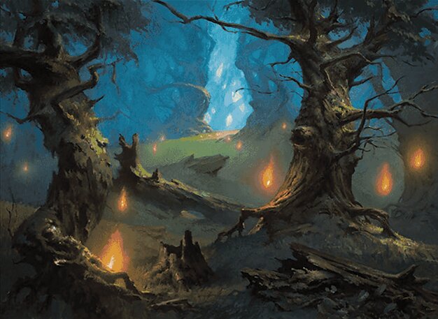
Let’s close out this adventure with the most veteran artist here, Adam Paquette. With nearly 300 cards of all sorts, many of them fantastic environments, they know their way around a landscape, whether it’s on a land or not. Their Forest uses a similar trick as Wen’s Swamp with the will-o-wisps and combines it with the near complementary palette of green and orange to create interest and lead the eye.
Paquette adds an extra wrinkle here with the diagonals created by some of the fallen trees. It creates a zigzag pattern that keeps our attention and leads us once again to an eerie blue light at the top of the hill. The pieces aren’t particularly connected, but it does almost feel like this forest could be leading to the same place as the swamp and that both could be connected to Sarah’s Island.
It’s unlikely to be the case, but the fact that the option for that sort of interpretation is there is great. It’s one of the reasons I love doing this.
Conclusion
For a set called Wilds of Eldraine, it’s fitting the lands be beautiful, and I’m glad I got a chance to discuss them. From a gameplay perspective, it’s easy to overlook them, but they offer so much flavor and a window into the tone of a set, and because landscapes can vary so wildly, they’re a great tool for artists to utilize specific storytelling skills and techniques. If you’re interested in how artists tell us things about the worlds we visit, I can’t stress enough that paying attention to the lands is one of the best ways to go about it.
As always, please let me know any favorite land arts you have or anything you’ve noticed art wise you’d like to see me talk about.
You can find me around the internet on places like Twitter or help support me on Patreon. You can also find me on Bluesky where I’m posting more and more. That’s it for now, so take care of yourselves out there, and I’ll see you in the next Artful Breakdown.

