
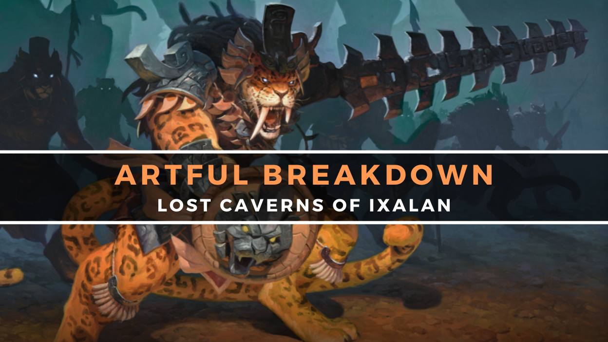
Artful Breakdown: The Lost Caverns of Ixalan

Sovereign Okinec Ahau by Victor Adame Minguez
Hello once again, and welcome back to Artful Breakdown, the series that takes a look at the art of Magic: The Gathering cards and the strategies, tricks, techniques, and decisions that go into making it. I’m Aaron, a fantasy illustrator myself, and it’s my pleasure to be your guide to looking at the interesting stuff you might miss at card size.
Digging Down
After a summer filled with Universes Beyond offerings, it’s nice to return to one of Magic‘s own worlds, especially Ixalan. Two of my favorite kindred decks (Merfolk and Vampires) get lots of love here. Then discovering that one of my favorite couples in the game reunited in the lore has me positively giddy. My “cards to buy” cart is overflowing for this set.
And of course the art is on point. That said, this article has been a struggle to write, largely because I’ve never felt so out of my depth artistically. Mesoamerican art isn’t my forté, so while a lot of things here feel like specific references, I just don’t know what those references are! More than most sets, this feels like one where the appreciation of the art would be greatly enhanced by learning more about the cultural influences at play. With that said, I did still find some great pieces showing off wonderful artistic tricks.
So let’s discover what’s below the surface of the cards, explore the art, and see what treasures we can glean from The Lost Caverns of Ixalan. (No, I’m not sorry for any of those puns).
Bloodthorn Flail by Igor Kieryluk
Igor’s work for Magic, especially lately, has a strong macabre and creepy vibe to it. There’s a reason they called this man in to do some truly unsettling Phyrexians. The eeriness here is a bit less over-the-top but still more than present.
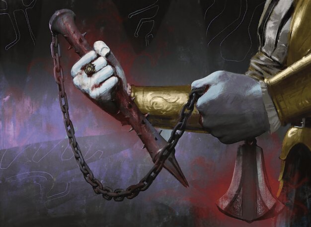
Kieryluk also handled some of the interesting challenges of Equipment and composition really well here, specifically how to get movement in the image. You want to focus on the object a lot rather than someone wielding it, and of course you want to make the whole thing interesting, but sometimes just having it in a position of display isn’t enough, especially for an object like this that’s pulling extra duty as something to demonstrate the devotion of the Vampires to their cause.
I don’t know if having the Vampire’s pale hands holding the flail was in the brief or a decision Kieryluk made on his own, but it works. The trick is clearer when viewed in black and white. See how much lighter and higher contrast the Vampire is in comparison to the background? That more even midtone for the cavern makes the dark flail and the light Vampire pop all the more vividly.
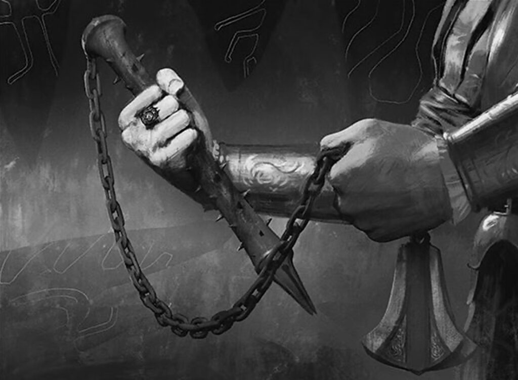
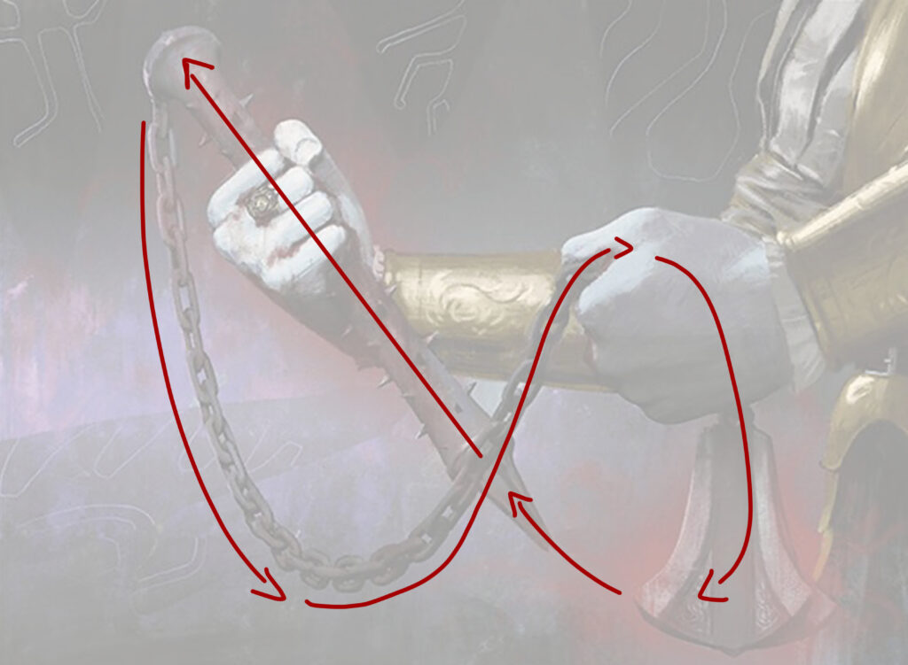
As for that movement concept I mentioned, it’s the shape of the flail itself that does it. It acts as a literal line to guide us. He also uses a neat trick to keep our eyes moving. The head of the flail is very close to the diagonal line formed by the handle. Coupled with this is the slight red aura around it that helps tie the whole piece together, having our eyes move in a loose figure eight.
Ojer Pakpatiq, Deepest Epoch by Chris Rahn
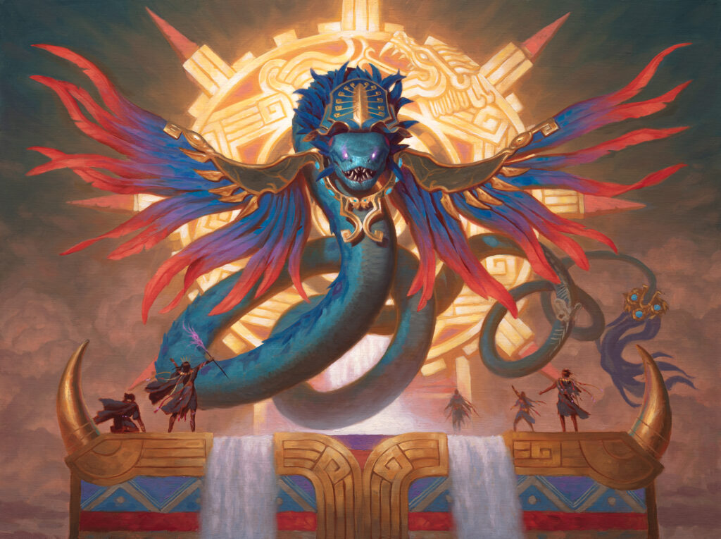
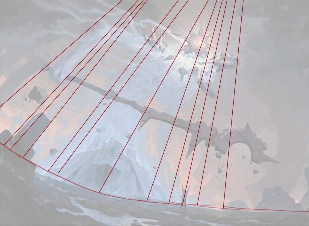
Another veteran artist of the game, Chris Rahn does something with Ojer Pakpatiq that’s hard to notice if you’re just looking at the card in a vacuum. It’s easier to notice when you look at it beside the other Gods from this set and the other Gods in Magic more broadly.
Usually WotC wants to emphasize the power and majesty of their God cards. I’ve talked about this at length in other articles, but one way to do that in art is the combination of massive size and a low angle shot. Obviously they don’t do this all the time or seem to mandate it, but it is an artistic trope. The The Ancient One and Ojer Kaslem, Deepest Growth are fantastic examples of this principle in action. I’ve added the horizon line and perspective lines to make it clearer.
Choosing the eyeline is a powerful thing, and Ojer Pakpatiq doesn’t do this. Instead Rahn chose to put the horizon, or, more accurately, the eyeline, in a very different spot: basically even with the God’s eyes. It’s almost as if we’re flying around the same level.
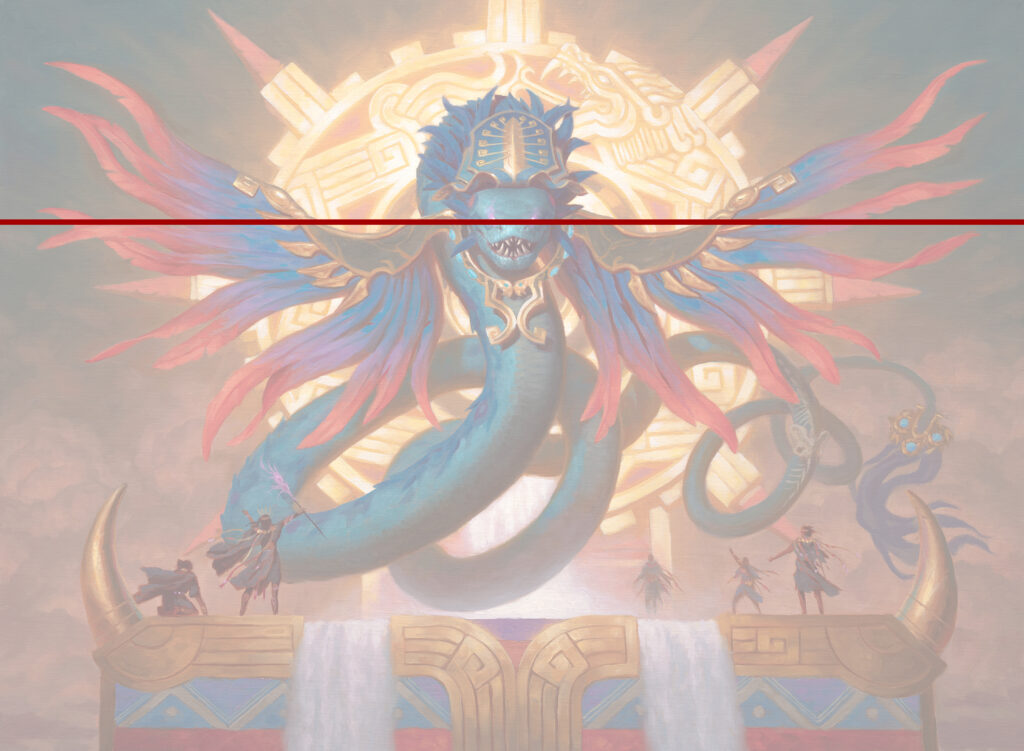
This kind of composition is often used as a challenge, but in this circumstance, I think it can be read another way.
This compositional choice feels akin to what’s going on in the art of some of the more human-scale Gods. Think Birgi, God of Storytelling, for example. It feels almost friendlier. Coupled with the fact this God is a fair bit smaller than many of the others and it seems to be a pretty clear reference to Queztacoatl (though again, I could be wrong), so this seems intentional. Almost as if the God is shown on a scale more humanlike to make it seem more approachable and even, on a power scale.
Additional side note: I love that this was done with oil paint on linen. If you zoom in real close, you can see the texture of the material, and I love that.
Sovereign Okinec Ahau by Victor Adame Minguez
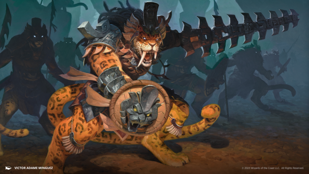
I want to close out today with talking about a trick that’s actually harder to get right than it seems: knowing when to paint less to get the point across.
Sometimes the impression or hint of something is more powerful than showing it clearly. We see this all the time in horror movies. That principle is on full display here with how Minguez gives us the impression of an army of jaguar warriors without needing to paint all of them!
Knowing that this is a legendary creature and thus that figure needs to be front and center, Minguez chose to only really render them and make them the focal point of the illustration. They’re the only Cat we see in more light than shadow. They literally step out of the darkness and into the light as referenced on the flavor text.
Some of the Cats nearest him are rendered a bit, a sacrifice to the properties of how light works and a choice to give a sense of depth to the piece, but not so much that they distract. Minguez is still willing to let them be indistinct while letting the silhouettes do a lot of the heavy lifting here. He even lets some Cats blend into the background completely turning them into haunting figures in the shadows.
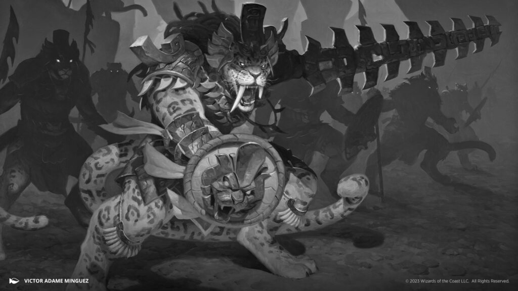
Again, this is easier to see in black and white.
But what’s especially telling is that you can see Minguez has thought clearly about each and every Cat in Okinec’s army, even if he hasn’t painted them.
It’s because of the eyes.
The glowing eyes that are the final detail in the wonderful ominousness of the piece demonstrate he knows exactly where the eyes should be in those forms. Shadows with eyes are such a common and powerful trope for “scary things in the darkness” that it’s actually easy to do them poorly if you aren’t considering what the overall structure of the thing you’re drawing is, especially with something that’s not very stylized. Minguez handles it spectacularly.
Conclusion
This set reminds me why I love Ixalan. It’s got such a rich vein of imagery, history, and tropes to work from. The colors feel more saturated and vibrant on this plane. Everything here feels bigger, more sprawling, and absolutely beautiful in a very different way from other worlds. It’s a setting that mashes a bunch of fascinating and different concepts together and still works amazingly. With that in mind, it gives the artists an incredibly fertile soil to work from. I’d love to hear insights from more knowledgeable folks about a few cards. Things like Descendants’ Path or the deeper significance of the Malamet (the jaguar people in this set) and how the culture plays into the art. I’m absolutely going to be looking for those analyses going forward.
But for now, this is where I’ll leave it. As always, please let me know any favorite land arts you have or anything you’ve noticed art-wise you’d like to see me talk about. You can find me around the internet on places like Twitter, or you can help support me on Patreon. You can also find me on Bluesky, where I’m posting more and more. Check back in for the next article, because I’m excited about it. I’ll be breaking down a couple of Vampire cards that use another fundamental illustration concept quite well that I haven’t talked about. Until then, take care of yourselves and I’ll see you in the next Artful Breakdown.

