Artful Breakdown: The Brothers’ War
Dominik Mayer
Hello, and welcome back to Artful Breakdown, the series where I take you through some of the art of Magic sets to see what makes them work and address details you might not always notice at card size. I’m Aaron Radney, a fantasy illustrator and longtime fan of Magic art. With this set, Magic retells the story of the first great war in its long history: the Brothers’ War.
The Great War
Looking at the set, the strategy for art direction seems clear: hammer home the gravitas of the set by referencing World War 1. Much of the set’s art feels like there’s a slight haze of smoke over it, almost a subtle graininess, like war footage or old movies, and we see references to the grinding nature of the conflict in cards like Fog of War, Lay Down Arms, and Mechanized Warfare. The card Over the Top even references trench warfare, and the helmets feel like a variant of a WWI soldier’s.
And like WWI, the Brothers’ War was an avoidable tragedy. In cards like Tocasia’s Welcome, we see that clearly. The bond between the brothers starts so strong before crumbling to ash. Plenty of cards depict the rivalry and eventual animosity. Cards like Epic Confrontation and Gruesome Realization hammer home the conflict, and at the end Calamity’s Wake features the pyrrhic stillness at the climax.
But a tragedy is hard for us to reconcile without characters. We need cards to help us get to know them, so today let’s look at a cycle of cards all about character stories: The Brothers’ War Commands, by Dominik Mayer.
Kayla’s Command
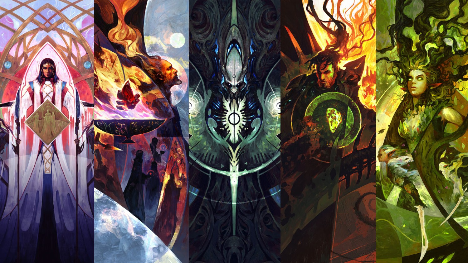
The whole set of Commands feel much like Sagas in some ways. They have to tell a lot of story quickly. Kayla’s feels like a mural in a Yotian palace commemorating the queen. She’s solid and centered, bringing stability to the composition, showing us how she’d like to be seen: strong, and steady. Her face is calm and serene. The light colors of her outfit give a strong contrast with the darkness of the lower part of the image. This makes her stand out as well as foreshadow the darkness of the war. The mechanized Yotian soldiers show us part of her role in the story connected to Urza’s war machines. Meanwhile, the gold lines and intricate patterning behind her reference the connections, unity, and order that are white’s strength.
Urza’s Command
-
Urza’s Command by Dominik Mayer
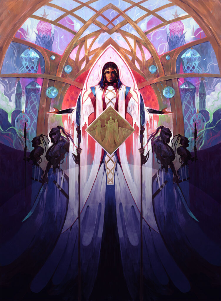
With Kayla’s Command, Mayer demonstrated his mastery of composition and storytelling. With her husband, he does so again, as well as showing off his impressive skills at stylization and abstraction. The themes of memory, regret, and remorse run thick through the piece. Moving from left to right, we see clearly the fires of Misha’s war machine and the destruction of Kroog. We see Kayla, connected with the flames of her home, and all of it done in a space formed by curved lines that leaves a giant red slash through the blue of Urza’s Command. It feels like a suitable connection point to his brother’s card. On the right we see Urza; head tilted up, almost in contemplation of his past, and hinting that what we see before is a memory. The orbs that float around him echo both his wife’s from her image.
And in front of all of it we see two objects that feature prominently in the tragedy of Urza’s life: the Mightstone and the Sylex, again, echoing a similar structure we’ll see in his brother’s card. The art reveals a level of sorrow that lends some humanity to one of the greatest examples of “the protagonist is not necessarily a hero” in the game’s history.
Gix’s Command
-
Gix’s Command by Dominik Mayer
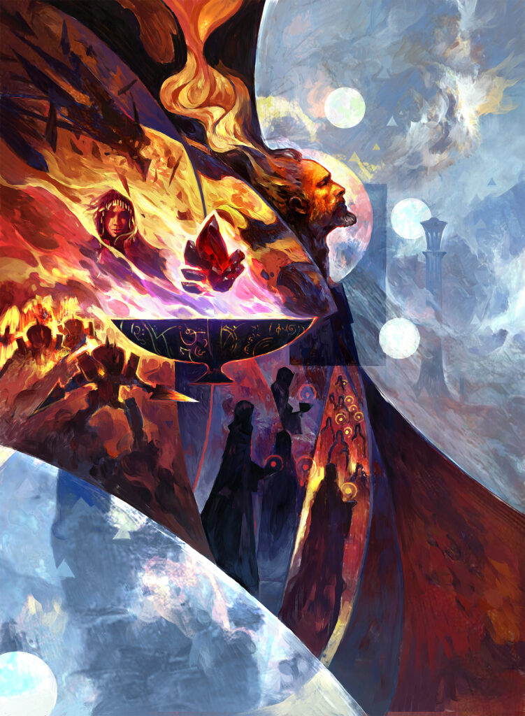
Some centered compositions evoke stability. Here, Mayer takes that placement and makes it about domination. Through his trademark control of shape language and repetition of a single symbol, Mayer hammers home the raw, inescapable terror of the Phyrexian threat. The focal point is, of course, the classic symbol of Yawgmoth within the shape of a dark ribcage pulsing with sickly green light. Stylized figures almost blend into the darkness of the circular frame of the image and reference the shadowy figures of his sleeper agents. All of them are crowned with the same mark, yet the way they’re angled, all pointing back to Gix, draws our eye back in like an inescapable vortex. Glowing circles on either side of Gix appear like eyes. They gleam and stare back at us. Challenging us.
And then, if we pull back far enough, we realize the whole image is one big version of the same internal symbol of Yawgmoth. All will be one indeed.
Mishra’s Command
-
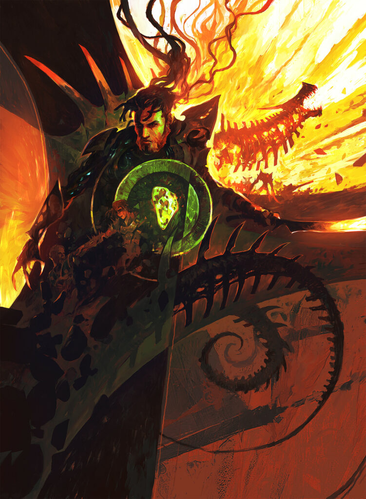
Mishra’s Command by Dominik Mayer
Mishra sits large here looking down and to our left, failing to meet our gaze. Whereas Gix’s art seemed to stare at us with the impression of challenging eyes, Mishra can’t quite meet ours. Where Urza looks away from us with something like sorrowful contemplation, Mishra feels different. This is the look of a man who knows he’s messed up, but is in too deep to put the shovel down now.
At this point I want to talk about another interesting trick Mayer pulls off here. None of these digital pieces look digital at first glance. This is especially true here. It looks like it was crafted using a palette knife, the smears of paint coming together in stylized fire. Barely visible memories of his past can be seen in the darkness illuminated by the Weakstone at the heart of the composition. Once more, a pattern of circles plays heavily in the work, this time the tail of the dragon engine. But here, they reference Mishra’s downward spiral into madness.
Titania’s Command
-
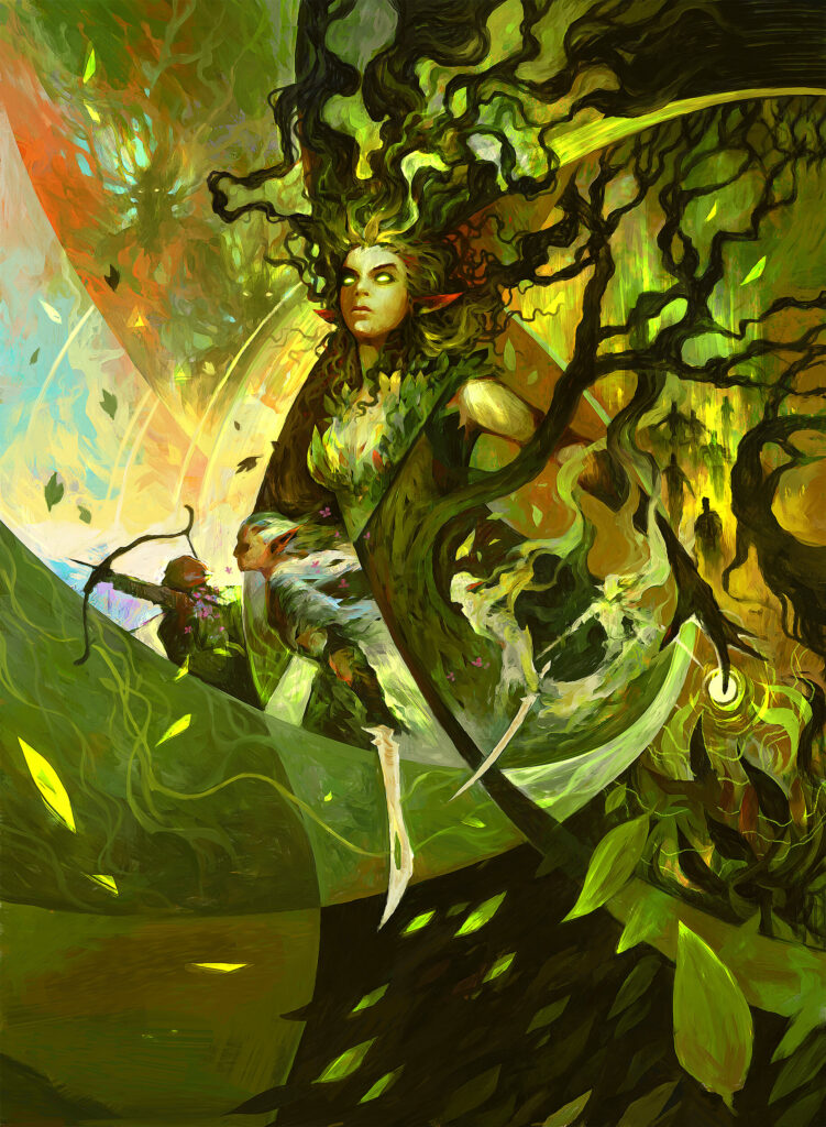
Titania’s Command by Dominik Mayer
The green command probably differs the most from the others. Fitting, as green stands apart with regards to artifice. Despite being less obvious, the circle theme is still present here. To begin, swirling curved lines lead us throughout and seem to emanate from the tip of Titania’s finger. Titania is more active than just about any of the other characters. Her curves end in sharp points like claws, talons. Those same curves are echoed in the weaponry of the stylized figures while the art tells the story of nature’s resistance. Vines and plant growth lead us upward, and you can even see the glowing eyes of Multani in the upper left. Additionally we see stylized Elven warriors and bowmen of the forest all seem to be in motion to the left of the image as we read it left to right almost as though they are coming to intercept us.
Final Thoughts
Commands have a unique history in Magic. They’ve been a few different things at different points in the game’s history. From abstract examples of power being released in Lorwyn, to depictions of group identity on Tarkir, to now vehicles for the stories of various legendary figures. As much as I love Magic‘s art and story, I only started playing in Lorwyn, so much of this is pretty new to me. To be sure, that’s one of the benefits of a reboot or a retelling: new fans get introduced to things they’d never know otherwise. And in the end, these Commands only scratch the surface. It would be incredibly hard for any artist to depict an entire story this complicated in a single tiny frame, but these serve as tantalizing windows.
That brings our time with The Brothers’ War to a close. As always, feel free to tell me about your favorite art in the comments or on Twitter (assuming it’s still there when you read this).