
Artful Breakdown: Tales of Middle-earth Favorites

Goldberry, River-Daughter by Marie Magny
Welcome back to Artful Breakdown, the series that takes a look at the art of Magic: the Gathering cards and the strategies, tricks, techniques, and decisions that go into making it. I’m Aaron, a fantasy illustrator myself, and it’s my pleasure to be your guide to looking at the interesting stuff you might miss at card size.
If you’re new here, each new set I like to go through the art and see what gems I want to discuss. Usually I only focus on a few cards per set and try to dive deep. Usually I like to stick within a theme and concentrate on some relevant element of the art that several pieces do well to highlight. That’s a little trickier to do with this set just because of the sheer volume of cards released.
The amount of art here is frankly staggering and I do not envy the herculean task it must have been for the art director(s) to keep it all together. That said, this set is built upon a beloved story and the narrative element of illustration is top notch because of it, so we’ll lean into focusing on that. I’m not an aficionado of LoTR lore, but for our purposes today that might actually work out in my favor. If the art is as on point as I’ve heard some people say it is, I should get pretty close to what the scenes on the cards depict in my interpretations, so read on and let me know where I get it right and where I miss the mark.
Some quick caveats, though. Like other Universes Beyond properties, there’s no original work for these; it’s all digital, which is a shame because it means some old traditional artist faves don’t get a call up on this one (no Jesper Eising for example), but it also means that it opens some interesting doors for newer artists.
Second Breakfast, by Christina Kraus
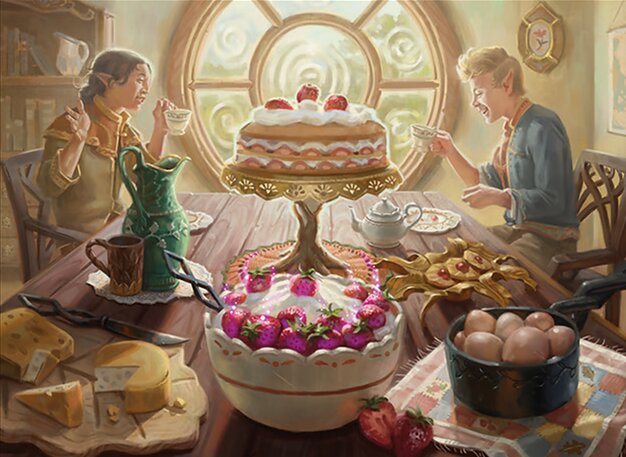
Christina Kraus is someone I’ve been watching for awhile, and I adore the gentle subtlety of her rendering. She’s a new artist to the game, with her first pieces appearing in Jumpstart and March of the Machine. Those pieces are good, but you can see she brought her A Game to the Tales of Middle-earth work.
When I was in school, one of my teachers noted that fantasy art is all about magnificent lighting, and I think this and her art of Bill the Pony really demonstrate that truism. There’s a whole selection of art in this dedicated to the shire and depicting life for the hobbits which, law enforcement aside, seems really idyllic. Kraus paints the sumptuous meal with careful attention and bathes the whole thing in pale morning light. It gives the scene a wistful energy of nostalgia that feels like a shout out to that famous Norman Rockwell painting of the family sitting down to Thanksgiving dinner.
It makes the whole thing feel like a memory, the kind of thing the hobbits reminisce about and miss throughout their journey. Images like this radiate the comforts of home but also hammer in the necessity of the quest. In fantasy, it’s important to establish the stakes, what will be lost if the grand adventure fails. Sometimes that’s best illustrated in simple comforts, like a good joyous meal. I’m absolutely looking forward to seeing more of Christina’s work in the game going forward.
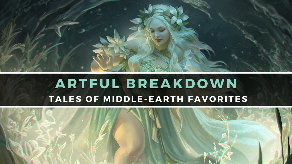
Goldberry River-Daughter, by Marie Magny
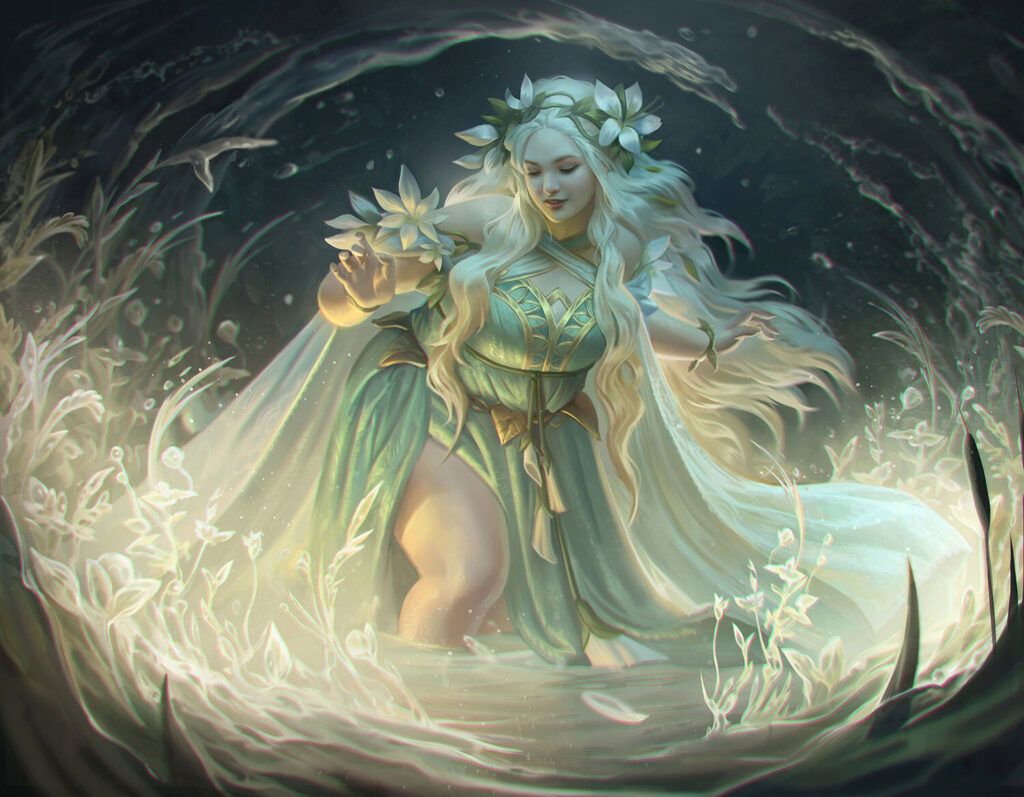
Marie Magny is another new name; she’s worked for a few other companies, including Ubisoft and Riot games. Her style somewhat reflects that, though the slight stylization she uses for Magic is less than that used for her Riot work. What carries over is a clear love and appreciation for character painting, especially women. Of the 12 unique cards she’s painted for Magic, 10 have been female-presenting characters. There’s a fantastic use of pose and expression to convey personalities in them from the coy, to the confident, to the maternal, and everything in between.
All of that is on display in Goldberry, where we get a beautiful full-figured woman (a pretty rare sight in most fantasy properties) that radiates a combination of warmth and power. Her expression is gentle and soft, with the character design and pose further emphasizing that softness. The painting goes a step further, emphasizing gentle color transitions and virtually no harsh shadows. The lighting is the final touch: it hugs her curves and adds a sense of ethereal power to the whole piece. The whole thing creates a sense of matronly protection which the flavor text bears out.
Arwen’s Gift, by Wangjie Li
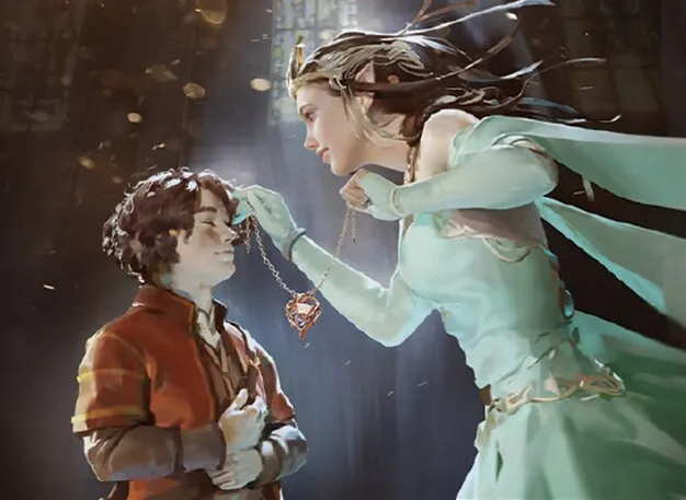
Aaron likes another blue card, surprise surprise. Wangjie Li is another artist who basically debuted this set. He’s a concept artist and educator with a portfolio where the work encompasses both tightly rendered illustrative pieces and more loose painterly works. Arwen’s Gift falls somewhere in between in terms of a technical approach. From what I can tell it’s intended to give us a sense of the wonder that hobbits feel in meeting one of the more important elves in the story.
Pale light has a tendency in fantasy to make things seem hazy and indistinct. In Second Breakfast, Kraus used yellow to create a feeling of nostalgic memory. Here, Li uses a pale blue light to make the whole thing feel like a dream. It evokes a sense of impossibility. Arwen is rendered somewhat hazily, her hair blowing back in an unseen wind. Lightly rendered but clearly considered, it almost evokes wisps of vapor. Similarly impressionist, much of the background fades away. The most rendered elements are Arwen and Frodo’s faces. Special attention seems paid to the expression of joy on our hobbit protagonist and the lighting falling on his hair.
Also, another little touch I’d like to call attention to are the little light flecks in the air. Those touches of gold add not only a neat color contrast, but they also enhance the whole, dreamy atmosphere.
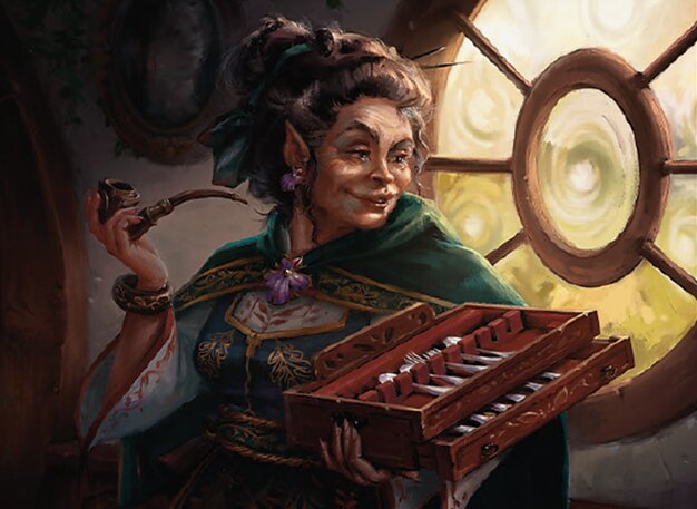
Lobelia Sackville-Baggins, by Hristo D. Chukov
I have no idea who this is in the story other than a relative of Bilbo. I didn’t even know she existed, and yet I’ve never wanted to punch a hobbit in the throat so much! There is something so familiar and loathsome in this character design. It’s that special kind of realistic smarminess that’s painted into every line of the face and that smug-as-heck expression, too. It clearly and wonderfully evokes that one relative you just can’t stand and never want to see. I also enjoy the pains that were taken to replicate a more painterly approach here. There’s relatively little blending or attempts to make things like the lines in the face smoother. You can see clear brushstrokes and only lightly blended colors in places. It helps sell an illusion of physical media even where none really exists.
Painted by Hristo D Chukov, a 15-year veteran of the entertainment industry with a litany of film and TV concept art jobs. It’s pretty clear that experience is why he got picked up for this project. Everything from the pose to the expression reads so delightfully smug and hateable. The lighting once again plays a strong role in ensuring we know not to trust her. Most of her figure is bathed in shadow even as she’s illuminated by the window. The body language as she’s clearly stealing the silverware is an especially nice touch.
The Last March of the Ents, by John Tedrick
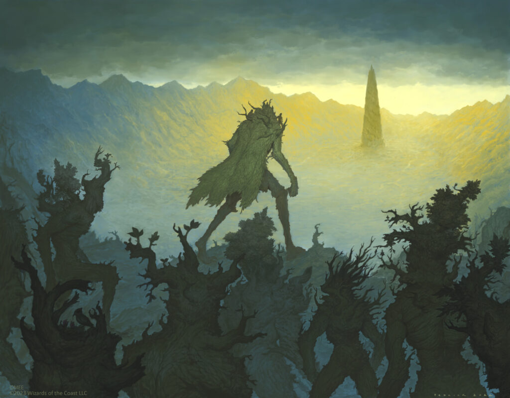
Something I want to make note of is that I don’t always pick pieces because of technical rendering skill when I talk about art in this column. While Last March of the Ents is a bit simple in its rendering, I bring it up because I love the way mood is expressed in this one. The composition does most of the heavy lifting, with the long horizontal bands of the sky and the land slowing the whole feeling of the image down. The cloud band stretching across along with the kind of desaturated greens in the distance evokes an air of slow resignation.
You can almost feel the weight of it on the Ents as they move steadily toward their destination and what you get the sense is a big, looming final battle. You really get a sense of weight pressing down. The image evokes a sense of melancholic resignation. There is no rage or fury. Only the ents moving, albeit tiredly, toward their destiny. Tedrick did a decent amount of art this set and seems to have a real affinity for creatures and monsters.
Battle of the Pelennor Fields, by Tyler Jacobson
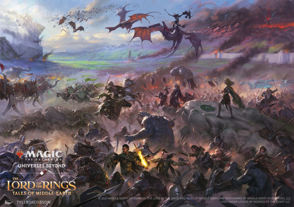
We couldn’t NOT talk about this one. Honestly it could, and probably deserves to be, an article all by itself. The absolute mammoth piece of the set, the Battle of the Pelennor Fields, is a polyptych that gives us alternate arts for 18 cards. It really hits home the scale and scope of the war. It also shows some of the interesting compromises that have to take place when depicting something of this type.:
For one thing, the perspective of the piece isn’t uniform. At the distance, they’re from the foreground: Éomer, Marshal of Rohan is far too large in comparison to the characters around him like Gothmog. We see similar size displacement between Aragorn, Legolas, and Gimli in the foreground and Prince Imrael on the far right. The charging riders in Rising of the Day are awfully small in comparison to the Oliphants they face in battle. All of this, however, is in service of making sure things also still work on individual cards.
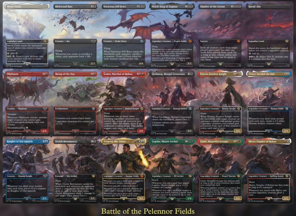
However, none of this is honestly that big of a deal and doesn’t take away from Jacobson’s efforts here. In fact, it’s a major testament to the artist’s skill that everything still hangs together. This is one advantage of illustration. An artist can make these kinds of purposeful decisions and break rules with an understanding of how to still get something brilliant. So much has to be easily read with this image and so many characters have to be clear, it’s honestly incredible. Somehow, Jacobson manages to be clear and recognizable while also plainly illustrating the chaos and confusion of a massive melee in the only way most of us will ever experience or would want to.
Conclusion
Those were just some of the pieces that stood out to me. My notes file was huge for this one, and narrowing it down was a struggle. If I skipped over one of your favorites, don’t worry: I skipped over a massive number of my own as well. But tell me what I missed in the comments anyway. I love hearing about other stuff folks enjoyed, and it might lead to another of these.
Also, if you’d like to support more of my own writing and art-making, please feel free to join me on Patreon; if seeing an illustrator’s artistic process interests you or you want to support me outside of the articles, I write here or on Twitter for as long as that continues to last. If not, just letting me know your thoughts on these and sharing is wonderful as well. I’ll see you again on the next Artful Breakdown.

