Artful Breakdown: Storytelling in Descendants’ Fury

Welcome back to Artful Breakdown, the series that takes a look at the art of Magic: the Gathering cards and the strategies, tricks, techniques, and decisions that go into making it. I’m Aaron, a fantasy illustrator myself, and it’s my pleasure to be your guide to looking at the interesting stuff you might miss at card size. If you’re new here, when interesting art comes out I like to go through a set and take a deep dive on a few pieces I find exceptional in order to talk about what makes them so and why they work.
We’re in Eldraine spoiler season now, but I’m not quite done with Commander Masters yet. Astute readers may have noticed in the last article I did cards from four colors and a land. Red was conspicuously absent. That’s because the red card I wanted to talk about wasn’t a reinterpreted art but a new piece and perhaps my personal favorite piece of art in Commander Masters from a storytelling standpoint.
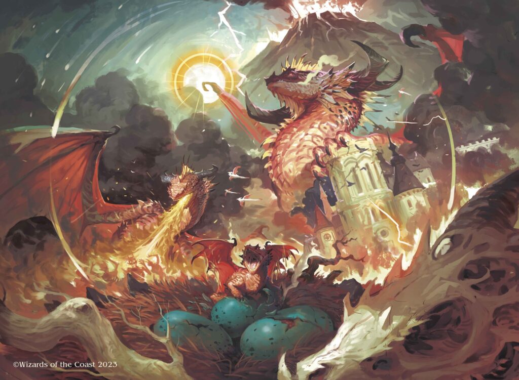
Descendants’ Fury by Aldo Dominguez

Dominguez is new to the game, with only 8 pieces before the new Eldraine cards were spoiled. If you check his portfolio, not only does he have some impressive work, but you can see clear growth in his composition skills over time. His work shows a penchant for richly painted cloud-filled backgrounds as well as layered and detailed character and creature design, especially with regards to his dragons. All of that is on display here in a piece that does an amazing job of telling a narrative compressed down to one image. A lot of Commander Masters doesn’t really do that. We got some, certainly (Flawless Maneuver and Fierce Guardianship immediately come to mind), but for me, this one stands apart.
Breakdown
The illustration has two “entry points” where we can begin our story. One of them is the baby dragon in the low center of the composition. The other (and the one I’m drawn to first) is the skull in the extreme foreground. This is what my first illustration teacher called “a horse’s ass.” It is nothing more or less than an attention-grabbing element in the foreground to keep your viewer paying attention. There was a time when the common trick for this was to paint the rear of a horse. Here, the skull serves the same function, but I think more people are likely to see the hatchling, especially at card size, so let’s start there.

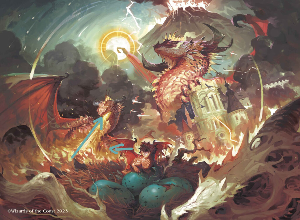
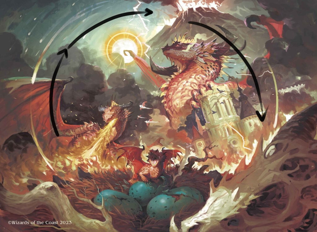
Our main character is front and center, and, like any newborn, screaming as it comes out of the egg. Here, Dominguez uses contrast here to get our attention. The teal-colored eggs pop against all the reds and golds in the rest of that section. The head is pointed left, and our eye travels along the line of fire up to a young adult dragon’s flames. We’re now primed to see this as either the baby dragon grown up, or that we’re seeing glimpses of the dragons they descend from, and it hints they’ll follow in the ancestors’ footsteps. Additionally, the faint gold circle clues us in to where our eye should flow.

That’s another great thing about this piece: there are generally multiple ways for your eye to get to the same spots.
The circle continues leading us up higher into the image. Dominguez uses the sun at this point to demonstrate, again, the passing of time and give us another point of visual interest. Since it overlaps with the dragon’s wing, we’re pulled out of the circle and down into the massive adult dragon. They even go so far as to give us a scene of the city tilted to indicate destruction and calamity.

And lastly, we come back to the skull to start the process over again. Coupled with the card name, it tells us a story of a hatchling who, after the death of its ancestor, takes its terrible revenge. It also hints at this being a cyclical problem, one that will occur again and again.
Conclusion
I adore pieces like this, and they remind me of what really great illustration is and can be. Visual storytelling is a challenging craft, and it’s often about more than just painting exceptionally well. So many little decisions clearly went into making this, and the attention to detail shines through pretty clearly. Everything from the stylization to the color choice and beyond feels on point and a master class in what makes Magic artists some of the best in the business. I hope you’re as excited as I am to see more of Aldo in the future.
For now we’ll close things out there. As always, thank you for reading. I’d love to hear what your favorite storytelling pieces are either from this set or any other. If you want to chat, you can find me on Twitter or help support me on Patreon if you’d like to help me on my own artistic journey. You can also find me on Bluesky now, which I’m enjoying more than a fair bit.
That’s it for now, so take care of yourselves out there, and I’ll see you in the next Artful Breakdown.