
Artful Breakdown – Phyrexia: All Will Be One

Mondrak, Glory Dominus by Jason A Engle
Welcome back to the Artful Breakdown, the series that takes a look at the art of Magic: the Gathering cards, then dive deep into the strategies, tricks, techniques and decisions that go into making the fantastic art for the game. I’m Aaron, a fantasy illustrator myself and a general lover of the craft of creating images. It’s my job to help folks take a moment to slow down and appreciate the art and artists that bring this game to life and show some secrets you may not always catch at card size.
We return to the metal world once known as Mirrodin, now turned New Phyrexia. The body horror is on full display here as artists from across the game have alluded to drawing on greats like H. R. Giger for artistic inspiration. While all of that is quite plain, what struck me most when going through the previews was the way color was handled. Specifically the colors on cards related to the fanbase’s favorite Lady-Gaga-emulating murder mommy: Elesh Norn.
It’s Norn’s World; We Just Live In It
Across 4 of the 5 colors, the vast majority of pieces seem to be purposefully limited in their use of color, sticking mainly to the card’s main color and perhaps a small additional accent and leaning heavily on tints and shades. To be certain, I checked and confirmed that yes, the overall look of this set is far more monochromatic than The Brothers’ War, Unfinity and Dominaria United. It’s almost as if color has drained from the set; or perhaps the Phyrexians might say, “Distilled to its perfect essentials.” The exception to this was the cards related to white-aligned faction. So let’s look and see what they tell us about Norn and her Machine Orthodoxy.
Elesh Norn, Mother of Machines by Martina Fačková
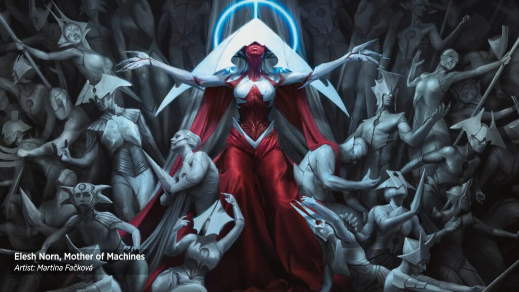
Elesh Norn’s cards make strong use of contrast and shape language to draw our eye. For all her evil, Norn’s got drip, and I’m not just talking about the blood and oil coming from flayed flesh. Many of Norn’s cards have some of the most striking contrast in the set. The cool tones in the white porcelain/dentition elements of her faction’s designs and the stark warmth of the red are immediately eye-catching. And unsettling.
Fačková is probably best known for her Return Upon the Tide, in Kaldheim, and her take on Tasha, the Witch Queen from Commander Legends, and her storytelling economy is top-notch. Centered in the frame, Norn’s narcissism is on full display as she sits upon a throne of petrified supplicants. All of them have something or another that pays homage to her headpiece and style of dress. Those statues fan out from her in a V-shape with her at its center. Coupled with the color placement Fačková chose, which places Norn’s bright whites and deep reds against the gray/blue shadows of a darker background, we can’t take our eyes off her. She’s the headliner and the center of attention. The image clearly speaks of two things: conformity and power, values at the heart of Elesh Norn’s vision.
Mondrak, Glory Dominus by Jason A Engle
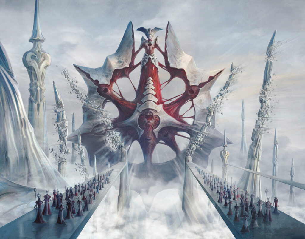
Like any ruler, Norn wants monuments to her greatness, and like every tyrant, they’re ostentatious and terrifying. Again the artist chose a centered composition that radiates stability and power. Jason is a versatile illustrator with over 100 cards of experience under his belt. Here he used strong leading lines from the two pathways that form a prominent V shape once again. It acts as an arrow to draw us into the piece and focus our eye on the horrific structure of the Dominus. Sharp edges are also an integral part of the design. Apparently for Norn, perfection includes lots of pointy bits. And lots of screaming mouths. If you look closely you can see them even at card size, and the horror of this is interesting. Like Elesh Norn herself, we see mouths, but no eyes.
There’s a metaphor here potentially about blind faith. For Norn, one does not need to see; they merely need to speak to praise Phyrexia. This could also be a commentary about her also not seeing every angle here.
Norn’s Wellspring by Jonas De Ro
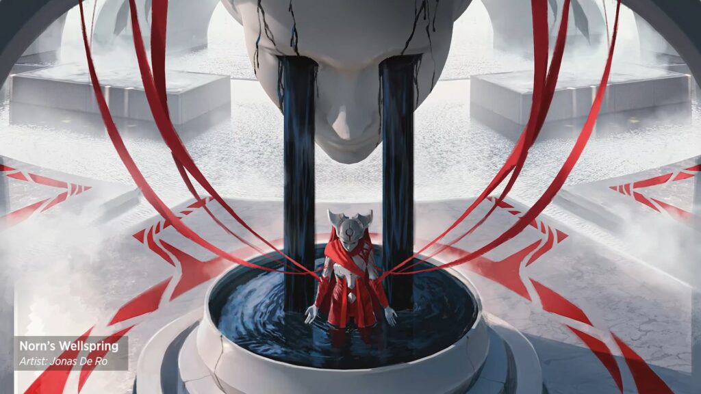
Of the white cards in the set, I struggle with whether this or the next one is my favorite artistically. It’s a powerful use of twisted color symbolism to create a thoroughly creepy image. Through use of a centered composition once again, De Ro commands our attention but places us above the subject. This distances us from it and puts us in a position of observer. We can see the events unfolding but we’re powerless to interact or engage. It creates a kind of general creepiness that De Ro is skilled at using. His recent lands for the last Innistrad sets bear this out.
The curved red lines should convey appealing gentleness, but end in sharp points that instead indicate threat. That juxtaposition helps sell again the sense of unease and danger. The lines of black, glistening oil streaming from the eyes of the face above create a dark central place that again provides contrast that makes our eye lock on to the figure in the pool. This all plays together fantastically with the stark, sterile environment. Even with the saturated reds, this space is devoid of warmth and life and it twists so much of what we think of with colors. In the west, white is often a color of purity and cleanliness; red of warmth and life. But here we’re reminded of why in other parts of the world white is the color of bleached bone and death. With that juxtaposition, red becomes the color of spilled blood, exposed flesh, and raw nerves.
Veil of Assimilation by Wayne Wu
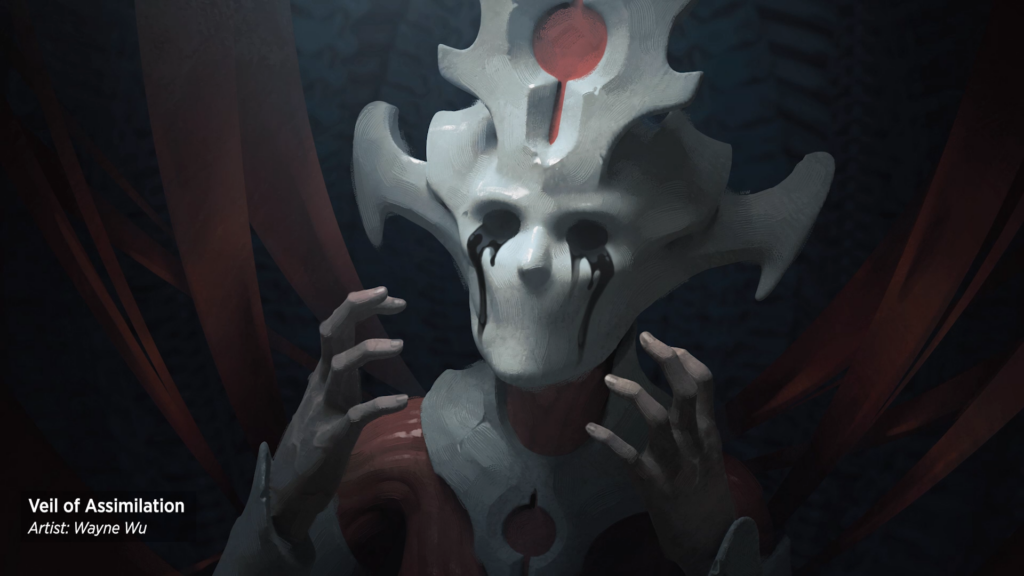
Wayne Wu is scaring the daylights out of me here. The horror here is classic and raw. Wayne is new to the game, but his digital painting has the feel of the very thick oil or acrylic paint of a traditional master. It’s got a heavy viscous look to it. The muted colors and stark light source concentrate our attention. It uses the side of the face on our left as the highest point of contrast and tells our eye immediately where to look. The body language is immaculate. The inflexible mask has removed the ability of the face to emote but we see the raw, flayed flesh, the stiffness of the hands, and the oil tears, and we know all we need to know about the horror and pain of the figure.
The themes of inability to see and loss of identity that are key to the horror of Norn, and her acolytes are once again on display as the mask has no clear indication of eyes; just the empty holes from which the oil spills. And unlike many others of Norn’s faction, this mask has not only robbed them of their eyes, but their mouth as well, evoking the horror trope of “I have no mouth and I must scream.” Coupled with the name, it’s utterly haunting. The flavor text ties it all together, for the figure can do none of the things listed:
“Hear only harmony. See only glory. Speak only truth.”
–Atraxa
Final Thoughts
One of the things that we as Magic players don’t often pay attention to is the art direction of a set. Artists aren’t making decisions in a vacuum. It’s easy to forget that most artists are freelancers working under the direction of an in-house Art Director (AD) who’s responsible for the big picture vision. It’s hard for the AD to get a set with a cohesive look and feel and to convey something more fully with the set as a whole without a lot of effort, and the success of the effort here is incredibly apparent.
The set tells us a lot about Elesh Norn and her place as Mother of Machines. Under her, things are rigid and inflexible. She dominates not just her faction who emulate her look and attitude but the other factions and praetors. We knew this based on their appearance on other worlds, but here it’s plainly in your face. Not just because she’s the only praetor who gets a card here but through the use of color choices and variation within the set itself. Her narcissistic belief in her supremacy is evident not just in the actions she takes in story but how she distorts the art of everything around her. That feels like a conscious choice of direction.
And that’s all for this edition of the Artful Breakdown. I hope you’ve enjoyed yourself as much as I have. What things did you notice about Norn based on the art that we didn’t talk about here? I’m sure there’s something. Also, please let me know what your favorite art in the set is below or on Twitter. I promise you won’t be assimilated either way. I’ll see you again next time to break down more great art.

