Artful Breakdown: A Tribute to the Brothers Hildebrandt
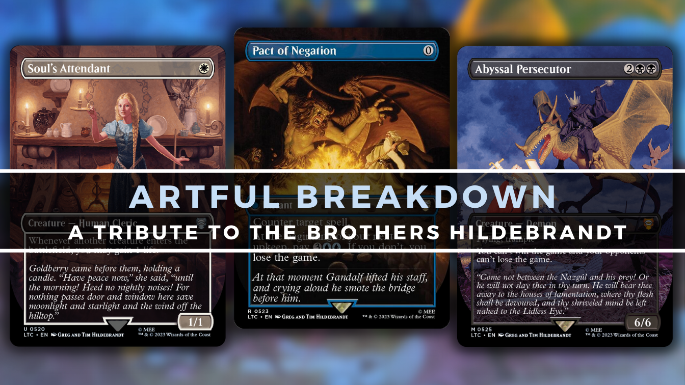
Hello once again, and welcome back to Artful Breakdown, the series that takes a look at the art of Magic: The Gathering cards and the strategies, tricks, techniques, and decisions that go into making it. I’m Aaron, a fantasy illustrator myself, and it’s my pleasure to be your guide to the interesting stuff you might miss at card size.
Today’s focus is on a set of cards from the Lord of the Rings Holiday set. Ordinarily I might have skipped it. Being a reprint set focused on new treatments, it feels a lot like the Innistrad Double Feature situation. But I heard there were a few new cards, and I wanted to do my due diligence. I’m glad I did. But first, forgive me a small digression to explain the choice of topic today.
Changing Times
In addition to writing and art, I work in a library for my day job, and I like to play a little game sometimes when things get dull. I’ll find a book and try to guess when it was published by looking at it. It’s almost impossible to get a perfect year, but I can usually guess the decade. How?
I can usually tell by the way the cover is illustrated.
Illustration trends change over time just like any media. Anyone who’s been a fan of Magic for a long time can see that happen even just within the game itself. Magic art in Alpha looks very different from a recent set like Wilds of Eldraine.
So imagine my surprise when I saw a collection of pieces that looked incredibly out of place in the collection near the bottom of the second page of the Scryfall search for the holiday set.
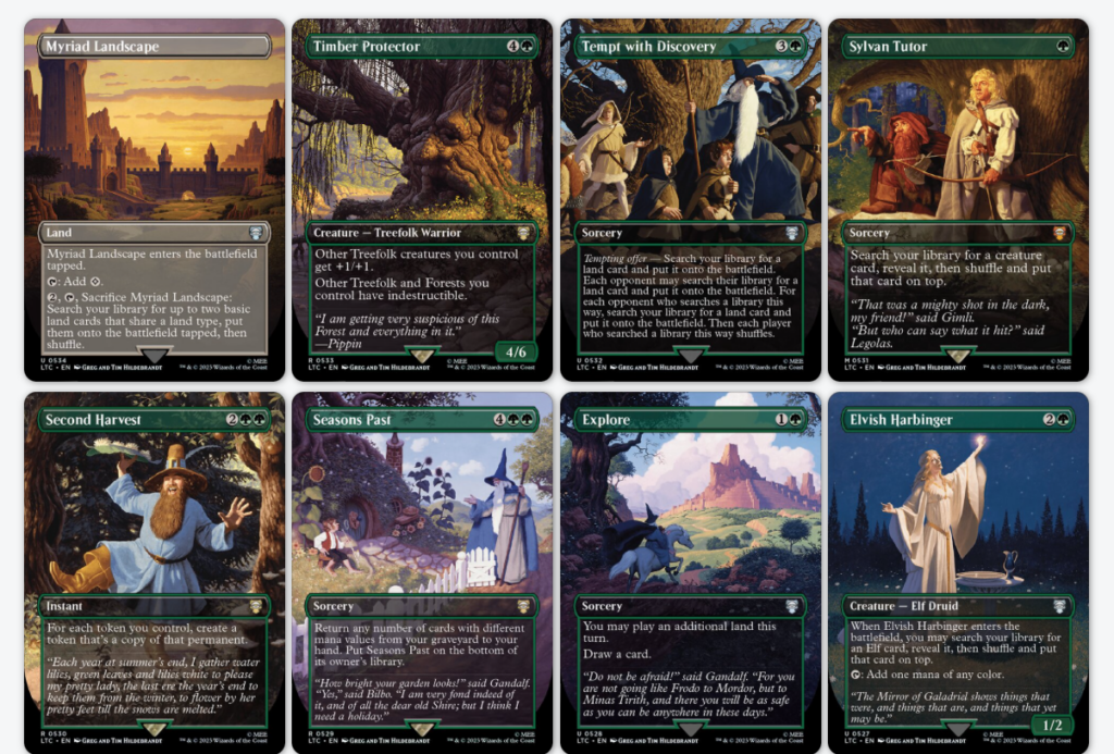
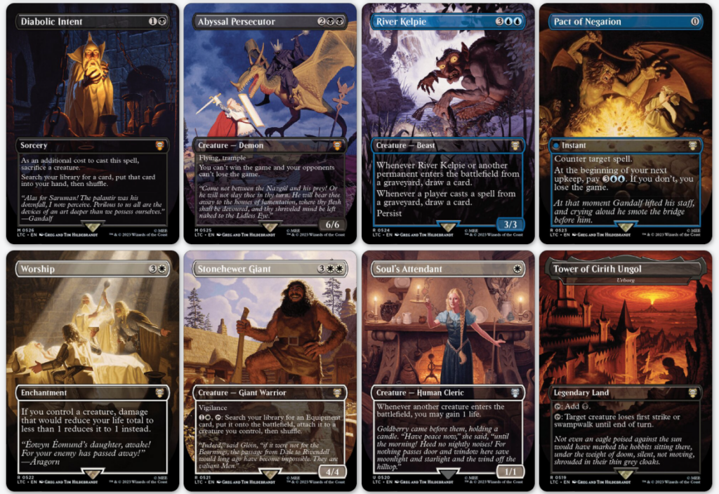
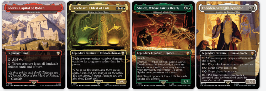
The only thing I could say about the pieces initially is that they didn’t look modern. It was bright, saturated, and done in a manner that felt reminiscent of work from the 70s or 80s. It was also pretty clear to me these are traditional painting. When I saw the dual artist credit, I assumed it was just new work from a duo who’d probably been working since that time and just never left that era of illustration behind.
Turns out the story is both more interesting and a bit sadder.
The Brothers Hildebrandt

Twins born in 1939 in Detroit the two worked together as professional illustrators from about 1959 forward. They’d work on Marvel and DC comics, Star Wars, numerous children’s books, and, of course, Magic. In fact, while researching this article, I discovered Greg painted literally one of the first cards I ever saw when I really started playing.
But their big claim to fame that would get them the attention for later in their careers would be a series of pieces for a Lord of the Rings calendar from 1975.
And it’s from that work and a few other calendar-adjacent projects that we get these pieces.
That’s why these look so different and out of place. These aren’t new. They’re licensed and repurposed classic depictions from two big names in the business from an earlier era. You can see most of them on the website their agency manages for their work.
Technique
Technique and working method can play a huge part in what makes an image look the way it does. That’s as true now as it was then. And I’ll say this, there’s elements of these guys’ work that I’m honestly not at all sure how they pulled off exactly. There’s a vibrancy and richness of color that makes me suspect oil painting. It’s hard to beat oil for those things. But knowing the deadlines they were working with, if you told me they were using acrylic and were just amazing at it, I’d probably believe you as well.
Nevertheless, there’s a huge emphasis on fantastic light in their pieces. I suspect some kind of gold or yellow underpainting in a lot of these because of just how much rich golden light suffuses a lot of their illustrations. Regardless of how it’s done, you can see that careful attention to lighting in cards like Reveille Squad and Knighthood that you do in these as well.
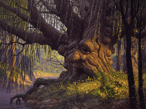
My favorite is Old Man Willow, here used for Timber Protector. That richness of light is on full display here, and the violet shadows play spectacularly with that yellow orange lighting on the tree’s face. It’s rendered well enough that the whole thing is incredibly believable but stylized enough that you know you’ll need to suspend your disbelief for the face in the trunk.
You can also see a difference in character design with these.
Things like Diabolic Intent and Abyssal Persecutor seem rather goofy from a character design standpoint rather than realistic and imposing. This kind of stylization was more common in the 70s. They also have the advantage of the Peter Jackson and Ralph Bakshi films not existing yet. In their time, art like this is how people were introduced to the visual style of Middle-earth.
Speaking of works that benefit from the lack of films of the admittedly kind of goofy character designs, my other favorite is Gollum, here pulling duty as the art for River Kelpie.
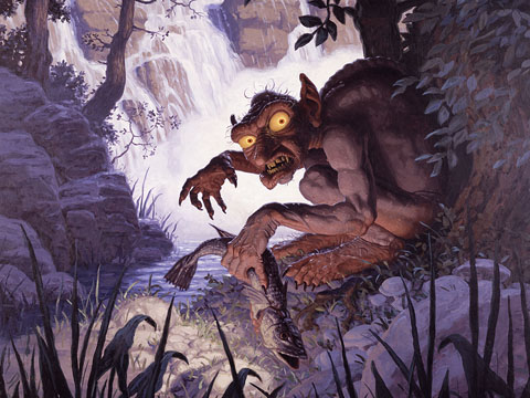
The use of light and shadow is striking, and the use of white water to contrast the shadows and make him stand out is a simple and elegant solution.
Later Life
The brothers worked together as a collaborative unit, only occasionally doing their own thing here and there, but they chose to pursue their own solo efforts in the 1980s.
Both would find successes in these endeavors.
Greg is still painting to this day at 84, though he seems to have transitioned away from a lot of fantasy work. He still does posters for the Trans Siberian Orchestra. Mostly his focus these days is on a series of 1940s- and 50s-style pin-up illustrations he calls his American Beauties series. As well as being a recipient of a Lifetime Chelsey Award.
Sadly, there couldn’t really be a reunion of the Brothers as an artistic duo for Magic: Tim Hildebrandt passed away in 2006.
Conclusion
I love seeing these vintage arts repurposed here. It’s easy to forget just how many lives these books touched, especially artists. Tolkien’s world is so rich and full of things for people to latch on to that there seems to be no end to the interpretations, and it’s art like this that’s a good reminder to us modern creatives. No matter how great what we do is or the strides we make, we stand on the shoulders of giants.
As always, please let me know your own favorite arts or if you have anything you’ve noticed art wise you’d like to talk about.
You can find me around the internet on places like Twitter or help support me on Patreon. You can also find me on Bluesky where I’m posting more and more. That’s it for now, so take care of yourselves out there, and I’ll see you in the next Artful Breakdown.