Artful Breakdown: A Conversation With Quintin Gleam
Welcome back to Artful Breakdown, the series that takes a look at the art of Magic: The Gathering cards and the strategies, tricks, techniques, and decisions that go into making it. I’m Aaron, a fantasy illustrator myself, and it’s my pleasure to be your guide to looking at the interesting stuff you might miss at card size.
We once more plunge into the Wilds of Eldraine today and get to check out one of my favorite things: unimpressive cards with very impressive art! Today I get to talk with Quintin Gleim about his Prophetic Prism for Wilds of Eldraine as well as his thoughts about the intricacies and weirdness of being a professional illustrator.
(Elements of the interview have been edited for clarity)
Artful Breakdown: Thanks for taking some time to do this with me! We’re all so busy, it’s great when I can get a chance to pick someone’s brain. I always like to start with the basics. Go ahead and introduce yourself and tell us a bit about how you got started as an illustrator.

Quintin Gleim: Hello! I’m Quintin Gleim, an Illustrator primarily working in the tabletop game industry. Coming from a small town in Ohio, my initial route into the art field was through design and later tattooing– but never really knowing illustration was a path that existed.
AB: That’s a thing I see a lot, actually. Had a similar situation. I didn’t know a lot of book covers were illustrations until I got to high school.
QG: Yeah, while studying design at a local university, I was lucky enough to take classes with Bastien Lecouffe Deharme, another Magic artist who first opened my eyes to illustration as a potential career. Shortly after, I created a portfolio and began shopping myself around at nearby conventions for any work I could find.
AB: Bastien is friggin’ amazing. One of my favorites! That explains a lot actually. Your work has a real strong painterly quality to it. Do you work primarily digitally or traditionally? And whatever way you choose to work, what’s the reason?
QG: Thanks! I primarily work digitally (or hybrid) now to meet deadlines, but most of what I have learned as a painter has been through oil painting. When working digitally, I try to think the same as I would with a physical medium: direct and thoughtful brushstrokes, building layers, texture, color mixing. Sometimes I get the result I want, sometimes not.
The further I get into this career, though, the more I want to get back to oil painting, even if it means I can’t take on as much work. The tactile, almost meditative feeling of pushing around paint is definitely something I miss.
The Art!
AB: I love the honesty there that it doesn’t always pan out the way you want. Folks really only ever see the successful art pieces and don’t think about all the missteps and false starts. But speaking of successes, let’s talk about your Prophetic Prism!
Can you tell us a little about how you end up with the briefs you get? What’s the process like? Does the AD tell you that they have you in mind for certain kinds of projects?
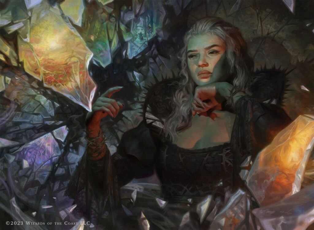
QG: With Magic, it generally seems to be random, though I do think my work as a whole is a bit dark and moody (I think I have done a little of everything at this point). This was a cool assignment though because it was my first MTG piece working with Deborah Garcia, an art director I had worked with years before on a different game, so she might have already had some idea of what my comfort zone is.
AB: I love talking about composition and narrative in this column. What kind of storytelling/composition things you were considering while working on this one.
QG: The first big challenge was with Prophetic Prism being an artifact; the original brief focused more on the shards. Most of my sketches were closeups with just a bit of the face or hands showing. I personally enjoy painting figures, though, so on a whim I included an option more pulled back just in case.
AB: So, that’s awesome. I got told in school to never show a sketch you wouldn’t be thrilled to do. Because the client will inevitably pick it. But every so often if you include one you really want, the client zeroes in on it and it’s like magic.
QG: Yeah! I loved the idea of the witch nonchalantly swiping through different scenes throughout Eldraine, just as we might switch channels on a TV. After that, it was a bunch of frantic nights trying to balance out the five colors without it looking too chaotic. Solved that by really only focusing on the Plains and simplifying or shrinking the others.
AB: Eriette is an important figure in this story and you painted her twice (Prophetic Prism and Eriette’s Whisper). What was that like? How much effort do you feel like the AD put in to keep your work and other depictions consistent, or is most of that handled with the stuff you get in the style guide?
(Note: For those unaware, Wizards of the Coast creates an internal style guide for artists on the sets to give them a sense of the unified look and themes. It also has concepts for important objects and characters.)
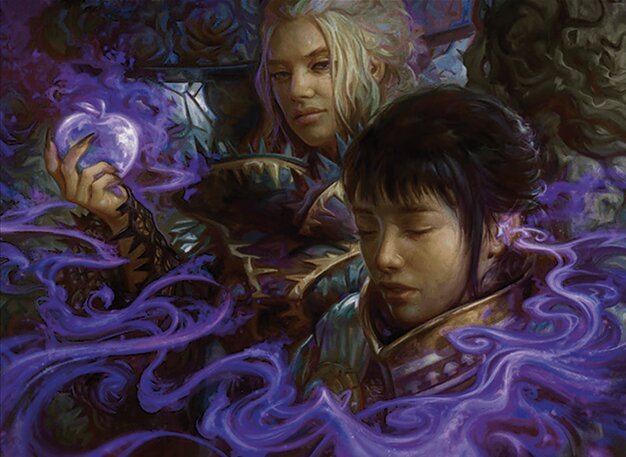
QG: It’s funny, to be honest I have only intentionally painted Eriette once. Prophetic Prism’s brief just asked for a general witch manipulating the mirror shards. Her design inspiration came from a combination of what I was seeing in the world guide, many of which included the elaborate gowns, mirror shard motifs, and the white hair was for contrast against the dark background. Later, when painting Eriette’s Whisper, I immediately realized the similarity, and if I painted these in reverse I definitely would have handled them differently. Lore-wise, I don’t know if the witch in Prophetic Prism has ‘become’ Eriette since, but that wasn’t the original intention.
To answer your question, though, in my experience painting any main figures, there will definitely be conversation about how to keep them consistent. If I remember correctly, I had to fix the eyes and nose in Eriette’s Whisper to get that final approval.
AB: Now that is cool! Alright, let’s talk hands! It’s almost a bit of a meme among artists that hands are some of the hardest things to paint, and these are stellar. Was there anything special that happened here where you felt like you got a really strong result?
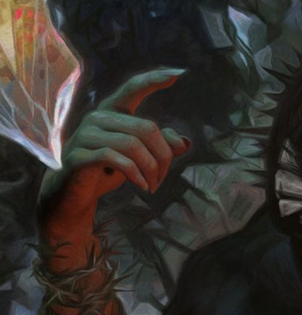
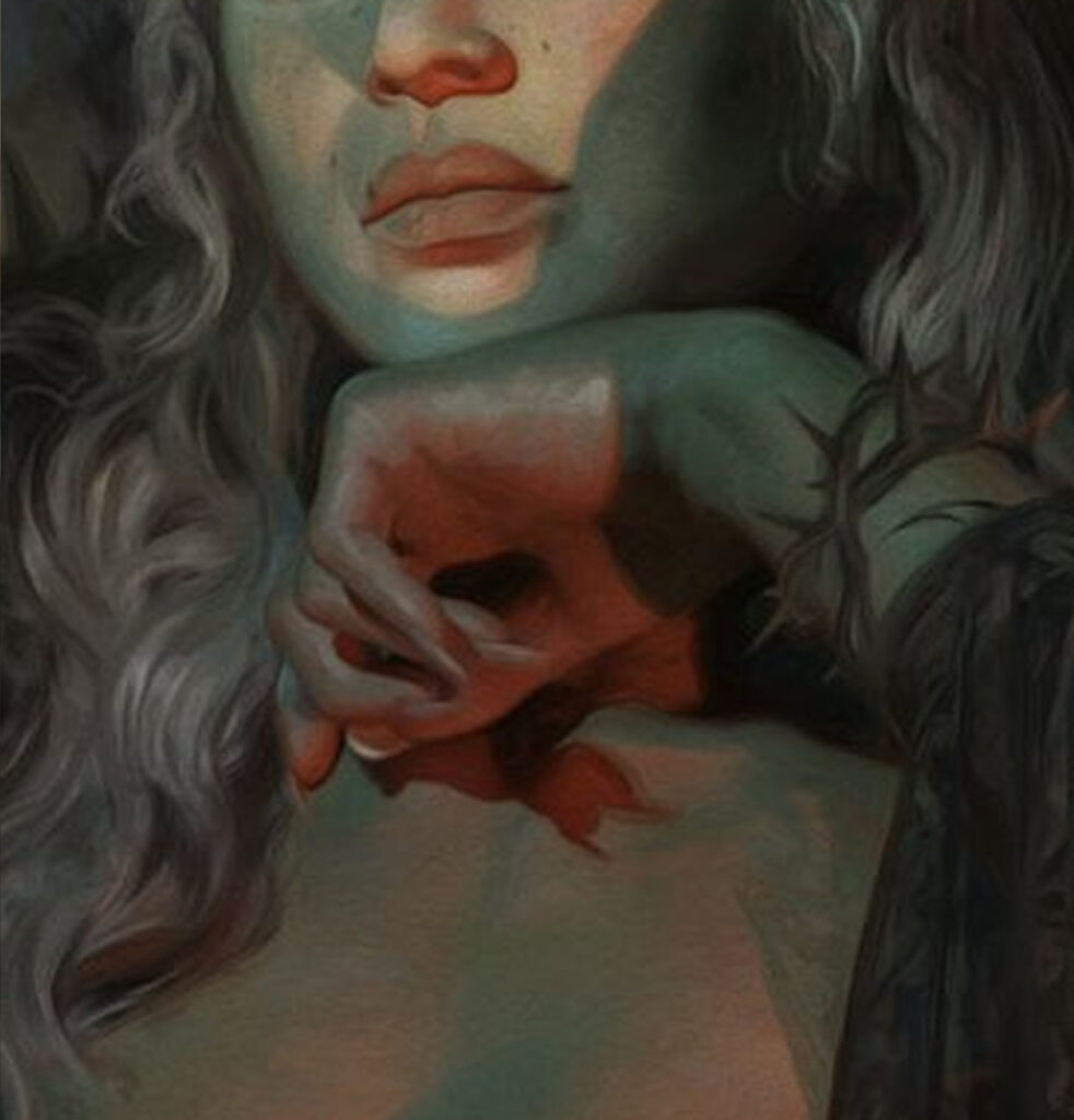
QG: I wish I could take more credit, but this really just came down to good reference. I was teaching foundation students color theory at the time, so the idea of warm and cool lighting was really fresh in my mind. Then, when setting up reference it all just came together, and if you zoom in it’s shocking how loose I was able to keep the hands while still being believable.
Going Broader
AB: I mean, a good reference will save your life as an artist a lot! Let’s zoom out a bit. What are some of your favorite subjects to work on and why?
QG: Without a doubt, figurative work. Before I knew about illustration, my work was entirely focused around drawing celebrities and friends. I love the challenge of getting likenesses and the subtlety of emotion.
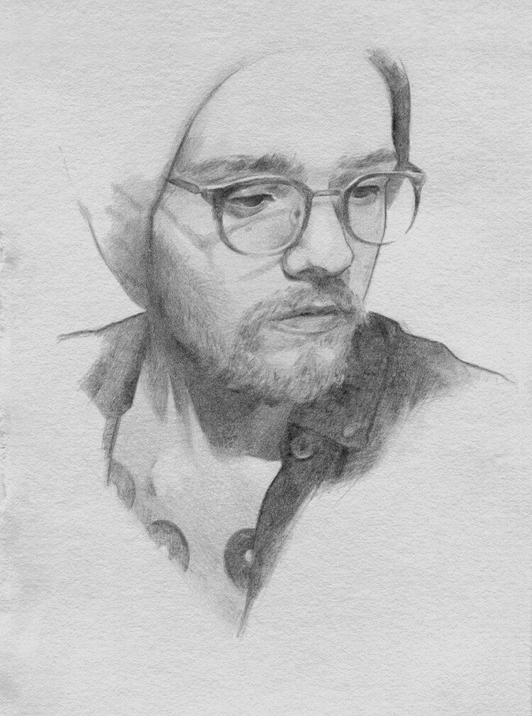
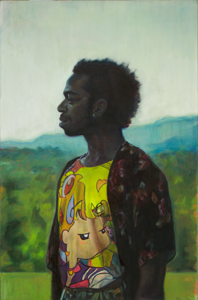
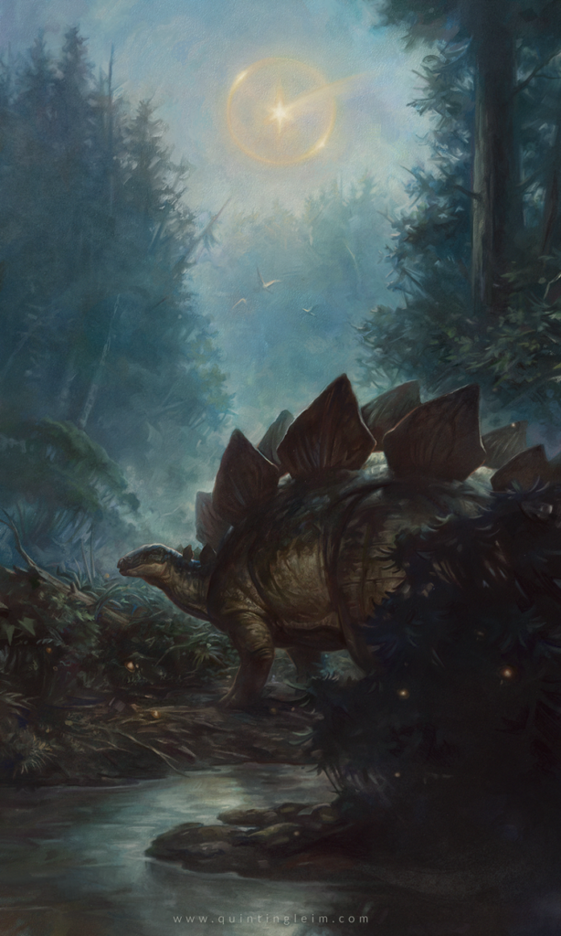
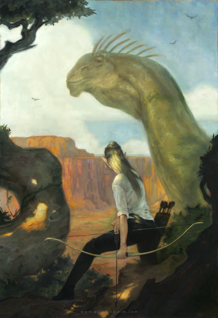
Beyond that, any time I can draw dinosaurs I’m happy, and some day I think I’d love to retire to the American West and just paint cowboys, canyons, and those crazy monolithic clouds.
AB: What do you feel is a unique feature of your art? Something that feels specific to you if not necessarily unique?
QG: I wish I had an answer to this; to me I just see a gross amalgamation of all the artists and art I admire; my work always comes out this way, though, even when I try for it not to, so there is probably something there whether I know it or not.
That said, I do think a consistent thread throughout my work are these quiet, almost somber moments? I don’t know, something to dive into more!
AB: What’s something artistically that you haven’t done yet and are excited to try?
QG: Like a lot of people working in commercial fields, there’s definitely a draw for me to create something of my own. My thesis work in graduate school was an illustrated novel I occasionally go back to. I have no idea if it will ever be finished, but it’s something nice to sit with and brainstorm in my free time. It has fantasy, dinosaurs, the wild west! Basically dessert for when I’m done with the ‘real’ work.
As for clients, I do occasional work outside of tabletop and have enjoyed working within comics, book covers, and even animation could be something fun to push more seriously into!
AB: I always like to close these out with a kind of mythbuster question. What’s something you wish more non-artists knew about the work we do?
QG: Again, speaking to growing up in a small town with limited thought on what art ‘can be’, the career side of art is something I really love to talk about now.
Illustration, but even more than that, there is so much opportunity to make a career in art if you just know where to look (if you want to, that is. I’m also a fan of art as a hobby.)
I won’t pretend it’s the easiest career, but, if you create the work that fits and find the opportunity to get the work in front of the people who need to see it, with a little luck you will set yourself up for when that opportunity eventually comes.
AB: Quintin, it’s been amazing getting to talk to you and I can’t wait to see more of what you do in the future and thanks for taking the time.
QG: Looking forward to seeing how it comes together! More than happy to answer a few questions. I’m glad you think my piece is worth talking about.
AB: It definitely is!
Conclusion
And with that, this Artful Breakdown comes to a close. Quintin was a blast to talk to, and I’m thrilled he’s on my radar now. You can find him around the internet in a few places. His website of course, as well as Bluesky and Twitter. Definitely support his stuff if you can.
With that, we’ll end things here, but please let me know as always what your favorite pieces are and any artists I should look at for possible articles like this in the future. Take care of yourselves out there, and I’ll see you in the next Artful Breakdown.